

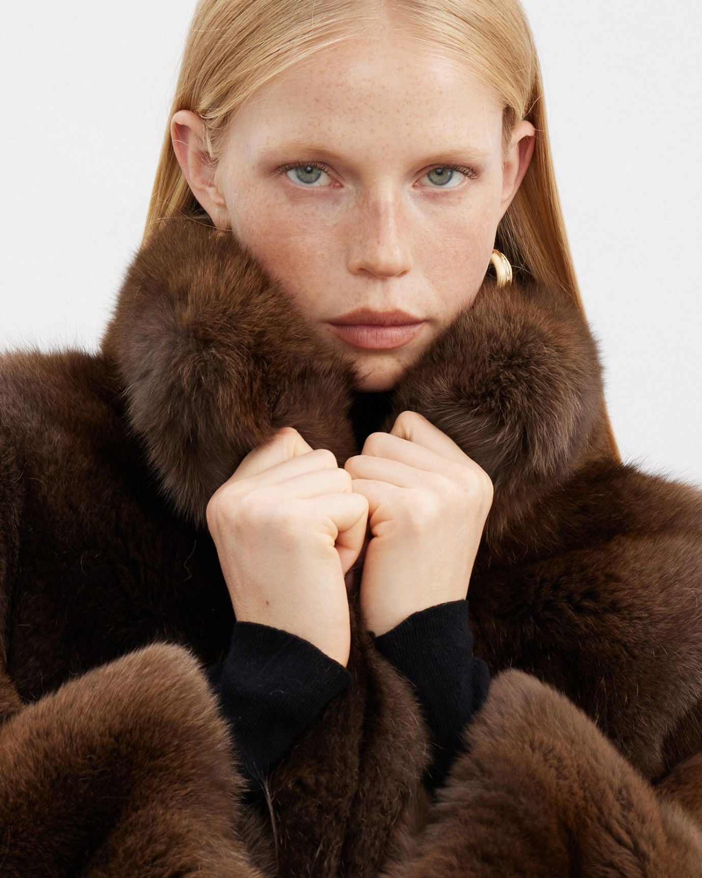
Polo Shirt Colors That Look Expensive in 2026
Reading time 13 min • 2646 words
Color is the first thing a room registers before cut, before fabric, before any other detail. In menswear, the wrong shade can make a well-constructed polo look like a souvenir, while the right one makes a simple knit feel like a considered choice. This is not abstract. It is a matter of specific hues, their saturation levels, and how they interact with skin tone and natural light.
In 2026, the palette that reads as luxury has not shifted dramatically. The quiet luxury palette continues to reward restraint: deep navies, clean whites, warm neutrals, and a handful of controlled accent tones. What has changed is that cheap fast-fashion brands have flooded the market with imitations, making it more important than ever to understand precisely which colors hold their ground and which ones collapse under scrutiny.
This guide is about polo shirts specifically, and about men who want to dress with genuine confidence rather than obvious branding. Every recommendation here is grounded in how color functions in real light, on real fabric, in real social contexts.
Key takeaways
- Navy blue is the single most reliable color for a polo that reads as expensive, across every fabric and occasion.
- White works only when the fabric quality is exceptional and the fit is precise, otherwise it reads cheap.
- Saturated, trend-driven colors age fast and undercut the luxury signal you are trying to send.
- Bordeaux, stone, and off-white are the strongest accent alternatives to navy within the quiet luxury palette.
- Fabric and color work together: a flat, pilled surface destroys even the best shade, while fine cotton or cashmere makes a simple color look rich.
In this guide
- Why Color Choice Signals Price Before Anything Else
- Navy Blue: The Benchmark Color for an Expensive-Looking Polo
- White: The High-Risk, High-Reward Option
- The Supporting Palette: Bordeaux, Stone, and Controlled Accents
- Fabric Changes How Color Reads: The Detail Most Men Miss
- Colors to Build Your Polo Wardrobe Around in 2026
- Frequently asked questions
Why Color Choice Signals Price Before Anything Else
The human eye processes color before it processes silhouette. This is not a styling opinion; it is a basic fact of visual perception. When someone walks into a room in a polo shirt, the shade registers in roughly 90 milliseconds, well before the quality of the pique or the precision of the collar construction becomes apparent.
Colors that read as expensive share a set of characteristics. They are desaturated or deeply saturated but never garish. They sit within a palette that has historical associations with wealth, sport, and European leisure. They do not chase seasonal trend cycles. And they photograph well in natural light without appearing washed out or aggressive.
Colors that undercut the luxury signal include most neons, overly bright primary reds, lime greens, and anything that appears to have been chosen because it was the boldest option on the shelf. As our editorial piece on colors to avoid if you want to look expensive makes clear, restraint is not timidity. It is the foundational grammar of expensive-looking dress.
The polo shirt is a particularly instructive case because it is a casual garment by origin. Its luxury signal depends almost entirely on color, fabric, and fit. Get the color wrong and no amount of fine cotton will save it.
Expert insightThe most expensive-looking polos are often the most boring in a thumbnail. That is the point. Quiet confidence does not compete for attention.
Navy Blue: The Benchmark Color for an Expensive-Looking Polo
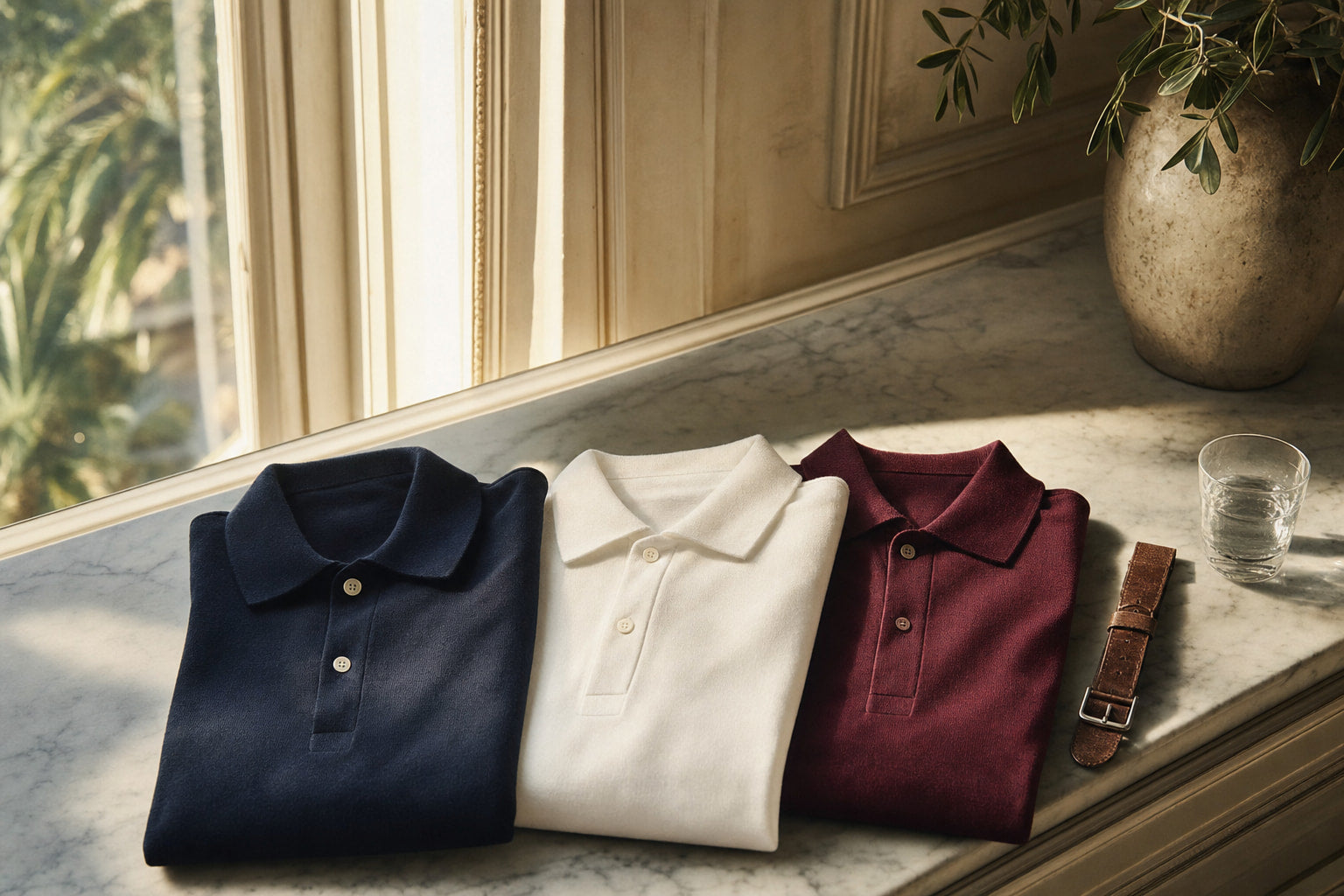
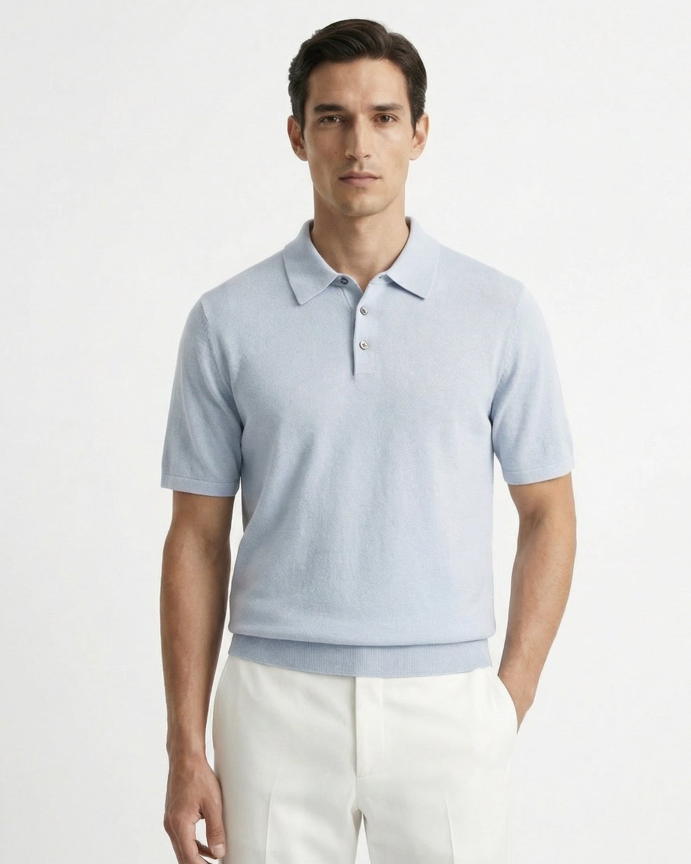
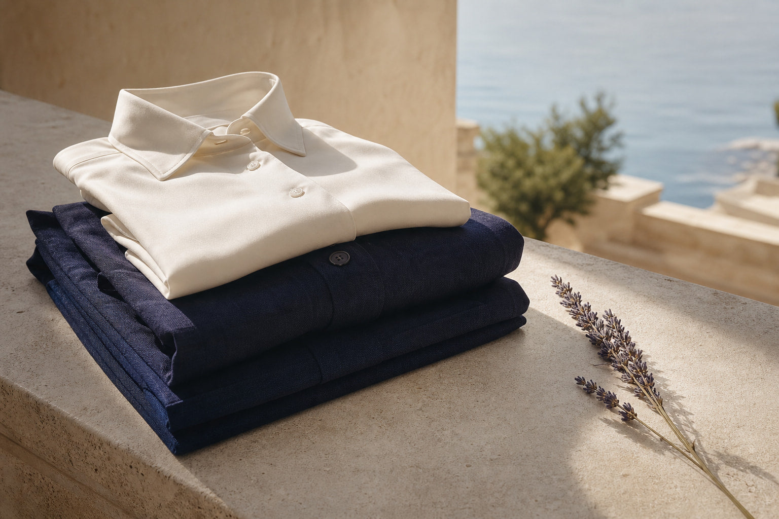
If there is one color that functions as the definitive answer to this question, it is navy blue. Not royal blue, not cobalt, not electric blue. Navy: a deep, slightly desaturated blue with enough darkness to hold its own in both daytime and evening light.
Why navy works so consistently comes down to its history and its optical behavior. Navy blue has been associated with naval dress uniforms, Ivy League rowing clubs, and European aristocratic sport for well over a century. That cultural weight is embedded in the color itself. When a man wears a clean navy polo, he borrows that register without saying a word about it.
Optically, navy absorbs light rather than reflecting it aggressively. It does not compete with the face. It reads as composed. On a polo shirt, this means the eye goes to the man wearing it rather than the garment, which is precisely what expensive dressing achieves.
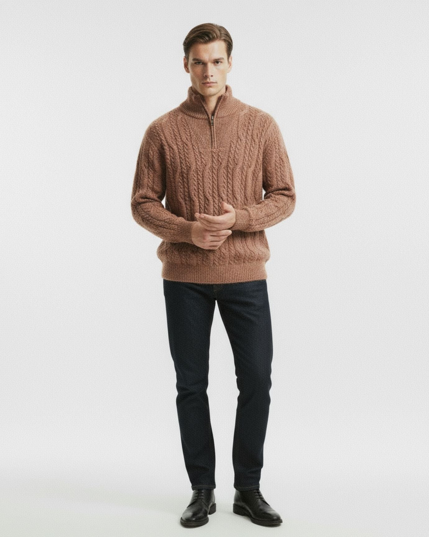
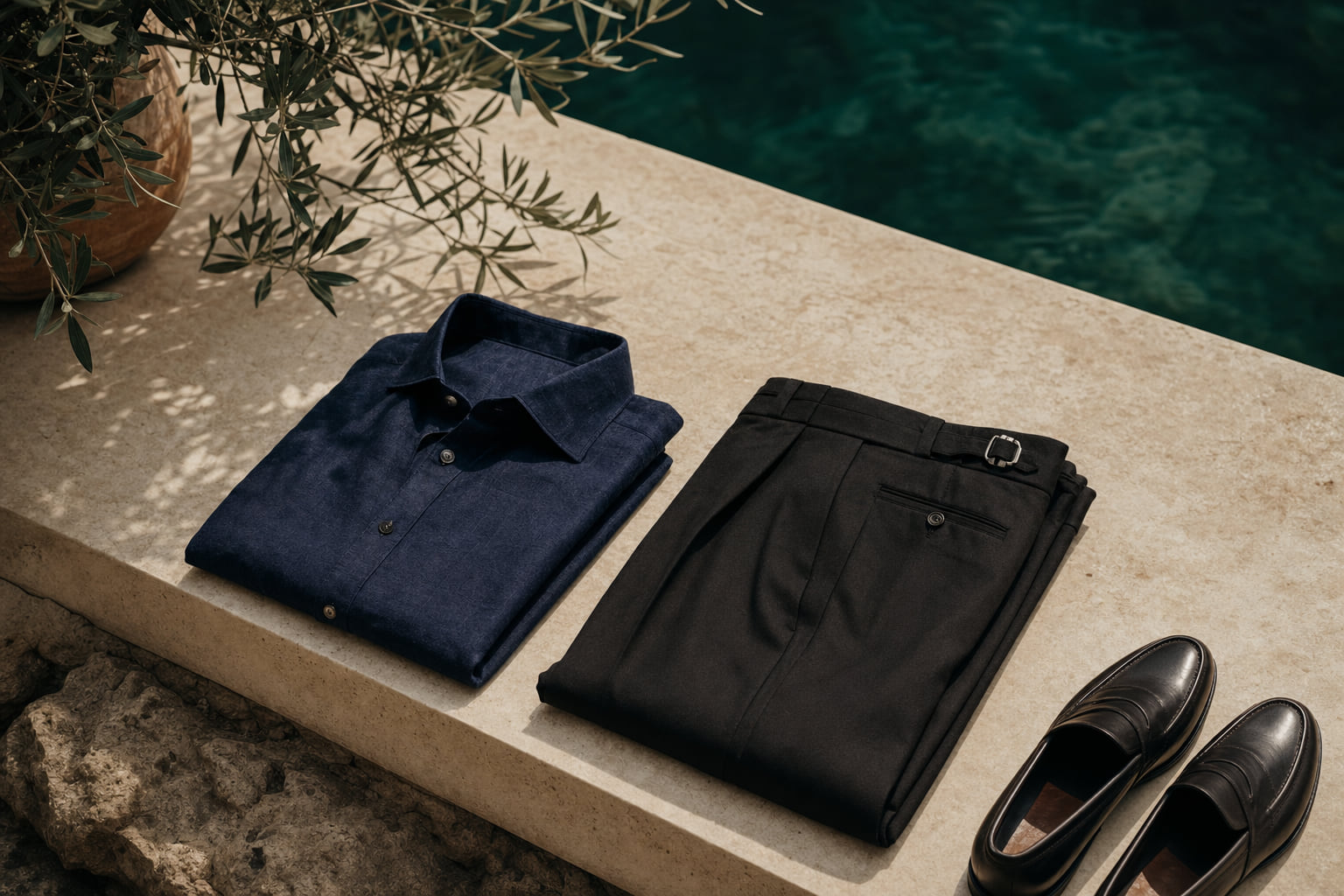
Our Old Money Polo Shirt Navy Blue is built around this principle. The shade is a true deep navy, not the faded mid-blue that loses its authority after a few washes. Paired with stone chinos or white linen trousers, it is one of the most reliable combinations in a man's warm-weather wardrobe.
For men who want a longer sleeve and a heavier hand, the Cashmere Wool Polo Long Sleeve in navy carries the same color authority with an added layer of tactile richness that reads as genuinely luxurious in cooler months.
- With tailored chinos: navy polo, stone or khaki trousers, tan loafers
- Coastal or resort: navy polo, white linen shorts, canvas espadrilles
- Smart casual evening: navy polo under a cream or camel unstructured blazer
Expert insightChoose a navy that stays dark after washing. Cheap navy fades to a dull blue-grey within ten washes, which is the fastest way to make an expensive color look inexpensive.

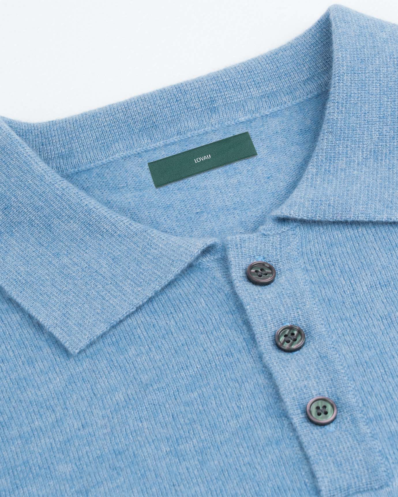
White: The High-Risk, High-Reward Option
White is the second most powerful color in this palette, but it is also the most unforgiving. A white polo in an inferior fabric looks immediately cheap: every pilling, every thin spot, every slightly-off shade of optical-brightener white announces itself. But a white polo in a genuinely fine cotton, properly fitted and well maintained, is one of the cleanest luxury signals in menswear.
The distinction between bright white and off-white matters more than most men realize. Optical-brightener white, the shade used in most fast-fashion basics, has a blue-tinged harshness that reads as synthetic even when the fiber is cotton. Off-white or natural white, the shade that comes from high-quality unprocessed cotton or fine pique without aggressive chemical brightening, reads as warm, expensive, and considered.
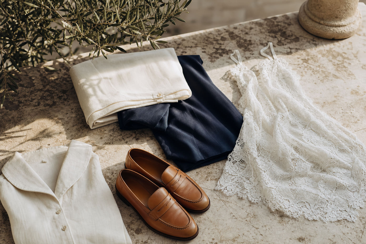
Our Old Money Polo Shirt White is calibrated to this warmer register. The fabric has enough weight to drape cleanly without clinging, which is what separates a white polo that looks expensive from one that looks like a gym shirt.
Maintenance is a real factor here. A white polo that is slightly grey or yellowed at the collar undermines everything. Our guide on keeping white polos looking brand new covers the practical care steps in detail.
- Pair with navy or dark green trousers for maximum contrast and visual authority
- Avoid wearing white polos with light grey or beige trousers in the same value range, the lack of contrast reads as washed out
- A white polo under a navy blazer is a Mediterranean classic for good reason: the contrast is sharp and the palette is impeccable
Expert insightHold a white polo up to natural daylight before buying. If it glows blue-white, it is over-brightened and will look cheap outdoors. You want a shade closer to warm cream.

The Supporting Palette: Bordeaux, Stone, and Controlled Accents
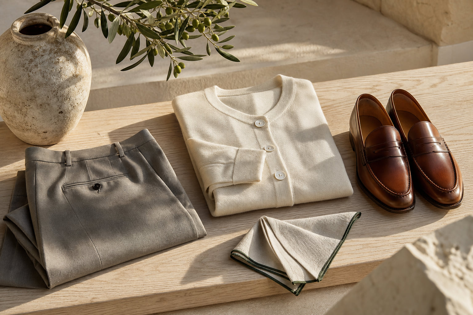
Navy and white carry the most weight, but a man who only owns those two colors is missing the depth that makes a wardrobe feel considered rather than formulaic. The old money color palette includes a set of controlled accent tones that expand the range without breaking the quiet luxury register.
Bordeaux is the strongest of these. It is a deep wine red, close to burgundy but with more blue in it, which gives it a European weight that brighter reds lack. It pairs naturally with grey, navy, and stone, and it photographs exceptionally well. Our Old Money Polo Shirt Bordeaux at $95 uses this shade with precision: the color is rich enough to read as an accent without becoming aggressive.
Stone and warm greige function as the neutral alternative to white. They are easier to maintain and carry a slightly softer, more relaxed register that works particularly well in linen or fine cotton blends for summer. For a textured take on this, the Fine Cotton Italian Jacquard Polo brings surface interest to the neutral palette without introducing color noise.
Forest and dark olive green are gaining traction within the quiet luxury space in 2026, as documented in our overview of what colors make you look rich. These work best in fine knit or pique constructions where the texture adds depth to the color.
What all of these have in common: none of them are trend colors. They are rooted in a palette that has been associated with European leisure and understated wealth for generations. That is precisely why they hold their value season after season.

Fabric Changes How Color Reads: The Detail Most Men Miss
Two polo shirts in identical navy will look entirely different depending on the fabric. This is not a minor point. It is the mechanism by which color either reads as expensive or collapses into mediocrity.
Mercerized cotton has a subtle sheen that deepens color saturation and gives navy a richness that flat cotton cannot match. The High-End Double Mercerized Cotton Silk Long-Sleeve Polo Shirt demonstrates this clearly: the color appears more complex and layered than a standard pique in the same shade, because the fiber surface reflects light with more variation.
Cashmere and wool blends add warmth to color. A navy in cashmere reads differently from a navy in polyester-cotton: it has a slight haze to it, a softness of tone that communicates natural fiber and, by extension, expense. The Fine Cashmere Polo Long Sleeve at $245 is the clearest example of this in our range. The color and the fiber are inseparable.
Linen lightens color slightly and adds texture. A navy linen polo has more visual movement than a navy cotton polo, which makes it better suited to casual outdoor settings but slightly less formal. For those who prefer the linen register, our old money polo shirts collection includes options across the fabric spectrum.
As the Gentleman's Gazette has noted in its fabric guides, the relationship between fiber quality and color depth is one of the most consistent markers of genuine clothing quality. A flat, synthetic-looking surface will make even the best shade look cheap. A fine natural fiber makes a simple color look considered.
- Mercerized cotton: deepens saturation, adds subtle sheen, best for formal-casual settings
- Cashmere/wool blend: softens tone, adds warmth, best for autumn and cooler evenings
- Fine linen: lightens and textures color, best for warm weather and resort contexts
- Silk blend: refines any shade dramatically, best reserved for evening or high-occasion contexts

Colors to Build Your Polo Wardrobe Around in 2026
A practical polo wardrobe does not need more than four or five colors. The goal is not variety for its own sake. It is a set of options that all work together, that all read as expensive, and that cover the range of contexts a man actually encounters.
Start with navy as the foundation. One polo in a true deep navy covers more ground than any other single garment in this category. It works from a morning boat trip to a restaurant dinner, from a Mediterranean terrace to a city garden. The neutral color codes of old money fashion places navy at the top of this hierarchy for exactly this reason.
Add white or off-white as the warm-weather counterpart. White and navy are the two poles of the luxury polo palette, and owning one of each covers the majority of contexts.
Then build in one accent color: bordeaux for men who want a warmer register, forest green for a more contemporary quiet luxury note, or stone for those who prefer to stay fully within the neutral range. The long sleeve polos collection is a useful reference for how these colors function across different constructions and weights.
Finally, consider one textured or specialty fabric polo in a neutral shade. The Marbella Cooling Acetate Silk Polo in a neutral demonstrates how fabric complexity can carry a simple color into genuinely luxurious territory. This kind of garment does not need a strong color to make its case. The material does the work.
The principle underlying all of this is simple: buy fewer colors, buy better fabric, and let the palette work quietly. That is what expensive dressing actually looks like.

| Color | Luxury Signal | Versatility | Best Occasion | Key Risk |
|---|---|---|---|---|
| Navy Blue | Very High | Very High | All occasions, day to evening | Fading to dull blue-grey in cheap fabrics |
| White / Off-White | Very High | High | Summer, resort, smart casual | Yellowing, fit errors show immediately |
| Bordeaux | High | Medium-High | Evening, autumn, European resort | Can read as festive if oversaturated |
| Stone / Warm Greige | High | High | Daytime, travel, casual smart | Too close to skin tone on fair complexions |
| Forest / Dark Olive | Medium-High | Medium | Outdoor, country, relaxed smart | Difficult to pair, needs careful trouser choice |
| Bright or Neon Tones | Low | Low | None in a luxury context | Reads as trend-chasing, ages within one season |
Frequently asked questions
What is the single best polo color for looking expensive in 2026?
Navy blue. It has the deepest historical association with refined European sport and leisure, it works across almost every context, and it reads as composed rather than attention-seeking. A well-made navy polo shirt in a fine cotton or cashmere blend is the closest thing to a guaranteed expensive-looking choice in this category.
Does a white polo look expensive or cheap?
It depends entirely on the fabric and the fit. A white polo in a fine, heavy pique with a clean off-white shade and a precise fit reads as genuinely luxurious. The same polo in a thin, over-brightened cotton with a sloppy collar reads as cheap. Fabric quality is the deciding factor. See our guide on keeping white polos looking brand new for the care steps that maintain that expensive appearance.
Are bright or bold polo colors ever appropriate in a luxury context?
Rarely. Bright colors in a polo almost always read as casual or trend-driven rather than expensive. The exception is a deeply saturated, historically grounded shade like bordeaux or forest green, which have enough cultural weight to carry a luxury signal. Neons, bright primaries, and anything that appears to have been designed for visibility rather than elegance should be avoided. Our article on colors to avoid if you want to look expensive covers this in detail.
How many polo colors should a man own?
Four to five, maximum. Navy, white or off-white, one warm accent such as bordeaux or stone, and optionally one textured or specialty fabric polo in a neutral. More than this and the wardrobe starts to feel like a collection of experiments rather than a considered set of choices. The goal is that every polo you own works with every pair of trousers you own. That kind of internal coherence is itself a luxury signal.
The colors that look expensive in 2026 are not surprising, and that is the point. Navy, white, bordeaux, stone: these are not trend discoveries. They are the result of decades of accumulated cultural association between certain shades and a certain kind of understated, confident dressing. What changes year to year is the quality of execution available at different price points, and the importance of choosing fabric that does justice to the color. Start with the right shade, invest in the right material, and the rest follows. For a complete reference on how these colors sit within a broader wardrobe strategy, our guide to neutral colors that never go out of style is the natural next step.