


Best Colors to Avoid If You Want to Look Expensive
Reading time 13 min • 2635 words
Color is the first thing the eye registers before silhouette, before fabric, before fit. A garment can be beautifully cut in fine material and still read as cheap if the color is wrong. This is not about avoiding bold choices. It is about understanding which specific shades carry the visual weight of quality and which ones, through association with synthetic dyes, fast-fashion production, and overexposure, immediately undermine the impression you are trying to make.
The colors that look expensive share certain characteristics: they tend toward complexity, depth, and a slight mutedness. They are shades that require more careful dyeing, that age gracefully, and that work across many contexts without announcing themselves too loudly. The colors that look cheap tend to be the opposite: flat, synthetic-looking, aggressively bright, or strangely indeterminate.
This guide works through the specific offenders, explains why each one fails, and offers the direct alternative to reach for instead. The goal is not a dull wardrobe. It is a wardrobe that reads as considered, confident, and genuinely refined.
Key takeaways
- Neon and highly saturated synthetic-looking colors are the fastest way to signal cheap fabric and cheap taste.
- Muddy, indeterminate colors, shades that sit between two distinct tones without committing to either, read as poorly dyed and low-quality.
- Stark, blue-toned white is harsh on most complexions and is associated with disposable fast fashion basics.
- Overly bright pastels in synthetic fabrics flatten the color and make even expensive cuts look mass-market.
- Replacing problematic shades with their refined counterparts, ivory instead of white, sage instead of lime, navy instead of cobalt, costs nothing but produces a dramatically more polished result.
In this guide
- Neon and Hyper-Saturated Colors: Why They Signal Synthetic
- Muddy In-Between Colors: The Problem with Indeterminate Shades
- Stark Optical White: The Fast Fashion Baseline
- Overly Bright Pastels in Flat Fabrics: Where Sweetness Becomes Cheap
- The Colors That Actually Work: Building Around a Refined Palette
- Color Combinations That Undermine Even Good Individual Pieces
- Frequently asked questions
Neon and Hyper-Saturated Colors: Why They Signal Synthetic
Neon shades, fluorescent yellow, electric pink, screaming orange, exist because synthetic dyes can produce them cheaply at scale. Natural dyes and high-quality pigments used in luxury fabrics do not produce these tones. The result is a deeply ingrained association: when you see neon, the brain reads polyester, fast fashion, and disposability.
This is not merely aesthetic prejudice. The science of color perception confirms that highly saturated, short-wavelength colors are visually fatiguing and demand attention in an aggressive way that refined dressing actively avoids. Quiet confidence does not shout.
What to wear instead: If you want brightness, reach for warm, complex versions of those hues. A rich saffron instead of fluorescent yellow. A deep coral instead of neon orange. A dusty rose rather than hot pink. These shades have the warmth of pigment rather than the flatness of synthetic dye.
For women, the Dreamy Retro Gentle Floral Dress is a useful example of how warm, layered color, handled through print and soft base tones, reads as far more expensive than any single-color neon piece could.
For men, the French Retro Striped Knit Polo shows how color can be present and even playful without tipping into the synthetic brightness that signals cheapness. The stripe is structured, the tones are balanced.
Expert insightA useful rule: if the color looks identical whether the fabric is cotton, polyester, or silk, it is almost certainly a synthetic dye producing a cheap-looking result. Good color should change subtly with the texture of the cloth.

Muddy In-Between Colors: The Problem with Indeterminate Shades
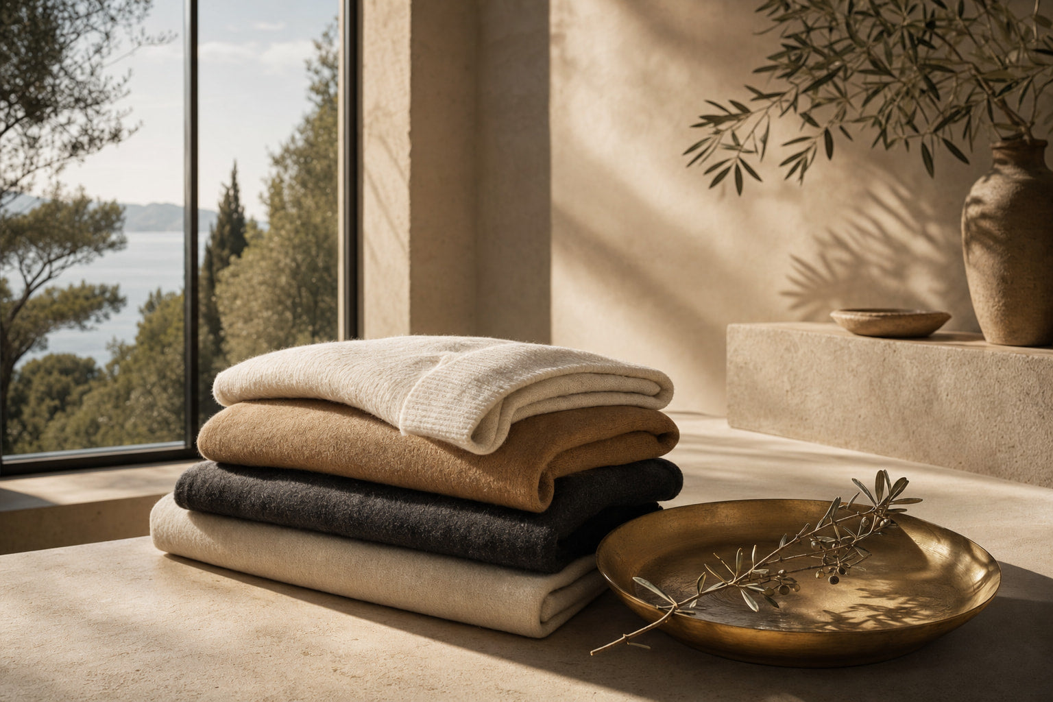
There is a specific category of color that appears most often in poorly produced garments: shades that cannot decide what they are. A green that is almost brown but not quite either. A grey that tips toward a strange purple. A beige that reads as dirty white. These tones exist because cheap dyeing processes produce inconsistent results, and the industry has learned to market them as "earthy" or "natural."
The problem is not earthy tones in themselves. Warm stone, true camel, proper olive, and genuine khaki are all sophisticated choices. The problem is the in-between shade that has no integrity, no clear identity. It reads as a mistake rather than a choice.
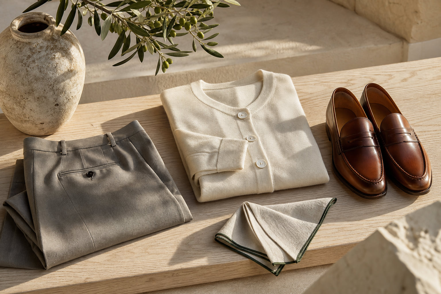
What to wear instead: Commit to the color. If you want green, choose a clear sage, a deep forest, or a proper olive with yellow in it. If you want warm neutral, choose true camel or genuine stone. The neutral color codes of old money fashion are a useful reference point for understanding which neutrals carry genuine visual weight and which ones simply look unresolved.
For men looking at trousers, the Ibiza Linen Trousers Limited Edition demonstrates how a committed neutral, properly executed in quality linen, reads as deliberate and refined rather than accidental.
Expert insightHold any neutral garment next to a pure white surface. If the color looks like it has been washed too many times rather than dyed to that exact shade, it is likely an indeterminate tone that will undermine the whole outfit.

Stark Optical White: The Fast Fashion Baseline
Stark, blue-toned optical white is the default color of mass-produced basics. It is achieved by adding optical brighteners to cheap fabric to make it appear whiter than white, a process that creates an almost luminous, slightly artificial brightness. The result is a color so associated with disposable basics, supermarket shirts, and fast fashion wardrobe fillers that it has become almost impossible to wear at a refined level.
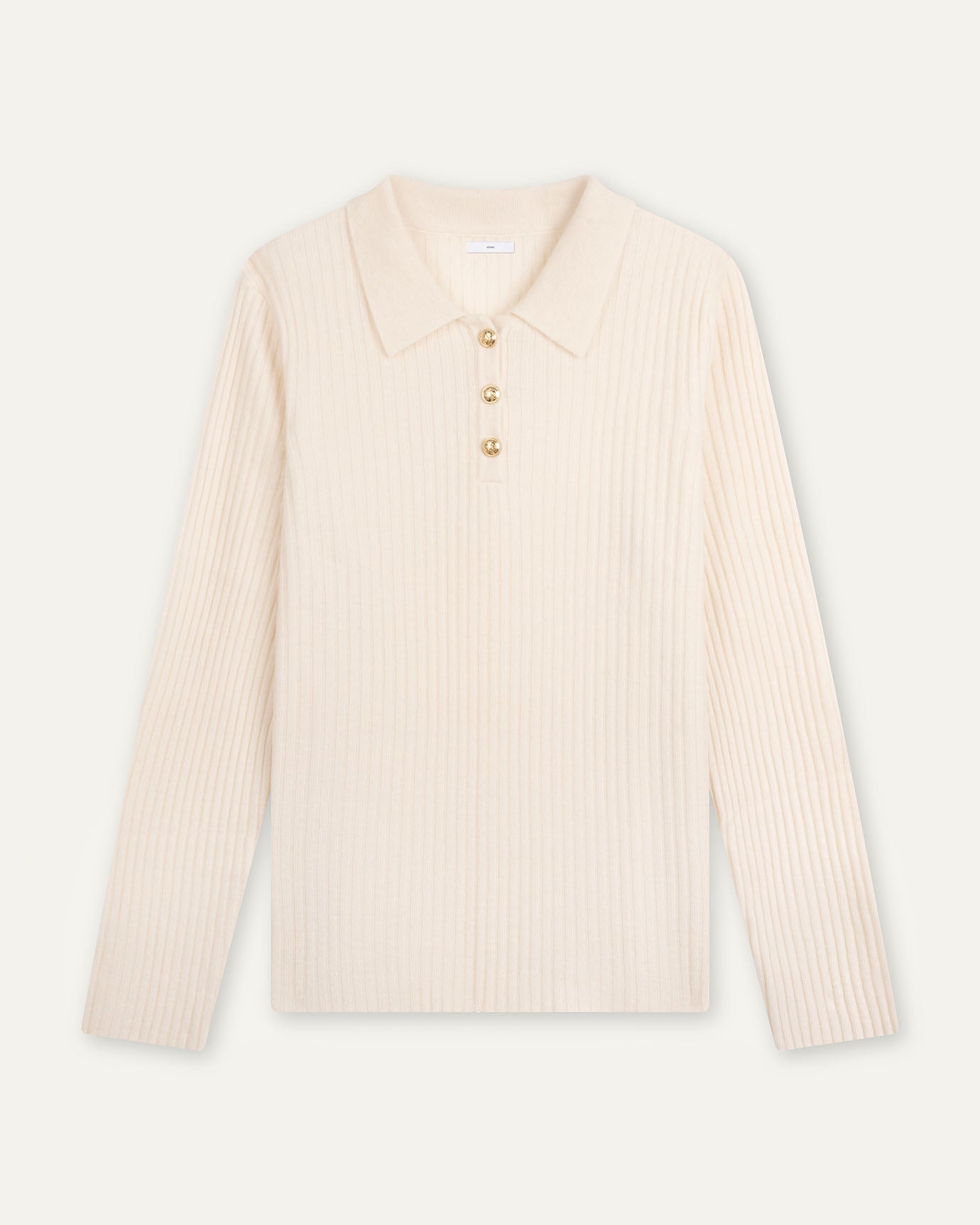
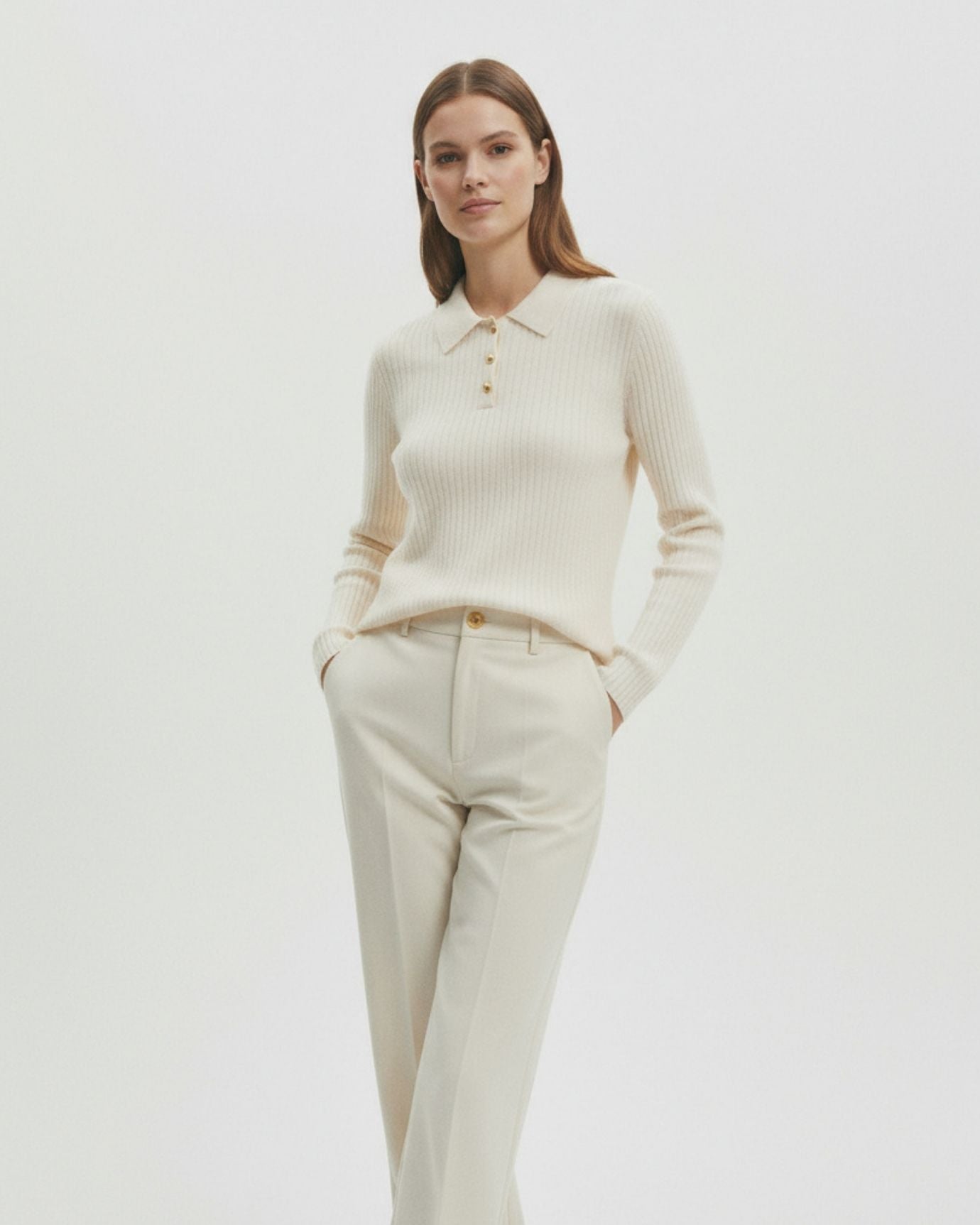
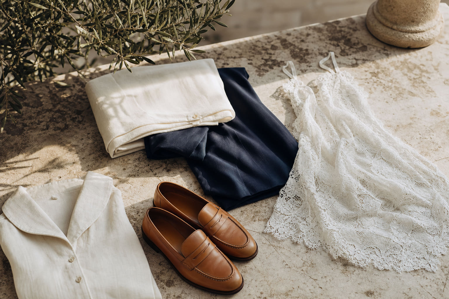
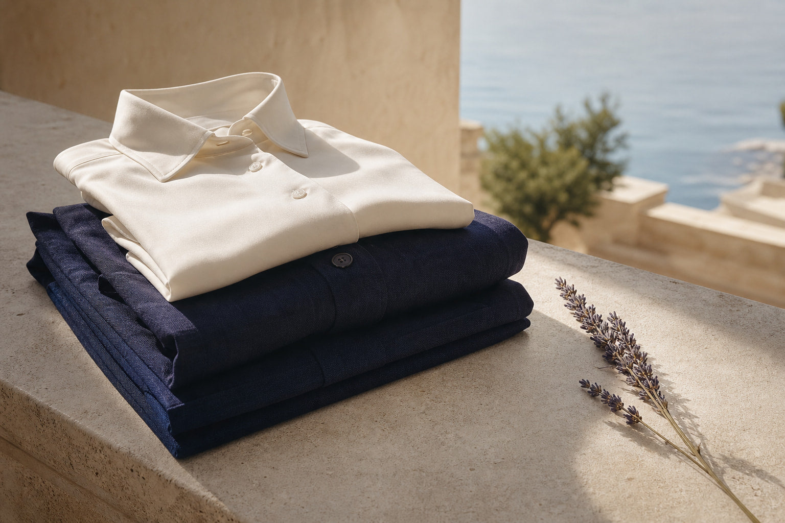
This does not mean avoiding white. It means being precise about which white. Ivory, cream, and warm off-white are entirely different propositions. They suggest natural fibers, careful dyeing, and a wardrobe built with intention. The psychology behind cream as a color choice is explored in more depth in our piece on the psychology behind the color cream, which is worth reading if you wear a lot of light neutrals.
For women, the French Niche Style White Dress is cut and finished in a way that moves it firmly away from the stark-white basic register. Structure and proportion carry it. Similarly, the Cira White Hollow-Out Lace Dress uses texture and lace detailing to give the white depth and tactility that a plain stark-white piece could never achieve.
For men, the High Count Fine White Linen Shirt sits in the warmer register of white that reads as quality rather than disposable. The fineness of the linen weave creates a natural slight warmth that separates it entirely from an optical-white cotton basic.
Expert insightWhen buying white or near-white pieces, hold them against your skin in natural daylight. Warm whites will complement most complexions. Blue-toned optical whites tend to cast a cold, slightly clinical light on the face.

Overly Bright Pastels in Flat Fabrics: Where Sweetness Becomes Cheap
Pastel colors occupy a complicated space. Done well, in fine wool, silk, or quality linen, they can be genuinely sophisticated. Done poorly, in flat synthetic fabrics with too much saturation, they become the visual language of fast fashion spring collections and novelty occasion wear.
The specific problem is brightness combined with flatness. A pastel that has been pumped up in saturation to compensate for cheap fabric loses all the delicacy that makes pastels work. The result is a color that looks like a children's party supply rather than a considered wardrobe choice.
What to wear instead: Muted, dusty pastels with genuine complexity. Lavender that has grey in it. Pale blue that reads almost like a neutral. Blush pink that sits close to skin tone. These shades work because they are quiet, they suggest restraint, and they tend to be more difficult to produce cheaply.
Our article on the best colors for old money men covers the specific pastel tones that work within a refined wardrobe, with outfit references that show how to deploy them without tipping into sweetness.
For women, the Amy Pink Dress Suspender is a useful example of how pink can be handled with enough structure and restraint that it reads as polished rather than girlish. The cut carries the color rather than letting the color carry everything.
For men wanting to bring color into their wardrobe through accessories, the Cashmere Gloves extended color matching edge offers a way to introduce a quiet pastel note without the risk of a full garment in a difficult shade.

The Colors That Actually Work: Building Around a Refined Palette
Understanding which colors to avoid is only useful if you have a clear alternative. The psychology of color in old money fashion is built around a specific set of principles: depth over brightness, complexity over simplicity, and restraint over statement.
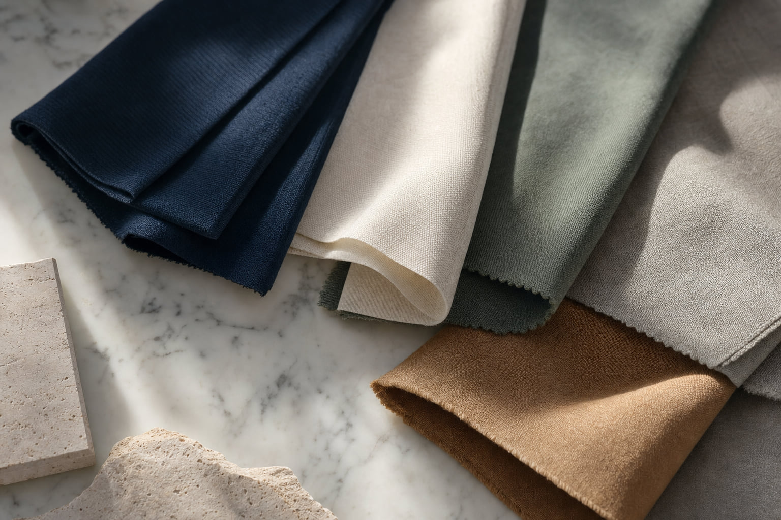
The colors that consistently read as expensive share a few qualities. They tend to be slightly muted, with grey or brown undertones that add complexity. They tend to work across multiple contexts, from casual to formal, without requiring a complete re-think of the outfit. And they tend to photograph well in natural light, appearing richer and more layered rather than flat.
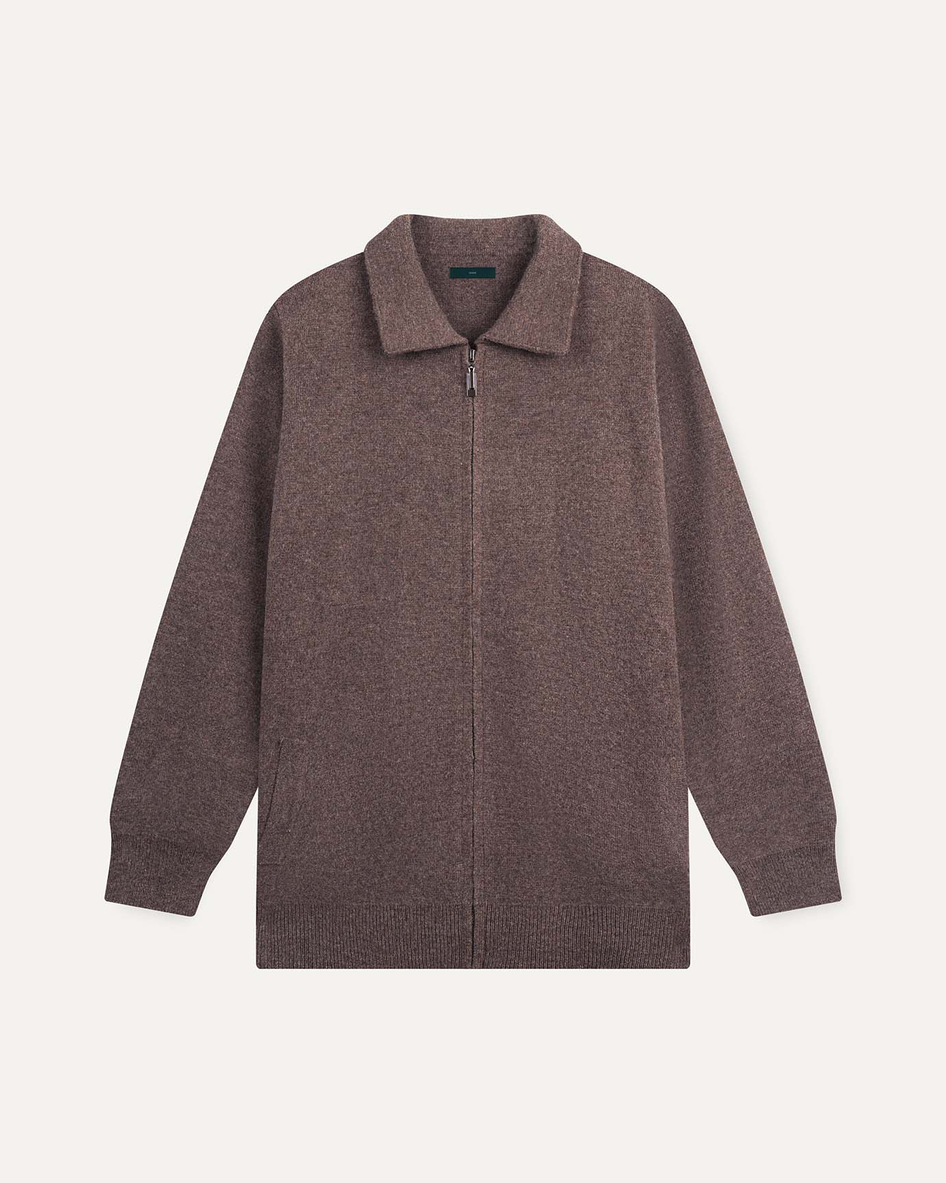
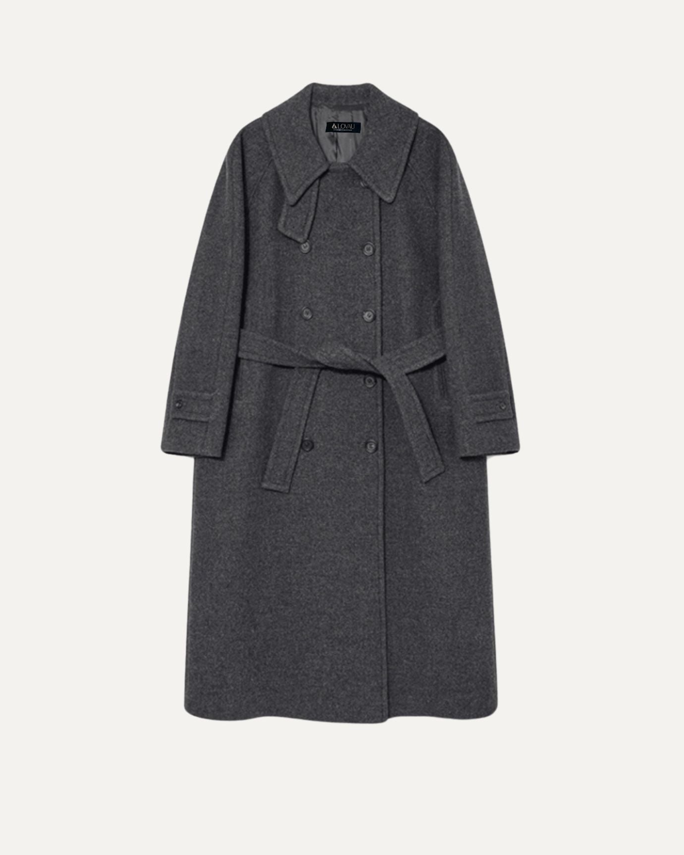
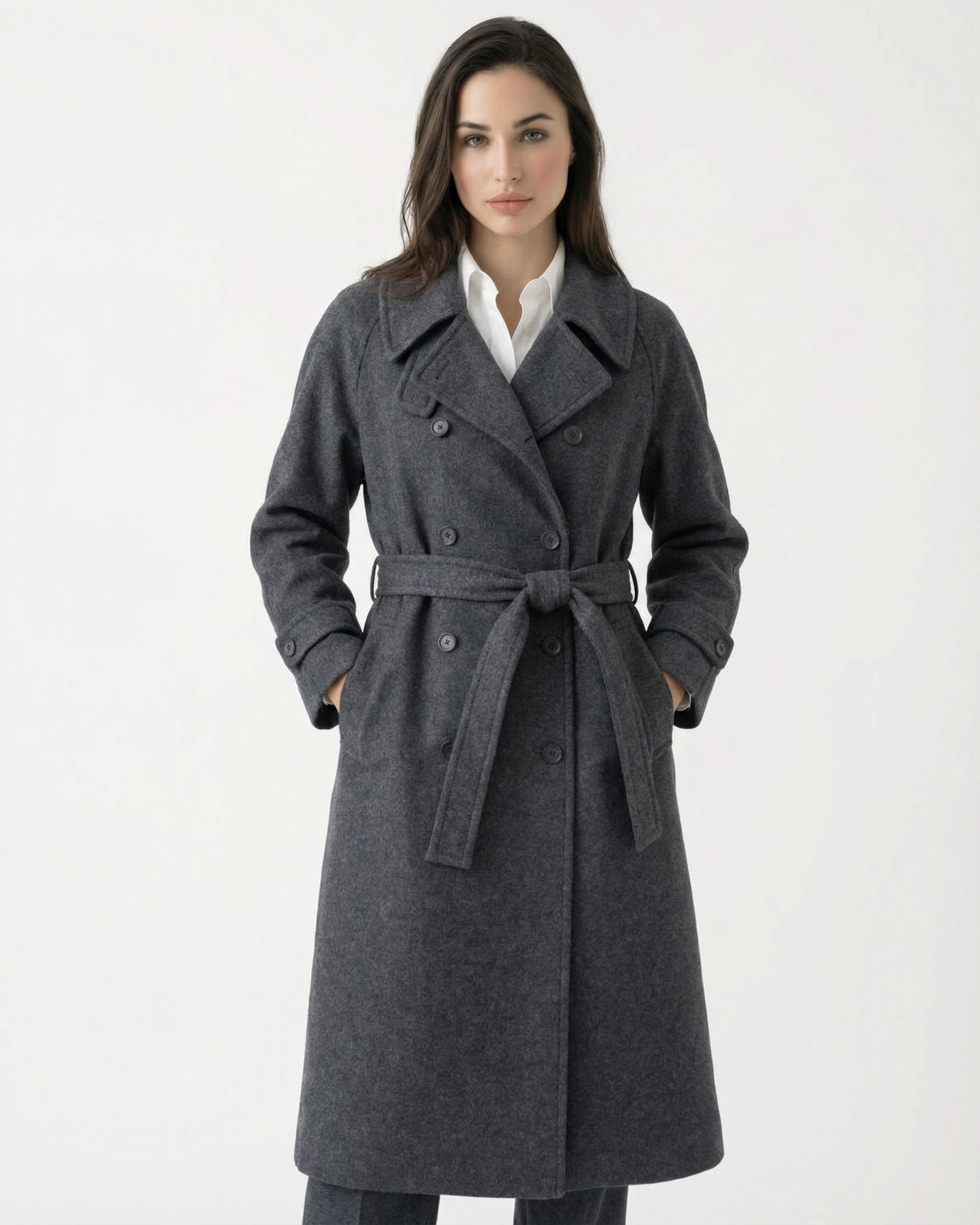
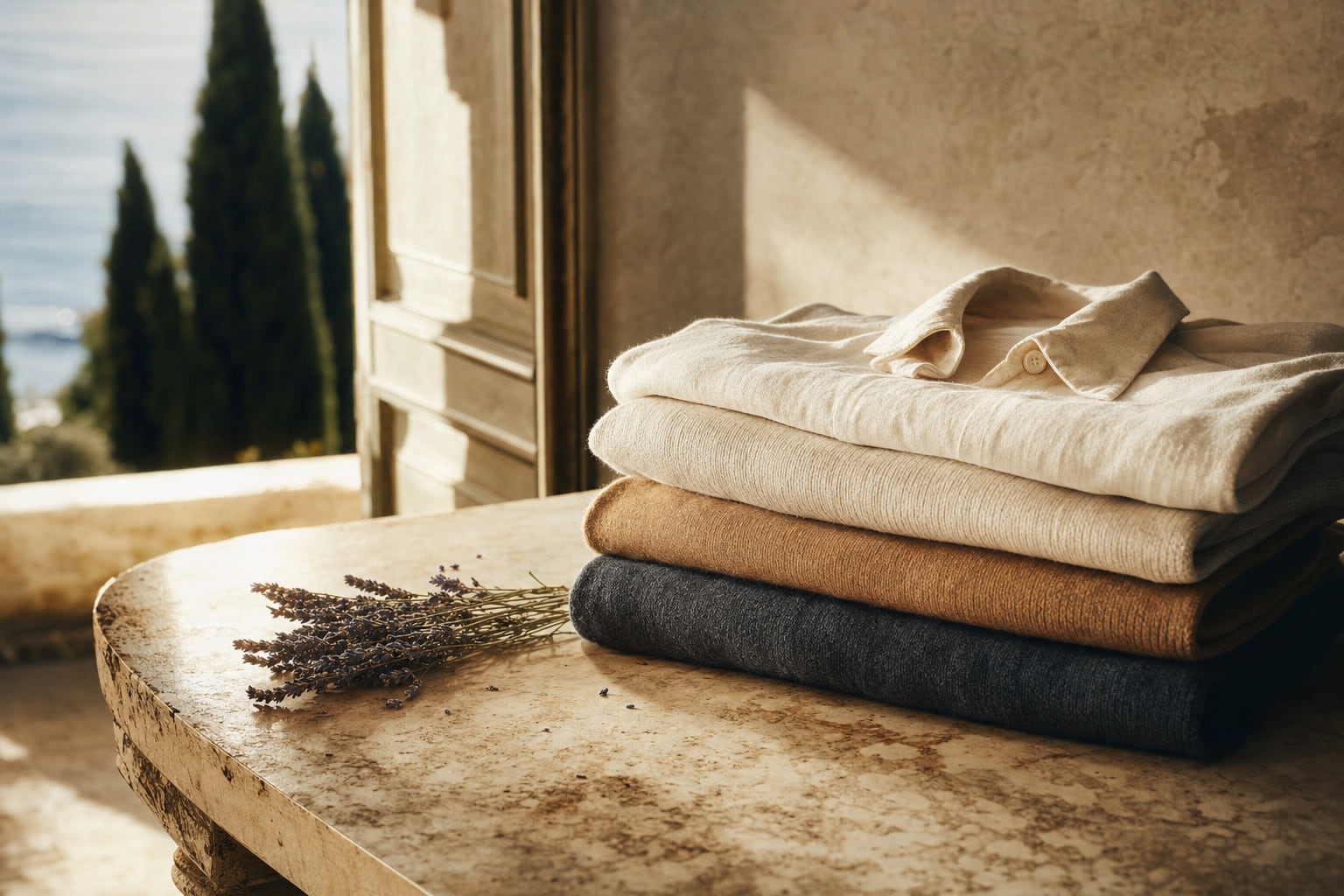
Navy is the most reliable of these. Not cobalt, not royal blue, but the deep, slightly greyed navy that sits close to black without losing its blue character. The High Count Navy Blue Fine Linen Shirt demonstrates the color at its most useful: quiet, versatile, and completely resistant to looking cheap.
Sage and forest green have replaced the muddy khakis and indeterminate earth tones as the refined green of choice. The High Count Fine Green Linen Shirt shows how a committed, clear green in quality fabric reads as intentional and sophisticated.
Stone, camel, and warm grey form the backbone of a neutral wardrobe that does not rely on stark white or indeterminate beige. For women building this foundation, our piece on luxury wardrobe essentials for a timeless look is a practical starting point.
For men, the Sakura Pleated Pants Loose Wide Leg in its neutral colorway shows how a refined base tone in a well-cut trouser becomes the anchor for an entire outfit rather than a background detail. Color and cut working together is what separates a genuinely expensive-looking wardrobe from one that merely avoids the worst mistakes.
The broader principle, confirmed by decades of European tailoring tradition and referenced extensively in publications like Permanent Style, is that the most expensive-looking wardrobes are built on a small number of deeply considered colors rather than a wide range of trend-driven ones.

Color Combinations That Undermine Even Good Individual Pieces
A color can be perfectly refined in isolation and still produce a cheap-looking result when paired incorrectly. Some combinations have become so associated with specific low-quality contexts that they are almost impossible to rehabilitate.
High-contrast primary combinations, red with royal blue, yellow with black in equal proportions, blue with green in similar tones, all carry associations with sportswear, fast food branding, or children's clothing that are very difficult to overcome. The Black Yellow Striped Linen Shirt is an example of how this combination can be handled when the proportions are carefully controlled and the fabric quality is evident. The stripe width, the linen texture, and the cut all work together to prevent the combination from reading as casual or cheap.
Matching too precisely is another combination problem. When a top and bottom are the same color but clearly from different fabrics or different dye lots, the result reads as a failed attempt at coordination rather than a considered choice. Either commit to a true matching set in the same fabric, or introduce deliberate contrast.
For women, the Mandelieur Color-Blocked Short Cardigan Jacket + Pencil Skirt Set handles color combination through deliberate blocking rather than accidental mismatching. The colors are chosen to contrast with intention, which is the opposite of the failed-coordination problem.
Tone-on-tone dressing, different shades of the same color family worn together, is one of the most reliable ways to look expensive without relying on complex color theory. A stone shirt with camel trousers. Navy jacket with a slightly lighter navy knit underneath. The effect is layered and considered without requiring any individual piece to do extraordinary work.

| Avoid This Color | Why It Reads Cheap | Wear This Instead | Why It Works | Best Occasion |
|---|---|---|---|---|
| Neon yellow / fluorescent green | Synthetic dye association, visually aggressive, no complexity | Warm saffron or clear olive | Pigment depth, works with skin tones, reads as intentional | Casual, resort, weekend |
| Optical / stark white | Fast fashion basic association, blue undertone is harsh | Ivory or warm cream | Suggests natural fiber, flatters most complexions, ages well | All occasions, formal to casual |
| Royal or cobalt blue | Sportswear and workwear association, too uniform | Navy or steel blue | Depth and versatility, reads as European and refined | Business, smart casual, formal |
| Bright candy pink | Novelty and seasonal association, too saturated in flat fabric | Dusty rose or blush | Neutral-adjacent, complex, works across seasons | Daytime, resort, social |
| Muddy indeterminate beige | Looks undyed or faded, no visual commitment | True camel or warm stone | Clear identity, rich in natural light, pairs with everything | All occasions |
| Lime green | Aggressively synthetic, single-season trend association | Sage or forest green | Complex undertones, works as a neutral, seasonless | Casual, garden, resort |
Frequently asked questions
Can black ever look cheap?
Black itself is not the problem. The problem is black in low-quality fabric, which loses its depth and reads as a flat, slightly greenish or brownish grey under most lighting. True black in quality fabric, dense linen, fine wool, or silk, retains its depth and reads as sophisticated. Avoid black in cheap polyester or thin cotton jersey, where the color cannot hold its character.
Are there colors that are universally flattering and refined?
Navy, camel, ivory, and sage green come closest to universal. They work across a wide range of skin tones, they photograph well in natural light, and they have no strong negative associations with fast fashion or cheap production. Our article on the neutral color codes of old money fashion covers each of these in detail with pairing suggestions.
Does color choice matter more for men or women when trying to look expensive?
The principles are identical. Both men and women benefit from muted, complex tones over flat, saturated ones. The difference is that men's wardrobes tend to have narrower color ranges overall, so a single cheap-looking color choice is proportionally more visible. Women's wardrobes often incorporate more color, which means there are more opportunities for both success and failure.
Is it possible to wear bright colors and still look expensive?
Yes, but the conditions are specific. The fabric must be visibly high quality, because richness of texture adds depth to any color. The bright color should be used in proportion, as an accent or a single statement piece against refined neutrals. And the shade itself should have complexity, a warm, slightly muted version of the bright rather than the most saturated version available. A single piece in a rich coral or deep emerald, worn with stone and navy, can read as genuinely expensive.
Color is the most immediate signal your wardrobe sends, and it is also the easiest to correct. You do not need to replace your wardrobe. You need to replace the specific shades that are working against you: the neons, the optical whites, the indeterminate beiges, the overly bright pastels. Swap them for their refined equivalents and the same silhouettes you already own will read as considerably more considered. For a practical framework on building a wardrobe around colors that consistently work, our guide to luxury wardrobe essentials for a timeless look is the logical next step.