


The Old Money Color Palette: Neutrals That Always Look Rich
Reading time 13 min • 2550 words
There is a reason certain wardrobes look expensive the moment you see them, before you register the brand, before you check the price tag. The answer is almost always color. Not a bold color, not a trend color, but a very specific group of neutrals that have been worn by European aristocracy, Ivy League alumni, and Riviera regulars for decades. These are colors that do not shout. They simply sit with authority.
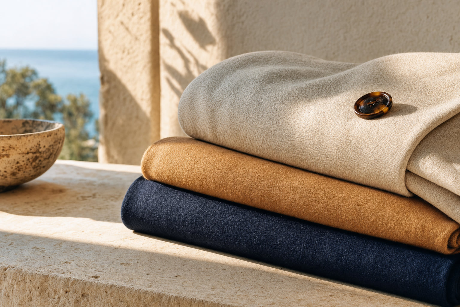
The old money color palette is narrower than most people expect. It centers on navy, camel, ivory, stone, and charcoal. Within those five anchors there is enormous room for nuance, in undertone, in depth, in fabric finish. But the discipline of staying inside this range is precisely what creates the effect. The moment you drift toward neon, toward saturated primary colors, toward anything that trends heavily in a single season, you lose it.
This guide breaks down each color in the palette, explains why it works, and shows you how to build real outfits around it, for men and women, across seasons. If you have ever wondered why some wardrobes look quietly wealthy without a logo in sight, the answer starts here.
Key takeaways
- Navy, camel, ivory, stone, and charcoal are the five core old money neutrals. Every other color in the palette should support one of these.
- Fabric quality determines whether a neutral looks rich or flat. A $30 camel acrylic coat reads cheap; a camel wool coat in the same shade reads expensive.
- Oatmeal and ivory are not interchangeable. Oatmeal has a warm grey undertone that works year-round; ivory leans warm and reads more formal.
- Avoid pure white and pure black in casual contexts if you want the old money effect. Off-white and near-black navy carry far more sophistication.
- A monochromatic look in any one of these five neutrals is almost always the most polished choice, provided the textures vary.
In this guide
- Why Restraint in Color Signals Wealth
- Navy Blue: The Foundation of the Palette
- Camel and Oatmeal: The Warm Neutrals That Do the Heavy Lifting
- Ivory, Cream, and Stone: The Quiet Whites
- Charcoal, Forest, and the Supporting Colors
- Building a Complete Wardrobe From This Palette
- Frequently asked questions
Why Restraint in Color Signals Wealth
Color psychology is well-documented. Color perception and cultural association research consistently shows that muted, desaturated tones are associated with permanence, seriousness, and high social status across Western cultures. Bright, highly saturated colors signal novelty and accessibility, which is exactly why fast fashion defaults to them.
Old money dressing is built on the opposite logic. When you wear a color that does not need to announce itself, you are communicating that you do not need to announce yourself. The restraint is the message.
This is also practical. Neutrals photograph well in any light, they do not clash, and they age gracefully. A navy blazer from fifteen years ago looks identical to one made today. A cobalt blue blazer from 2012 looks dated the moment you know the year. For a deeper look at how quiet luxury colors are evolving for the near future, see our piece on the 2026 quiet luxury palette.
The key distinction is between neutrals that look rich and neutrals that look plain. The difference lies almost entirely in fabric and undertone, not in the color name itself.
Expert insightThe most common mistake is choosing the right color in the wrong fabric. A camel-colored acrylic knit and a camel wool coat are the same color on a screen. In person, one looks expensive and one does not. Always let fabric carry the color.
Navy Blue: The Foundation of the Palette
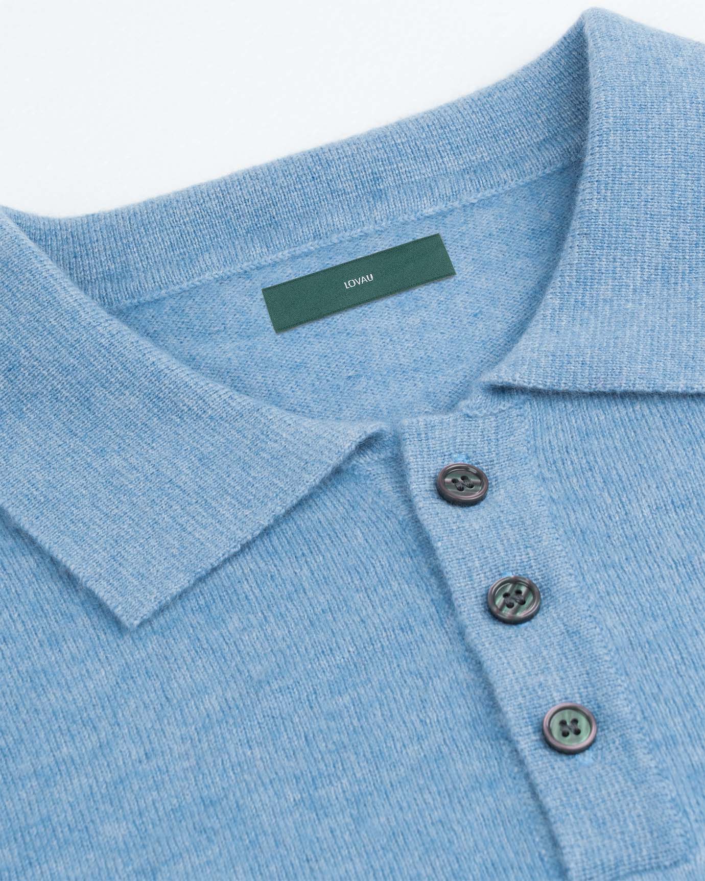
If the old money color palette has a cornerstone, it is navy. Not bright blue, not cobalt, not royal blue. Navy: deep, close to midnight, with a slight warmth that keeps it from reading as cold or corporate.
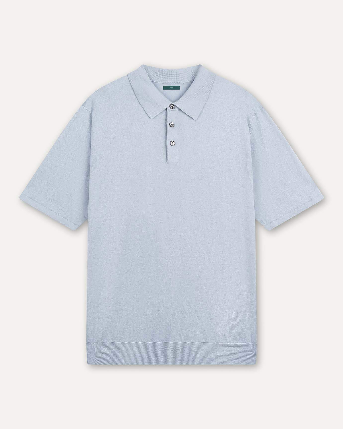
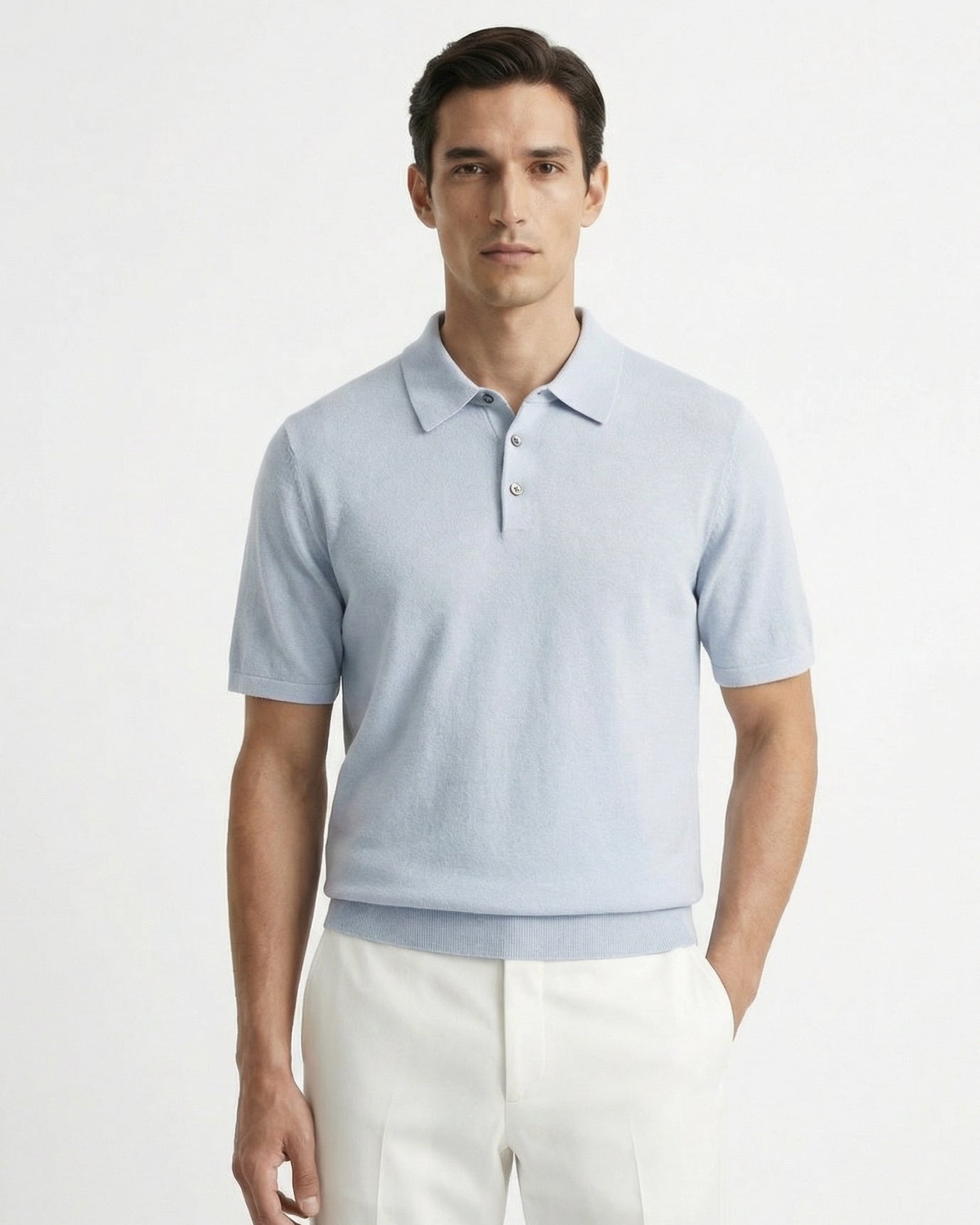
Navy works because it functions as a near-neutral. It pairs with camel, ivory, white, stone, and even other shades of blue without conflict. It is formal enough for a dinner jacket, casual enough for a weekend polo, and versatile enough to carry an entire outfit on its own.
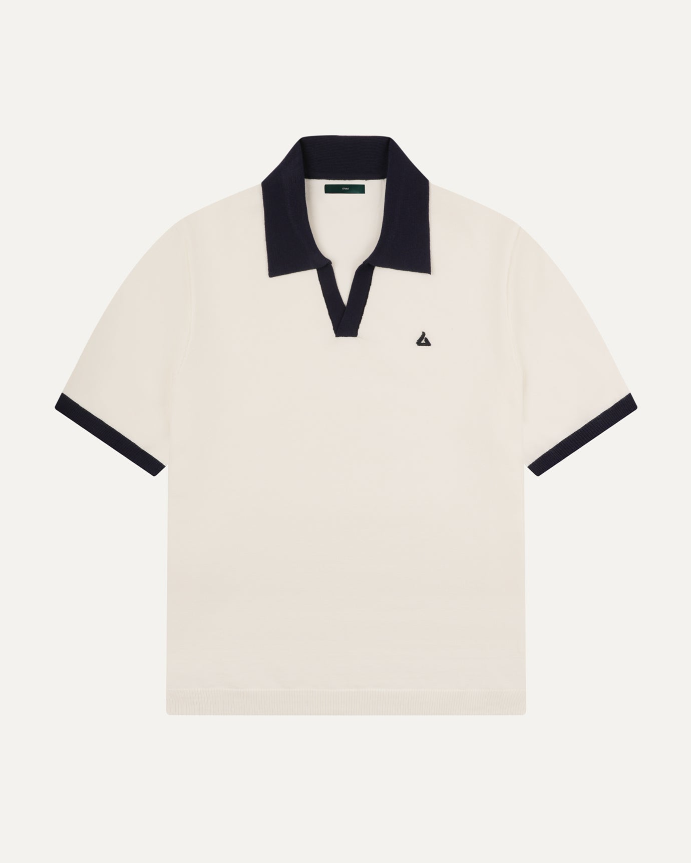
For men, a navy polo shirt is one of the most reliable pieces in this palette. Worn with stone chinos or cream linen trousers, it reads immediately as polished without any visible effort. The key is fit: not too slim, not boxy, with a hem that sits just below the waistband.
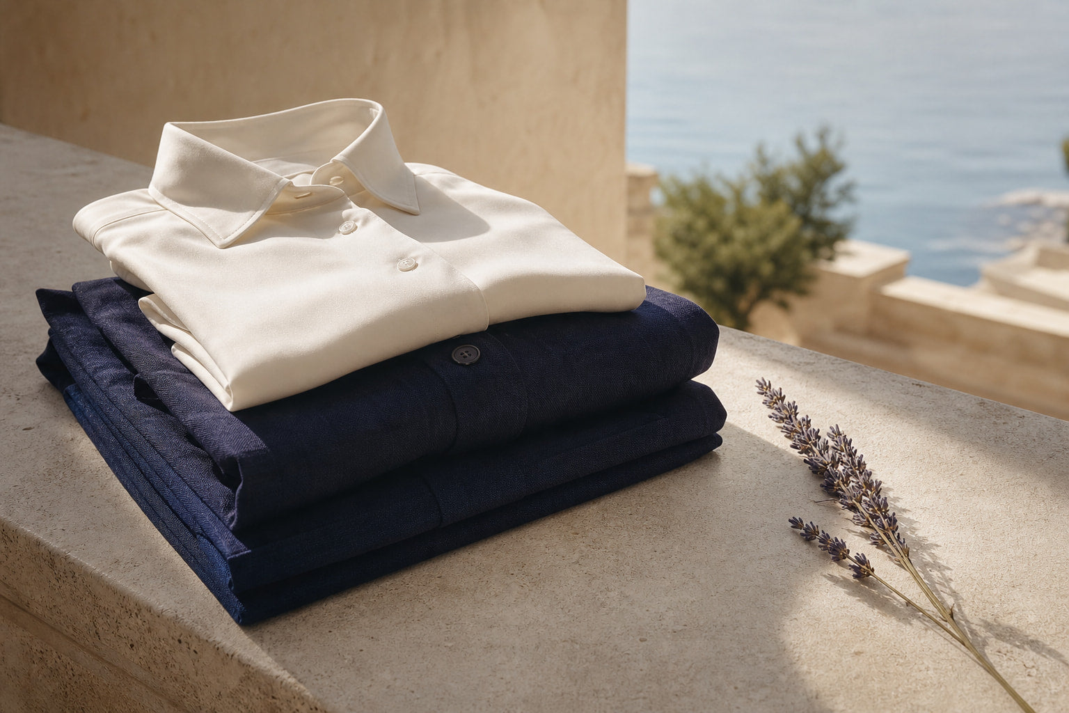
For a more refined occasion, the high count navy linen shirt in a fine-weave fabric carries the same color authority with the kind of drape and texture that makes navy look genuinely expensive. Linen at a high thread count does not wrinkle the way cheaper linen does, and that distinction is visible.
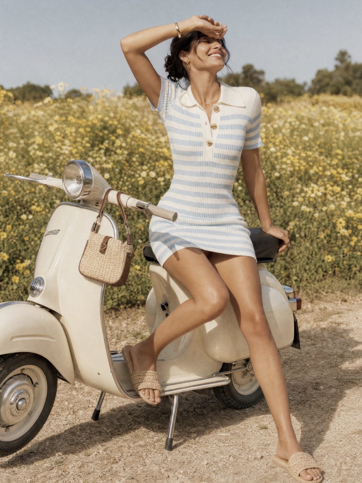
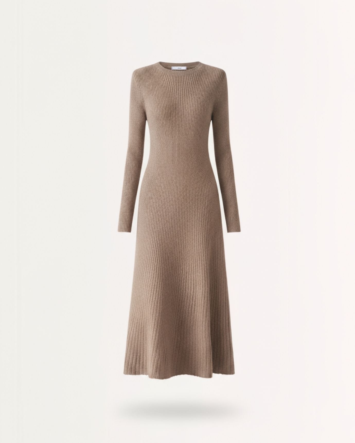
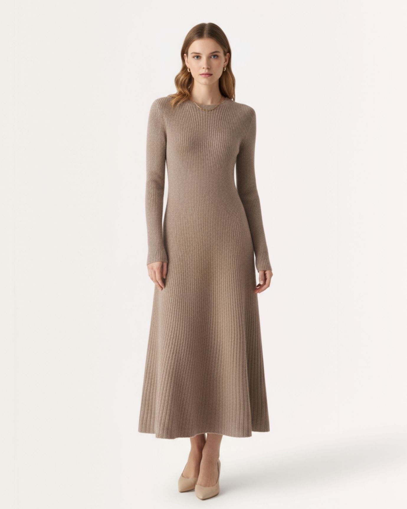
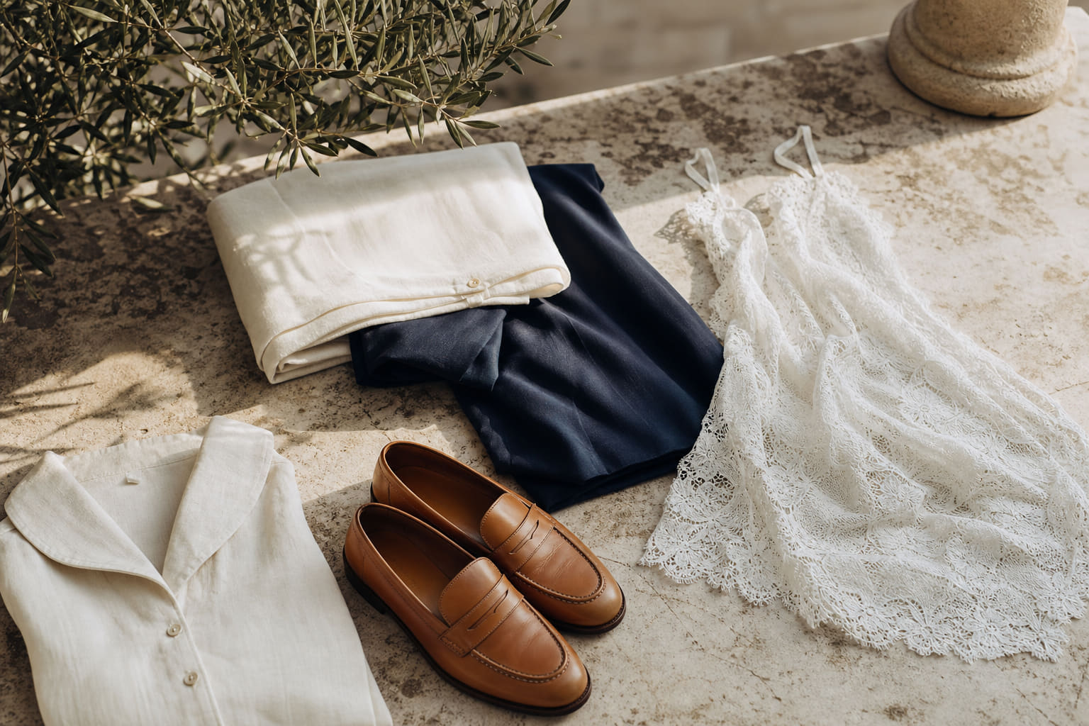
For women, a navy knitted dress in a fine-gauge knit demonstrates how a single color, worn head to toe in a considered fabric, can be one of the most sophisticated choices in a wardrobe. Pair it with camel leather flats and a cream cashmere layer.
For more on how navy fits into a broader seasonal palette, our guide to coastal old money colors goes further into how navy shifts in context from the Riviera to the Hamptons.
Expert insightNavy reads differently depending on fabric finish. A matte navy flannel says autumn country house. A mercerized navy cotton says summer yacht club. The color is the same; the context is completely different. Choose the finish based on the occasion, not just the color.

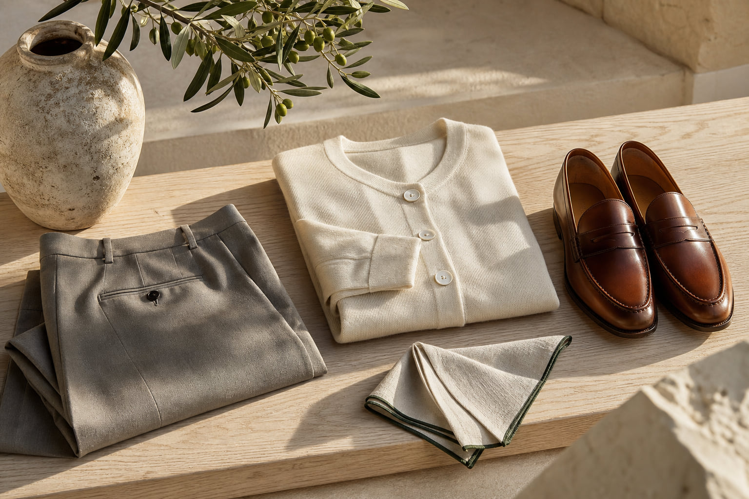
Camel and Oatmeal: The Warm Neutrals That Do the Heavy Lifting
Camel is arguably the most underused color in most wardrobes and the most overused color in genuinely expensive ones. That gap tells you everything.
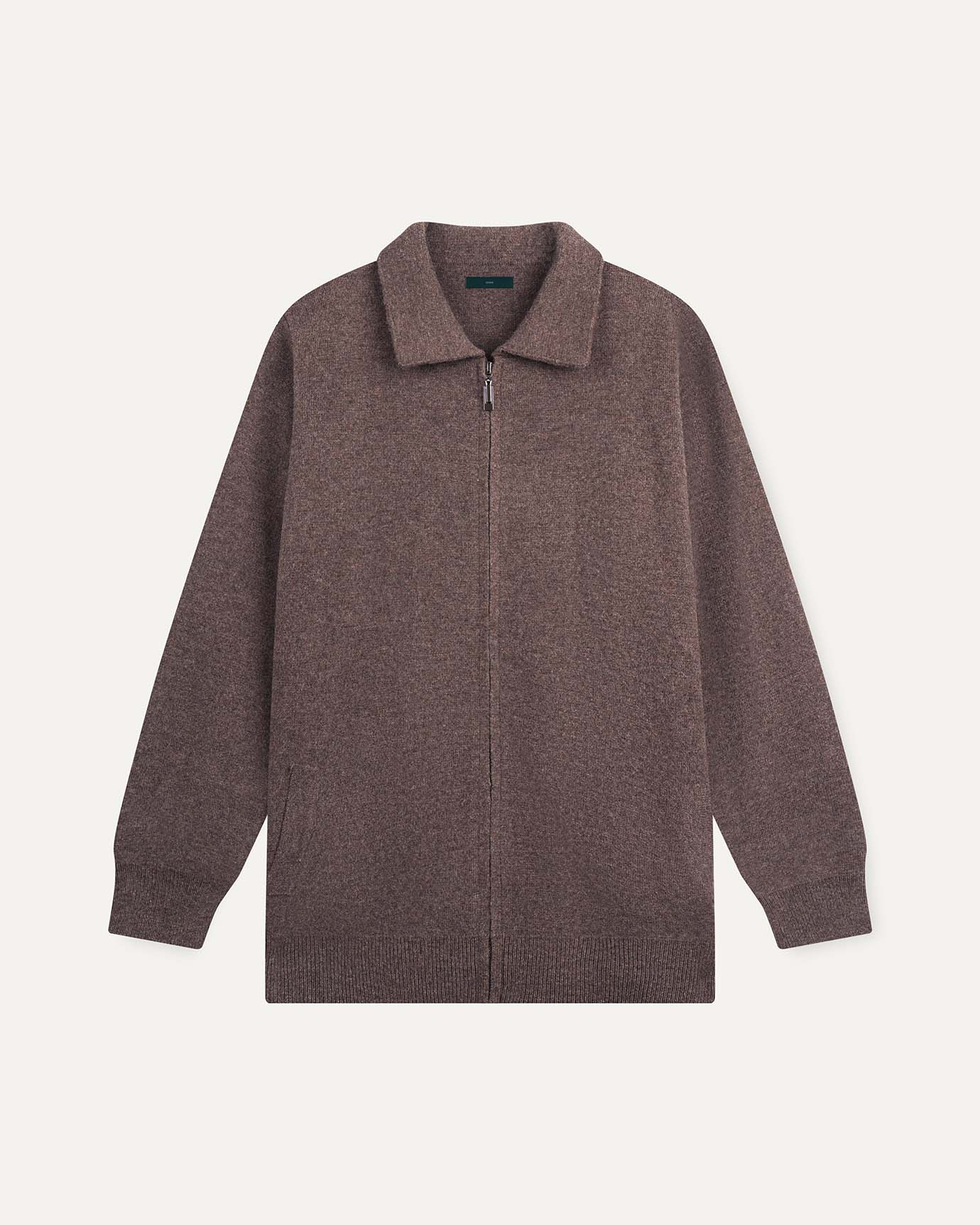
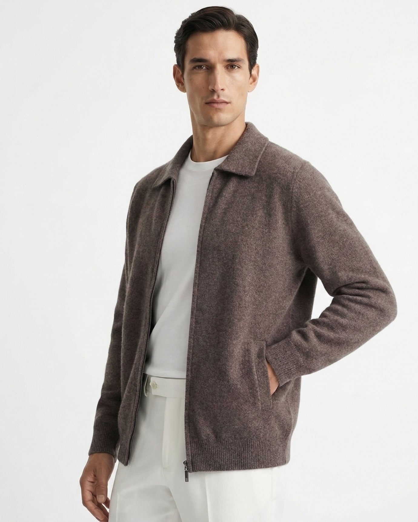
True camel sits between tan and amber, with a golden undertone that reads warm and substantial. In a coat, it is one of the most recognizable signals of classic European dressing. The camel suede loafer follows the same logic at the shoe level: a single material in this specific warm tone grounds an entire outfit.
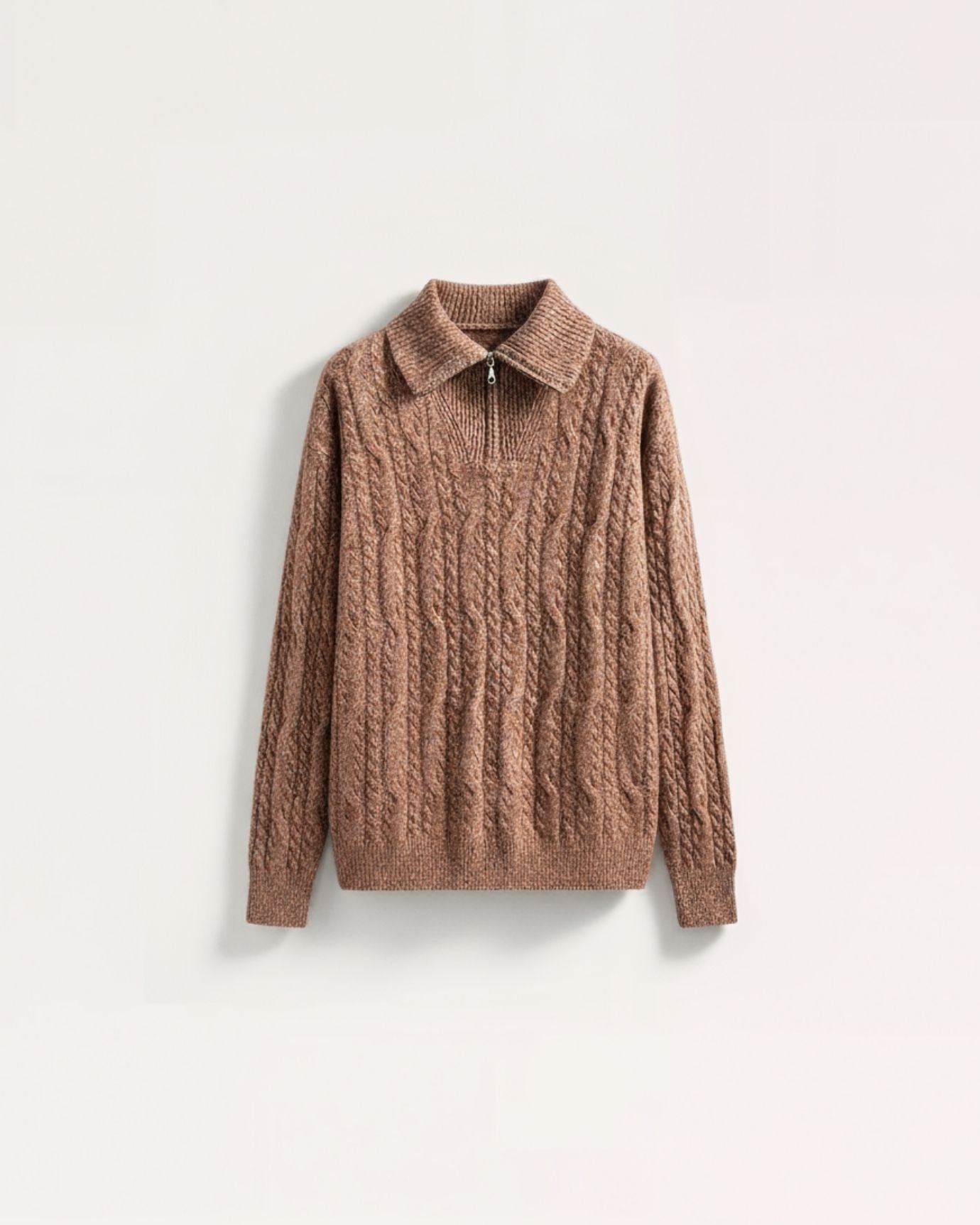
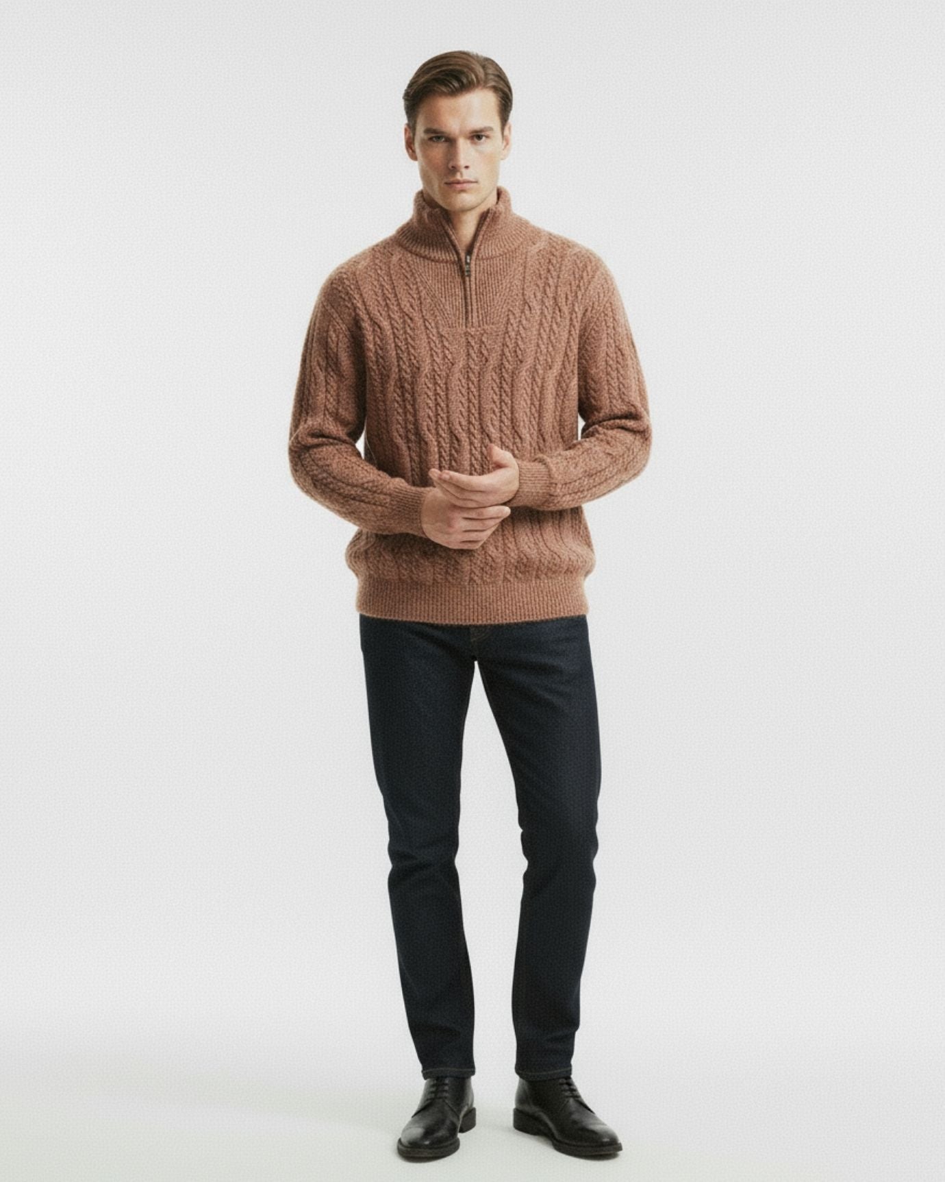
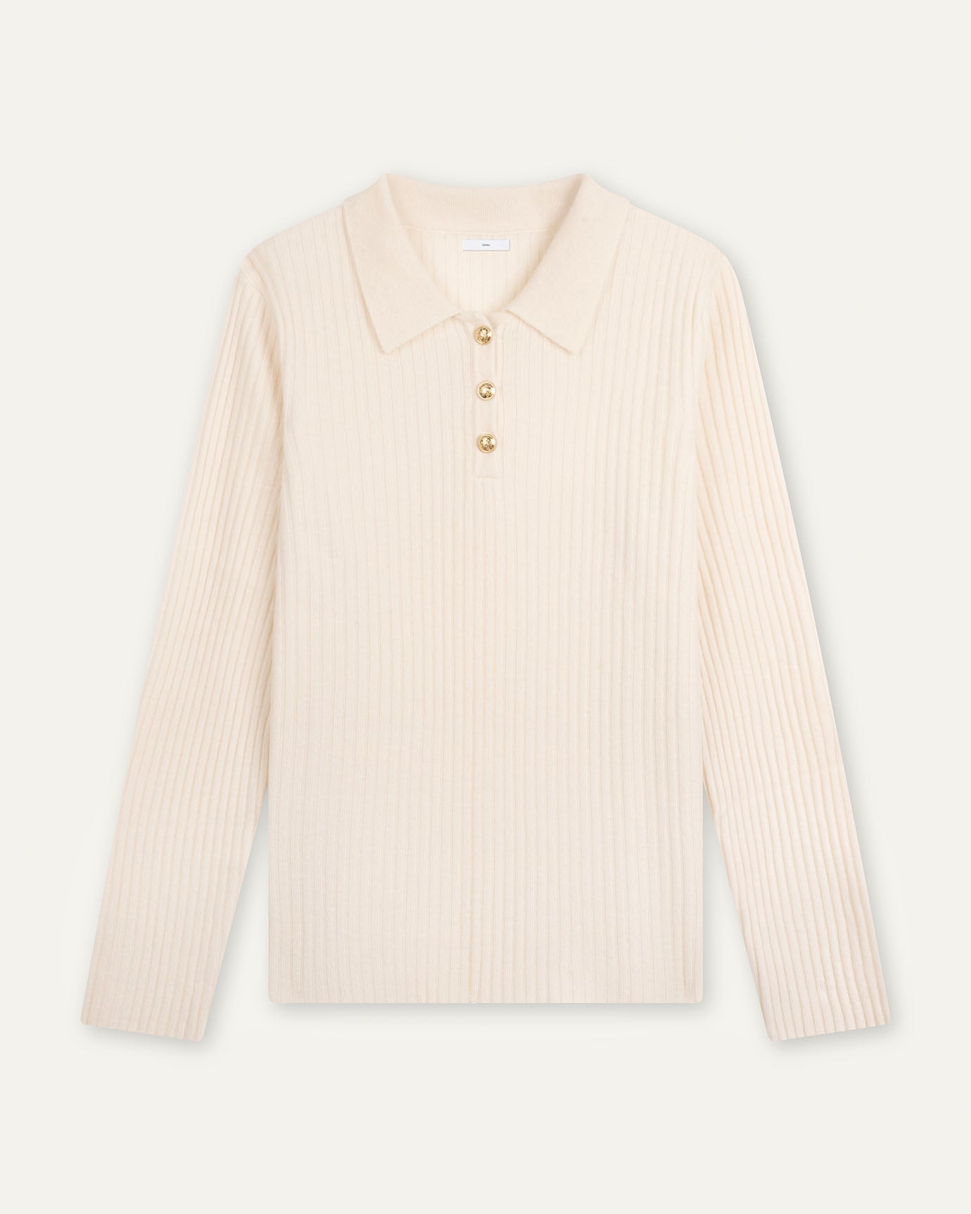
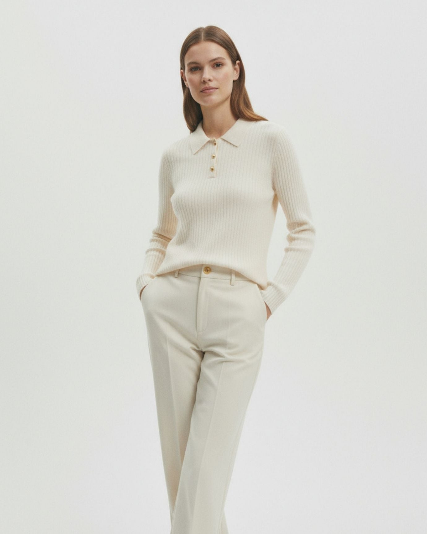
Oatmeal is a cooler, greyer version of cream. It has enough warmth to avoid looking clinical but enough grey to feel contemporary. An oatmeal tee is not an ivory tee and not a white tee. It occupies a specific tonal space that is forgiving against almost every skin tone and pairs cleanly with navy, camel, and charcoal without competing.
The white cotton t-shirt from our collection sits at the clean end of this spectrum, while a true oatmeal sits slightly warmer. The principle is the same: a fine-gauge cotton with a tight knit structure, worn in a relaxed but fitted silhouette.
How to use camel and oatmeal together: Layering camel over oatmeal creates a tonal look that reads as intentional and considered. A camel coat over an oatmeal merino crew, worn with navy trousers, is one of the most complete old money combinations in existence. The colors do not match exactly, which is the point. They harmonize.
For a full breakdown of how these warm neutrals function within the broader palette, our article on the neutral color codes of old money fashion covers beige, cream, and camel in detail.
Expert insightCamel works best in heavyweight fabrics: wool, cashmere, leather, suede. In lightweight synthetic fabrics, it reads cheap almost immediately. Reserve camel for your investment pieces.

Ivory, Cream, and Stone: The Quiet Whites
Pure white is not an old money color. This is one of the most counterintuitive points in this palette, but it is consistent across the reference points, from Ralph Lauren's original preppy aesthetic to the wardrobes of European aristocracy documented in the 20th century. Pure white reads as clinical, stark, and difficult to maintain. It signals effort in the wrong direction.
Ivory, cream, and stone are the alternatives. Each has a specific character.
Ivory has a slight yellow warmth. It reads formal and clean without the harshness of white. A fine ivory linen shirt, like the white linen shirt in our high-count collection, demonstrates how a near-white in a quality fabric looks far more considered than pure white would.
Cream is warmer still, sitting closer to oatmeal. It is the color of aged paper, of natural silk, of unbleached cotton. It has depth. For a detailed look at why cream carries specific psychological weight in fashion, see our article on the psychology behind the color cream.
Stone is a grey-beige, cooler than camel and more substantial than white. It is the color of limestone, of pale sand, of a Provencal wall in winter light. As a trouser color, it is one of the most versatile options in the palette.
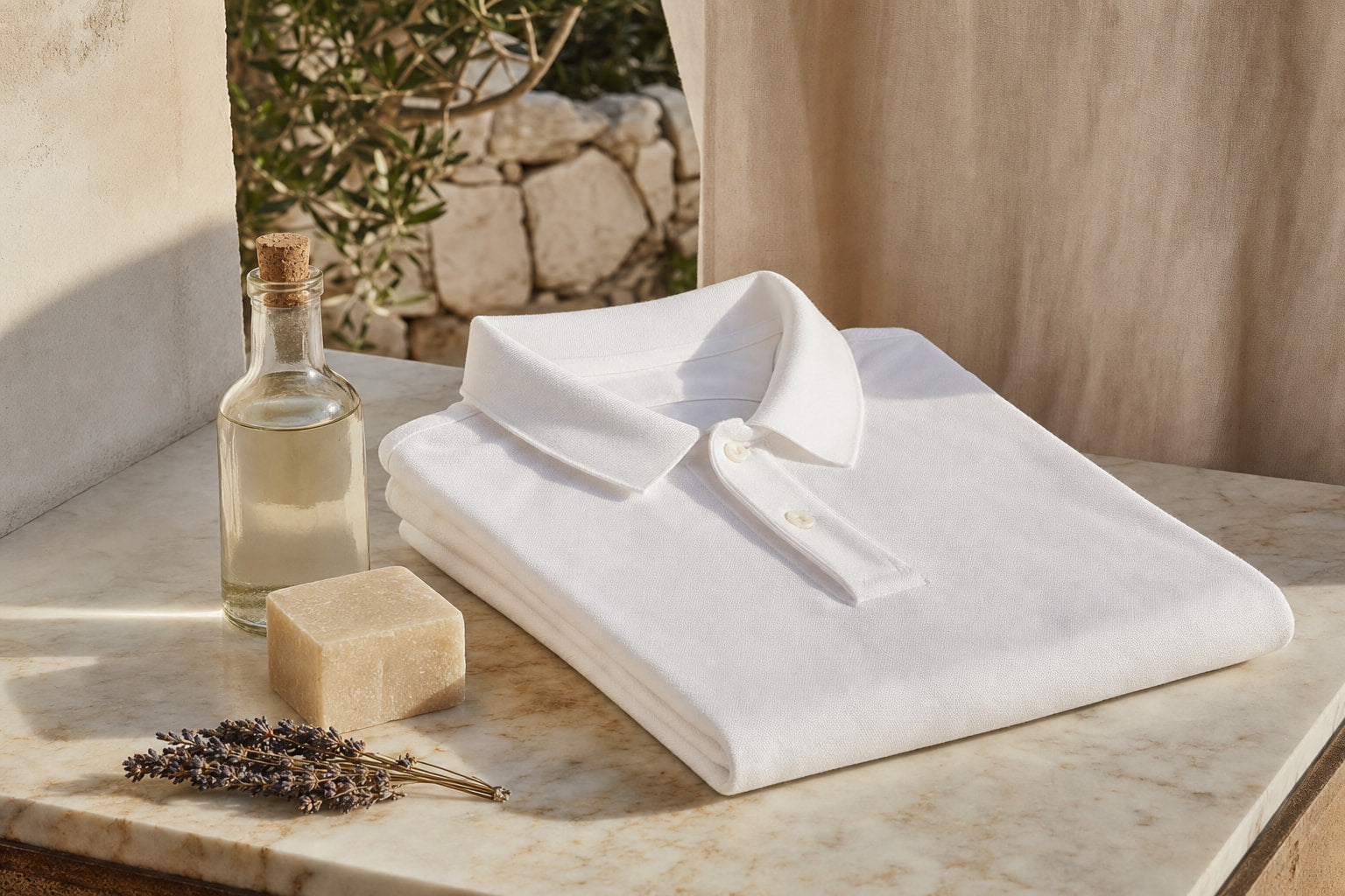
The old money polo in white sits at the cleaner end of this spectrum and demonstrates how a polo in near-white, in a properly structured pique cotton, carries the palette without tipping into the clinical starkness of a bright white.
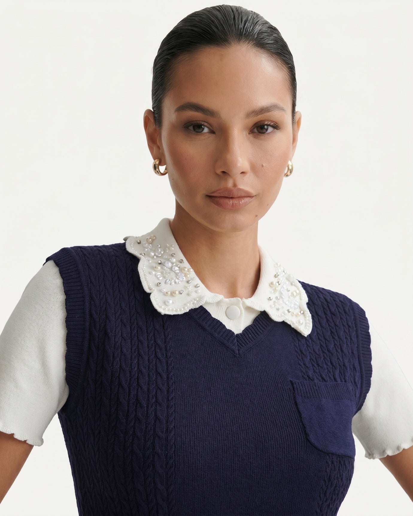
For women, the navy and white contrast collar dress shows how pairing a clean white with deep navy creates the most classic expression of this palette in a single garment.

Charcoal, Forest, and the Supporting Colors
The core five neutrals carry most of the work, but the old money palette does include a small supporting cast.
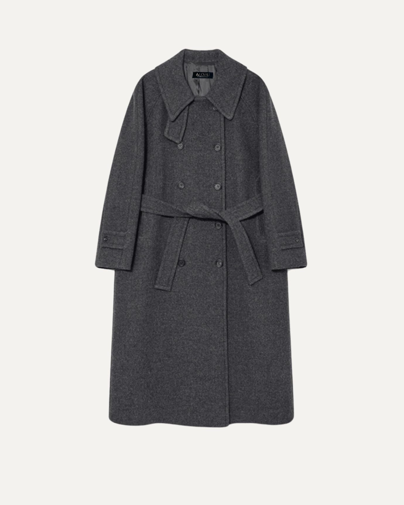
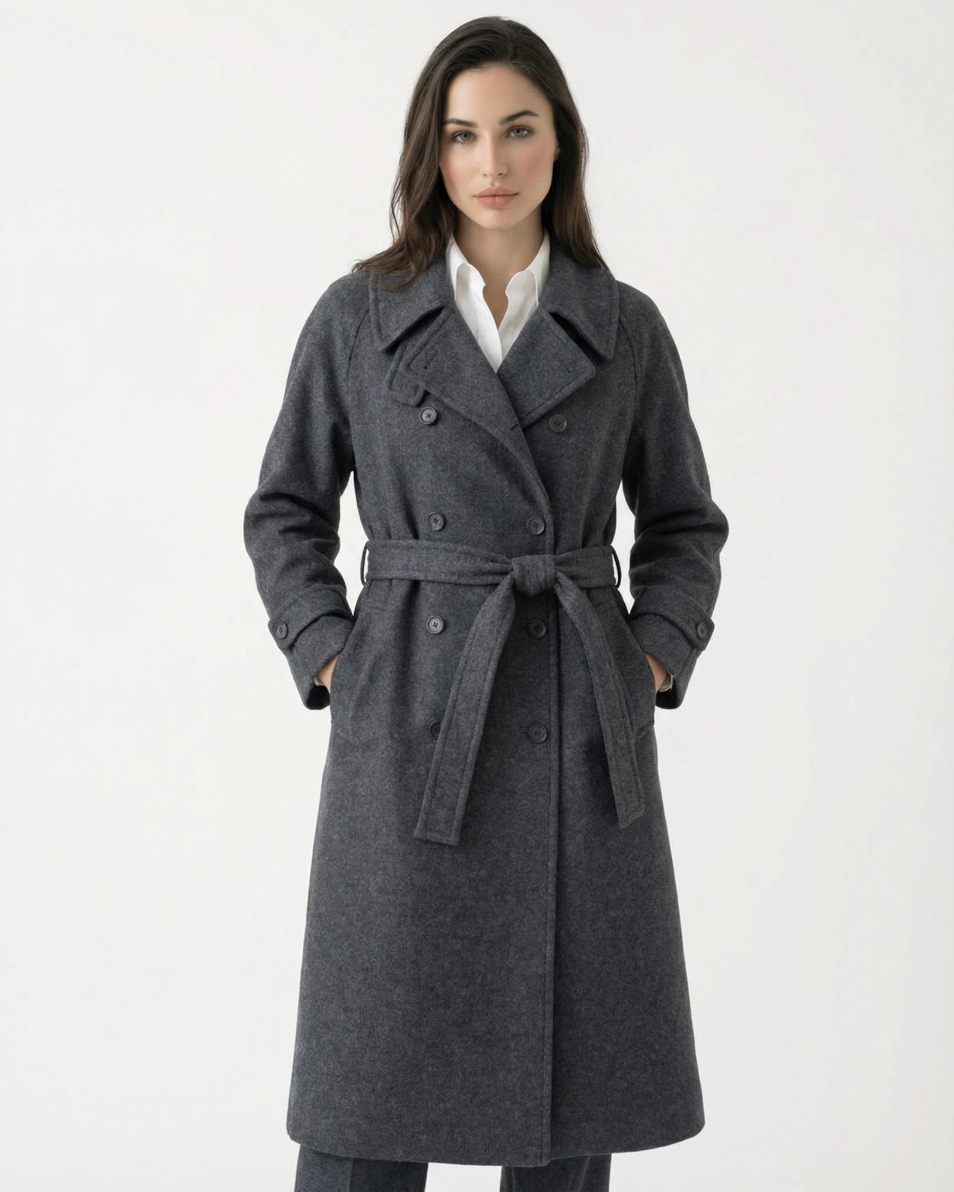
Charcoal grey is the winter counterpart to navy. Where navy has warmth, charcoal is cooler and more austere. A charcoal flannel trouser or a charcoal wool coat reads as deeply European and formal without the corporate associations of black.
Forest green and bottle green are the only saturated colors that consistently appear in old money wardrobes. They work because they are dark enough to function as near-neutrals. A dark green cotton t-shirt in a fine gauge sits within the palette because the depth of the green prevents it from reading as a statement color. It is the difference between wearing a color and wearing a shade.
Bordeaux follows the same rule. Deep enough to be mistaken for a dark red-brown in certain lights, a bordeaux polo works within this palette when it is paired with navy or camel rather than other saturated colors.
The discipline here is simple: if a color reads as a statement, it is probably outside the palette. If it reads as a shade, it is probably inside it.
For guidance on what to actively avoid, our article on colors to avoid if you want to look expensive covers the specific tones that undermine the effect.

Building a Complete Wardrobe From This Palette
The practical value of the old money color palette is that every piece works with every other piece. This is not an accident. It is the structural advantage of building within a narrow tonal range.
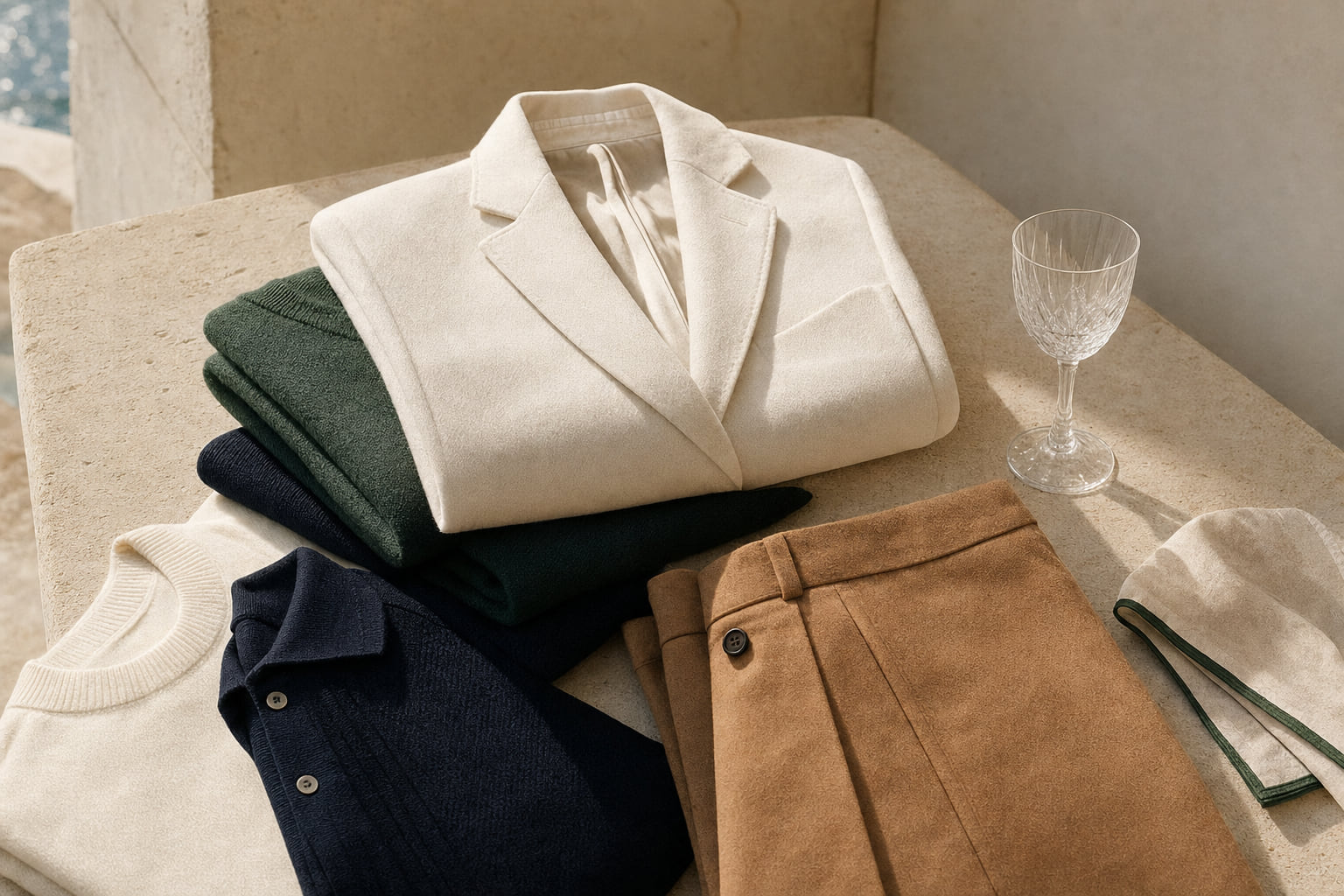
For men, a working foundation looks like this: two navy pieces (a polo and a linen shirt), one oatmeal or ivory t-shirt, one camel or stone trouser, one charcoal or navy trouser, and one camel or navy outerwear piece. From those six items, you can build more than twenty distinct combinations, all of which read as coherent and polished.
The cashmere wool polo sits at the intersection of several palette principles: the navy or camel colorway, the fine-gauge knit texture, and the polo structure that works from lunch to a late afternoon walk without changing. For a broader view of what long sleeve polos can do within this palette, browse the long sleeve polo collection.
For women, the same logic applies. A women's polo in navy or ivory, a knitted dress in a deep neutral, and one camel or stone layer covers the palette completely.
If you are building from scratch and want to see the full range of how these colors come together across categories, the best sellers collection shows which pieces within this palette our customers return to most consistently.
For seasonal adaptation, particularly in warmer months, our guide to old money color palettes for spring and summer shows how the same neutrals shift in fabric weight and finish without leaving the palette.

| Color | Undertone | Best Fabric | Primary Season | Pairs Best With |
|---|---|---|---|---|
| Navy | Cool blue, slight warmth | Linen, merino wool, pique cotton | Year-round | Camel, ivory, stone, white |
| Camel | Warm golden amber | Wool, cashmere, suede, leather | Autumn, Winter | Navy, ivory, charcoal, cream |
| Oatmeal / Ivory | Warm grey to warm yellow | Fine cotton, cashmere, linen | Spring, Summer, Autumn | Navy, camel, stone, forest green |
| Stone / Cream | Cool grey-beige to warm off-white | Linen, cotton, light wool | Spring, Summer | Navy, camel, charcoal, bordeaux |
| Charcoal | Cool grey | Flannel, heavy wool, merino | Autumn, Winter | Ivory, camel, navy, forest green |
Frequently asked questions
Is black part of the old money color palette?
Black is used sparingly in old money dressing, primarily in formal evening contexts or as a single accent piece. In casual and smart-casual settings, near-black navy or charcoal almost always reads as more refined. Pure black in everyday wear can look severe and tends to date more quickly than true neutrals. If you want to understand which colors undermine the effect entirely, our guide to colors to avoid if you want to look expensive addresses this directly.
Can you wear pattern within the old money color palette?
Yes, but the pattern should use colors from within the palette. A navy and cream stripe, a camel and ivory check, or a charcoal and stone houndstooth all stay inside the range. The rule is that no color in the pattern should be more saturated than the neutrals it sits alongside. Loud prints, even in technically neutral colors, break the effect.
How do I stop oatmeal and ivory pieces from looking washed out?
The answer is almost always texture and structure. A flat, thin oatmeal fabric in a loose cut will look shapeless. The same color in a tightly knit cotton, a fine-gauge rib, or a substantial linen weave reads completely differently. The color is not the problem; the fabric weight and construction are. Pair oatmeal with a darker navy or camel piece to give the outfit contrast without leaving the palette.
Does the old money color palette work in warm climates?
Completely. The palette shifts in fabric weight, not in color. Navy linen, stone linen, ivory cotton, and camel suede accessories work as well in a Mediterranean summer as in an English autumn. The key is choosing natural fabrics that breathe: linen, fine cotton, lightweight merino. Our guide on ways to dress rich in a tropical climate covers this in detail.
The old money color palette is not a limitation. It is a framework that makes every decision easier and every combination more reliable. Navy, camel, ivory, stone, and charcoal, chosen in the right fabrics and worn with attention to fit and proportion, create a wardrobe that reads as quietly wealthy without requiring a single visible logo or seasonal trend. The discipline is the point. Start with one anchor piece in each of the five core neutrals and build outward from there. If you are looking for a starting point, the Lovau men's old money collection is organized around exactly these principles.