

What Colors Make You Look Rich? The 2026 Guide
Reading time 12 min • 2449 words
Color is the first thing a room notices before cut, before fabric, before brand. Certain colors have carried associations of wealth and restraint for centuries, not by accident, but because the people who could afford quality dyes and fine materials simply chose differently from those who could not. That history has calcified into instinct. We still read those tones as expensive.
In 2026, the palette of quiet luxury has not changed dramatically. It has narrowed. The maximalist color experiments of recent seasons are receding, and what remains is a considered group of neutrals, deep tones, and soft naturals that work across every occasion from a coastal lunch to a board meeting. This guide names them specifically, explains why they work, and tells you how to wear them.
This is not about following trends. The colors in this guide were expensive-looking fifty years ago and they will be expensive-looking fifty years from now. That is precisely the point.
Key takeaways
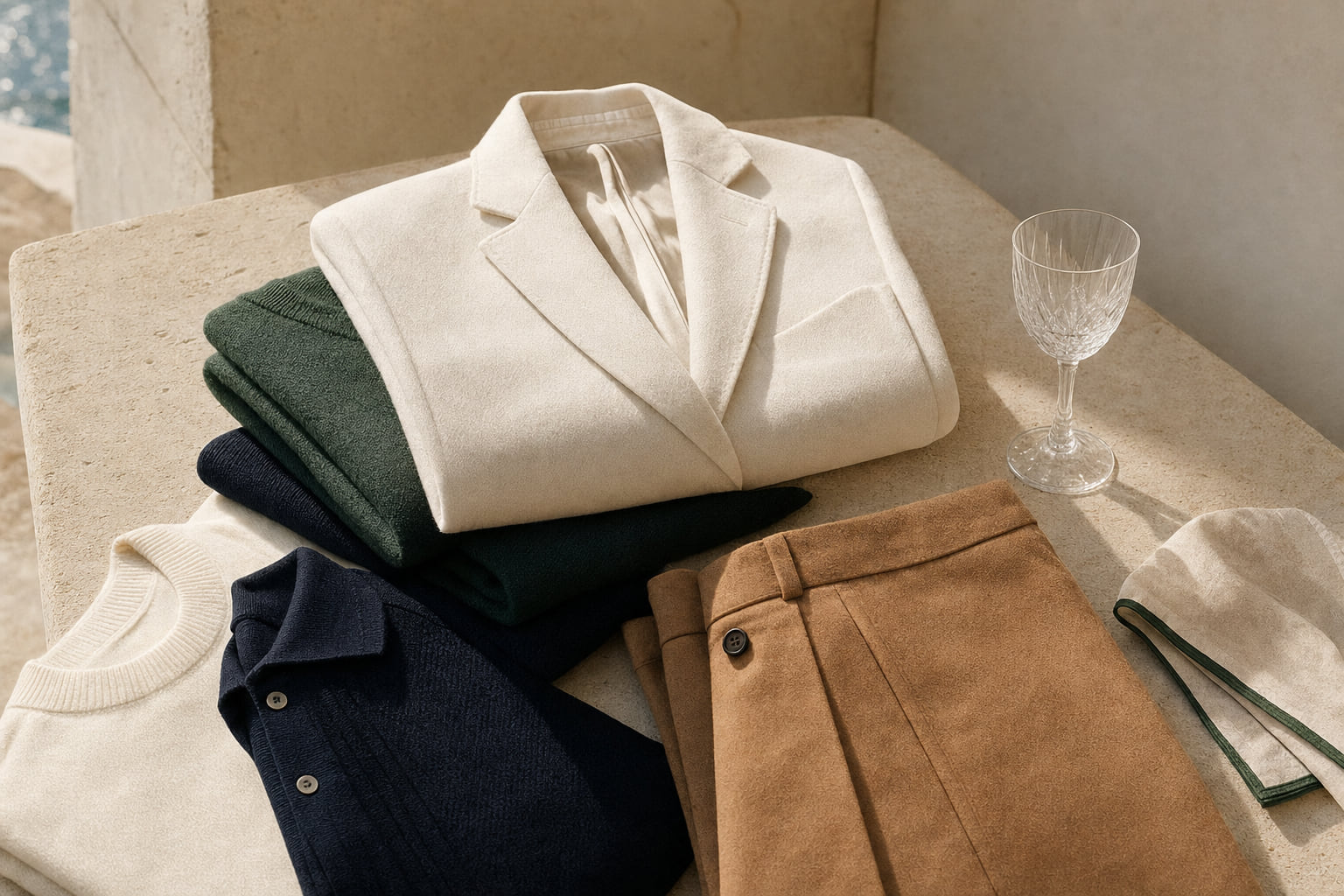
- Navy, ivory, camel, forest green, and charcoal are the core colors that read as wealthy because they are saturated but never loud.
- Fabric matters as much as color: a navy in cheap polyester signals nothing; the same navy in fine linen or wool signals everything.
- Monochrome dressing in one neutral tone is the single fastest way to look more expensive without changing your wardrobe.
- Avoid colors that fade quickly or photograph as washed-out; rich-looking colors hold their depth in both natural and artificial light.
- Color combinations with a maximum of two or three tones per outfit consistently read as more refined than busy, multi-color looks.
In this guide
- The Science Behind Colors That Signal Wealth
- Navy Blue: The Single Most Reliable Wealth Signal
- Ivory, Cream, and Warm White: The Neutrals That Actually Read as Expensive
- Deep Tones That Command a Room: Forest Green, Burgundy, and Camel
- How to Build a Rich-Looking Outfit Around These Colors
- Colors to Build On: The 2026 Palette in Practice
- Frequently asked questions
The Science Behind Colors That Signal Wealth
Color psychology and fashion history agree on one thing: colors that read as wealthy share specific visual properties. They are desaturated or deeply saturated, never garish. They hold their tone under different light sources. They do not compete with the face or the silhouette.
According to color theory research, the human eye associates mid-to-deep value ranges with stability and authority. Bright, high-chroma colors, think neon orange or electric pink, trigger excitement. Calm, resolved colors trigger trust and competence. Wealth, historically, has wanted to project the latter.
There is also a practical history here. Before synthetic dyes, deep navy, true black, burgundy, and forest green were extraordinarily expensive to produce reliably. Fading was the mark of a cheap dye. Colors that held their depth were the colors of those who could afford them. That association never fully left the collective visual vocabulary.
For a deeper look at how this plays out specifically in old money dressing, the article on the psychology of color in old money fashion covers the cultural mechanics in detail.
Expert insightHold a garment up to natural daylight before buying it. A color that looks rich under store lighting but washes out in sunlight is not a rich color. It is a trick of the bulb.
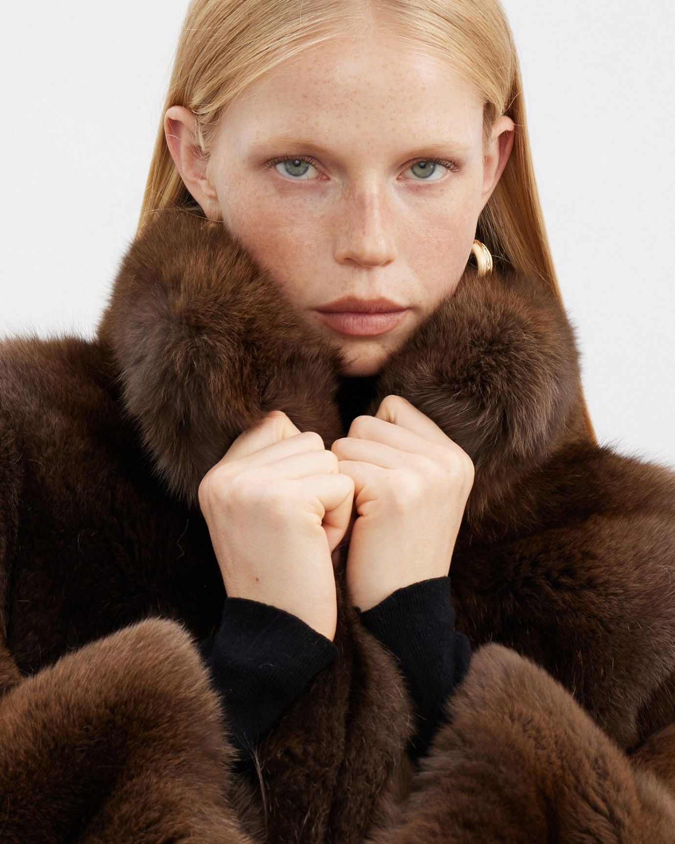
Navy Blue: The Single Most Reliable Wealth Signal
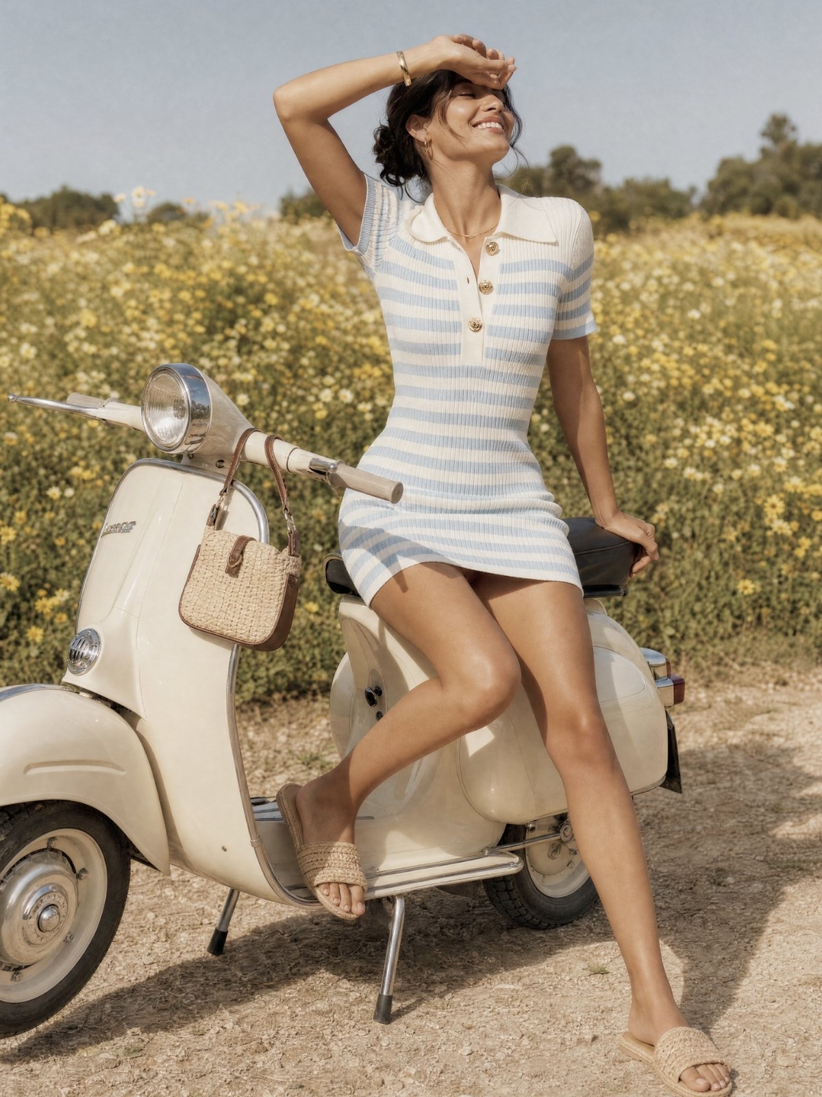
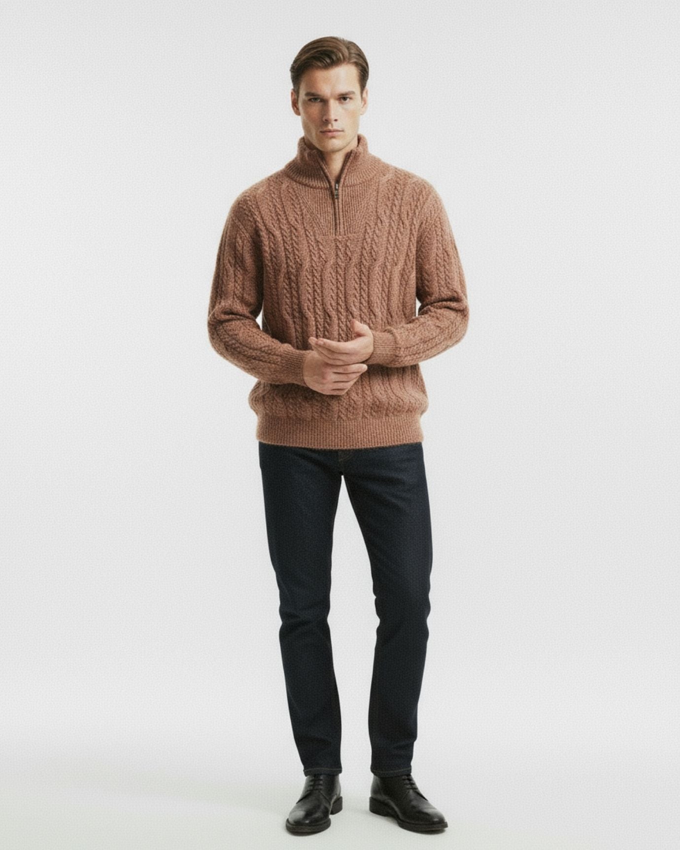
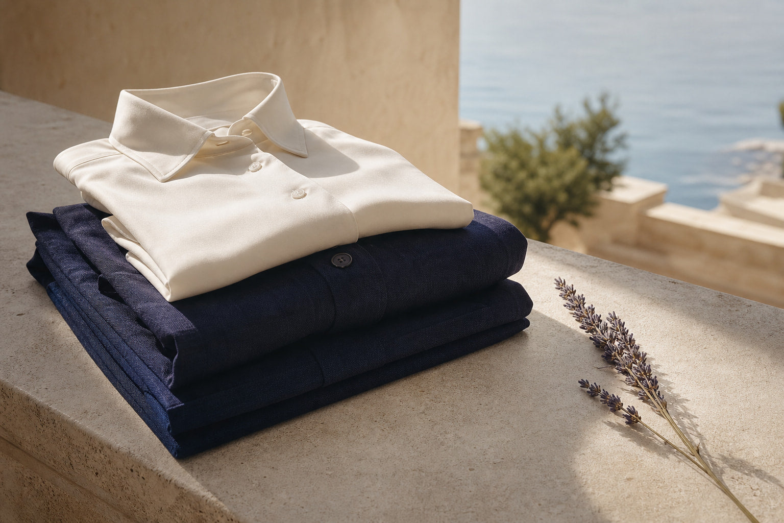
If you could own only one color in your wardrobe and needed it to communicate refinement consistently, that color is navy blue. It is dark enough to read as serious, blue enough to remain approachable, and versatile enough to work in linen for summer and wool for winter without looking like you are trying too hard.
Navy works for both men and women. For men, a high count navy blue fine linen shirt in a fine-weave linen is one of the clearest signals of considered dressing available at any price point. The fabric does the work: fine linen drapes differently from cotton, breathes visibly, and ages with character rather than deteriorating.
For women, navy in a structured silhouette, a fitted jacket, a column skirt, a long dress, reads as authority without austerity. Pair it with ivory or warm white and you have one of the most timeless combinations in European fashion.
The key mistake people make with navy is choosing the wrong shade. True navy sits close to black in depth. Bright royal blue or mid-blue denim tones read differently. Go deep or go home.
For more on how navy fits into the broader neutral palette of old money dressing, see the neutral color codes of old money fashion.
Expert insightNavy and cream is the Mediterranean formula. It has dressed the European coastal elite for a century because it photographs beautifully, ages gracefully, and requires no explanation.

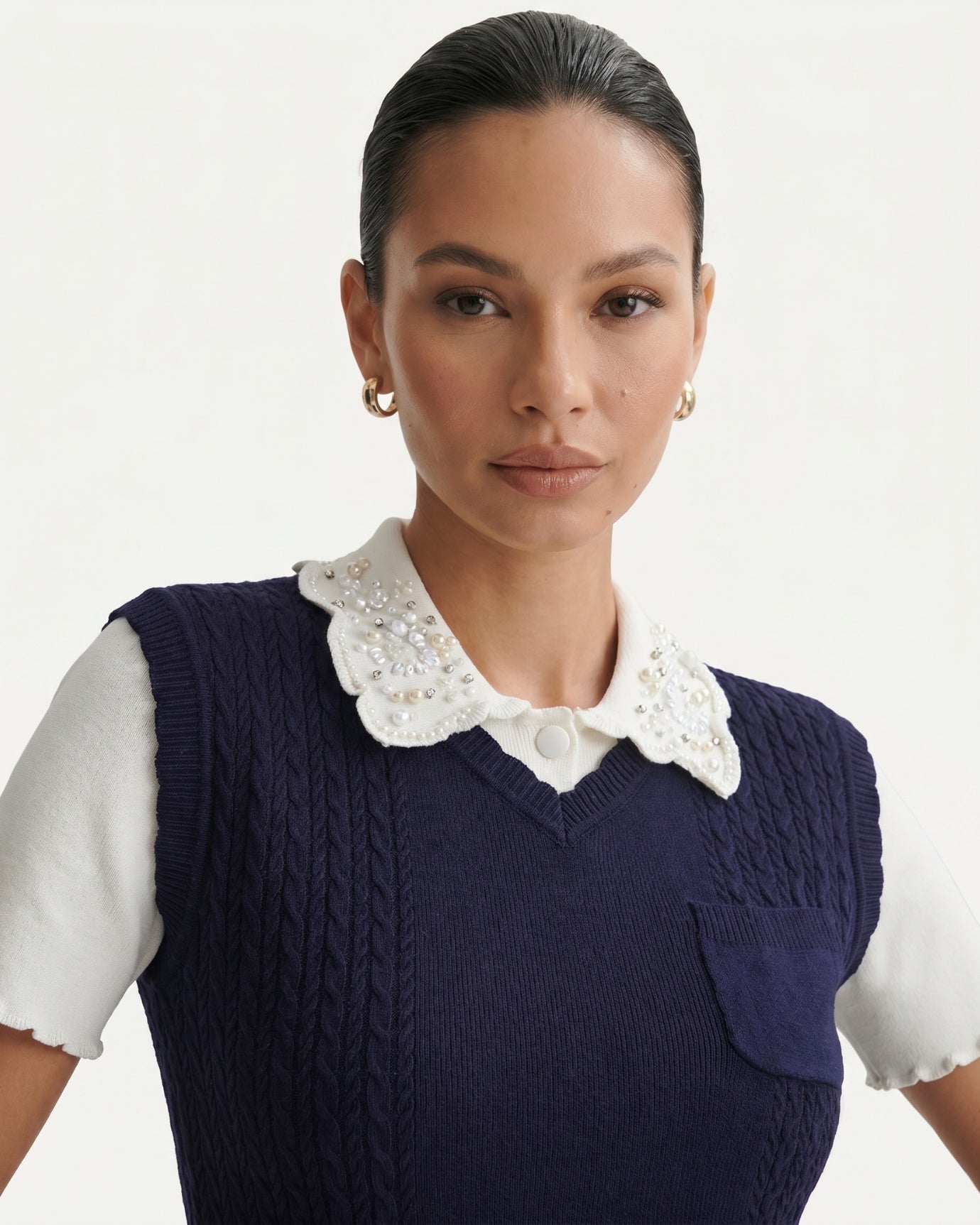
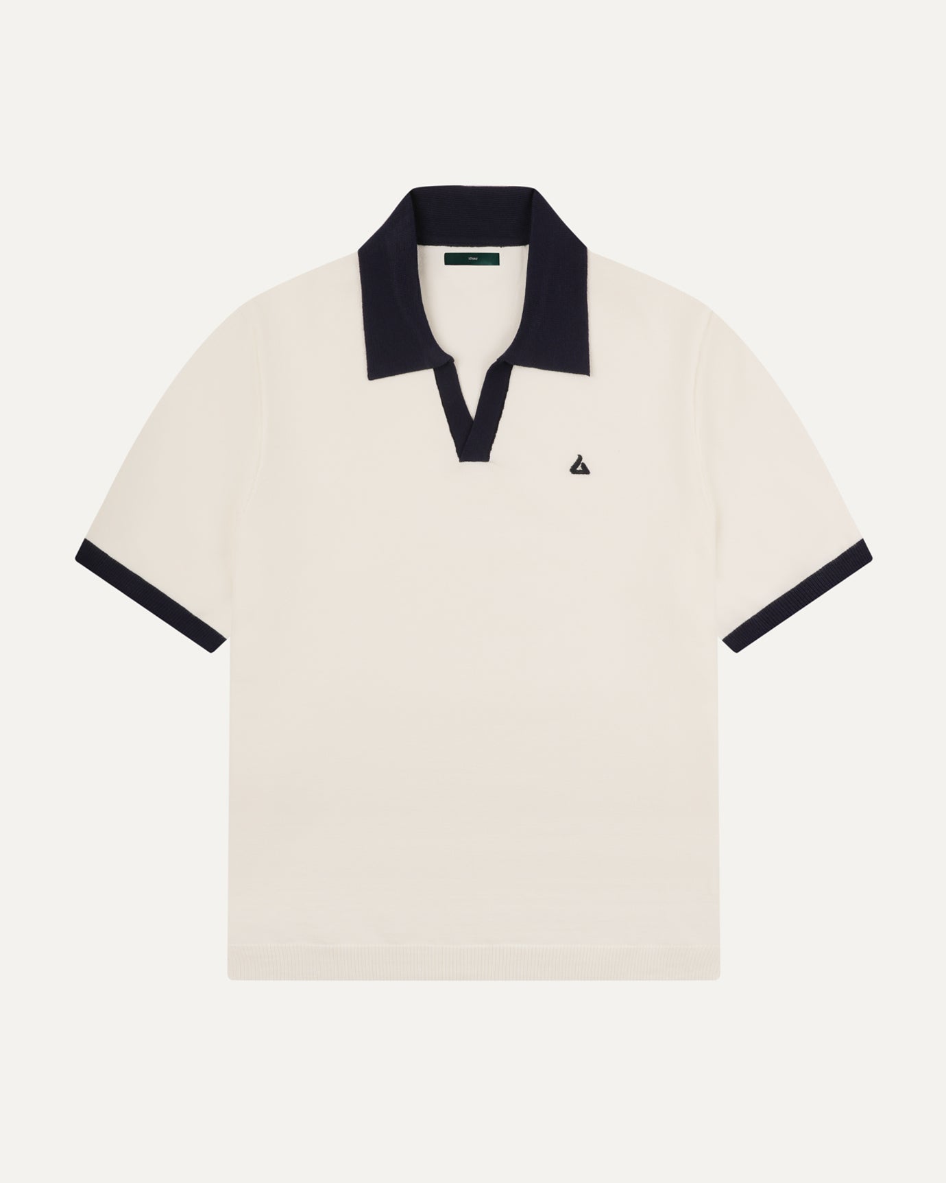
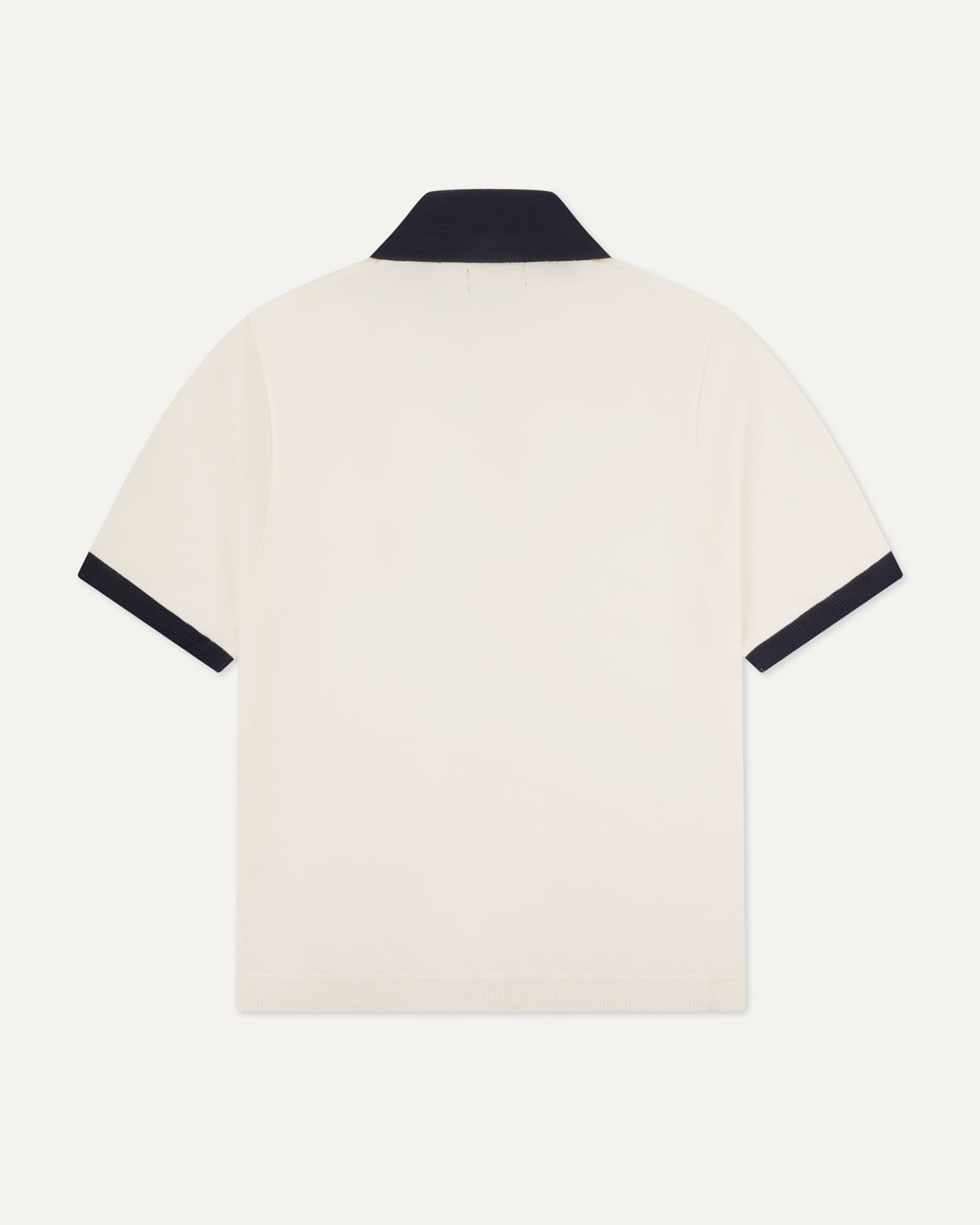
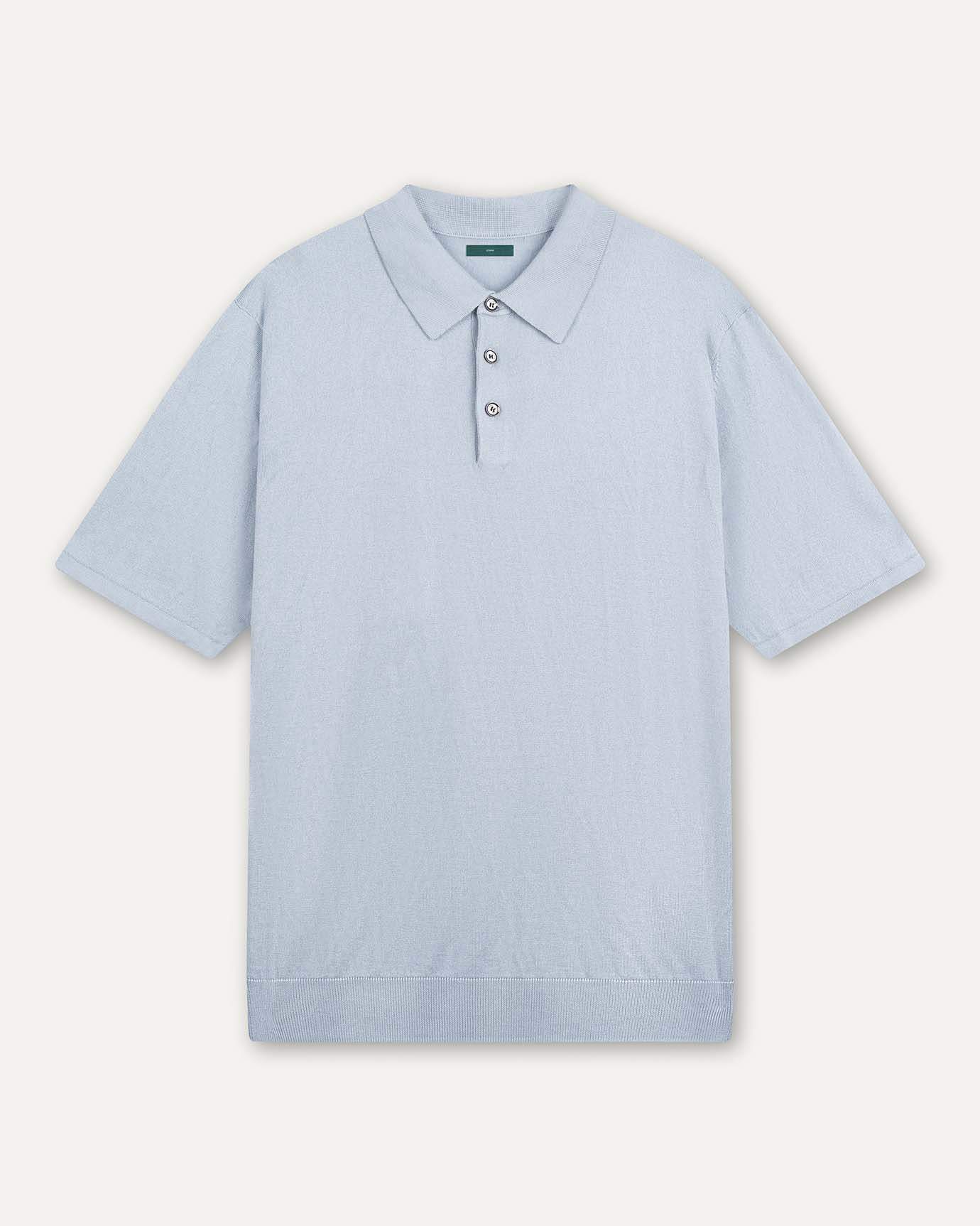
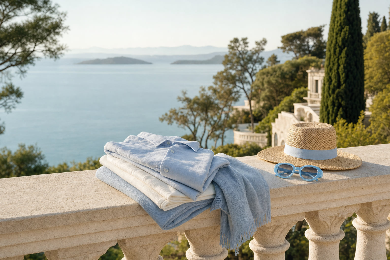
Ivory, Cream, and Warm White: The Neutrals That Actually Read as Expensive
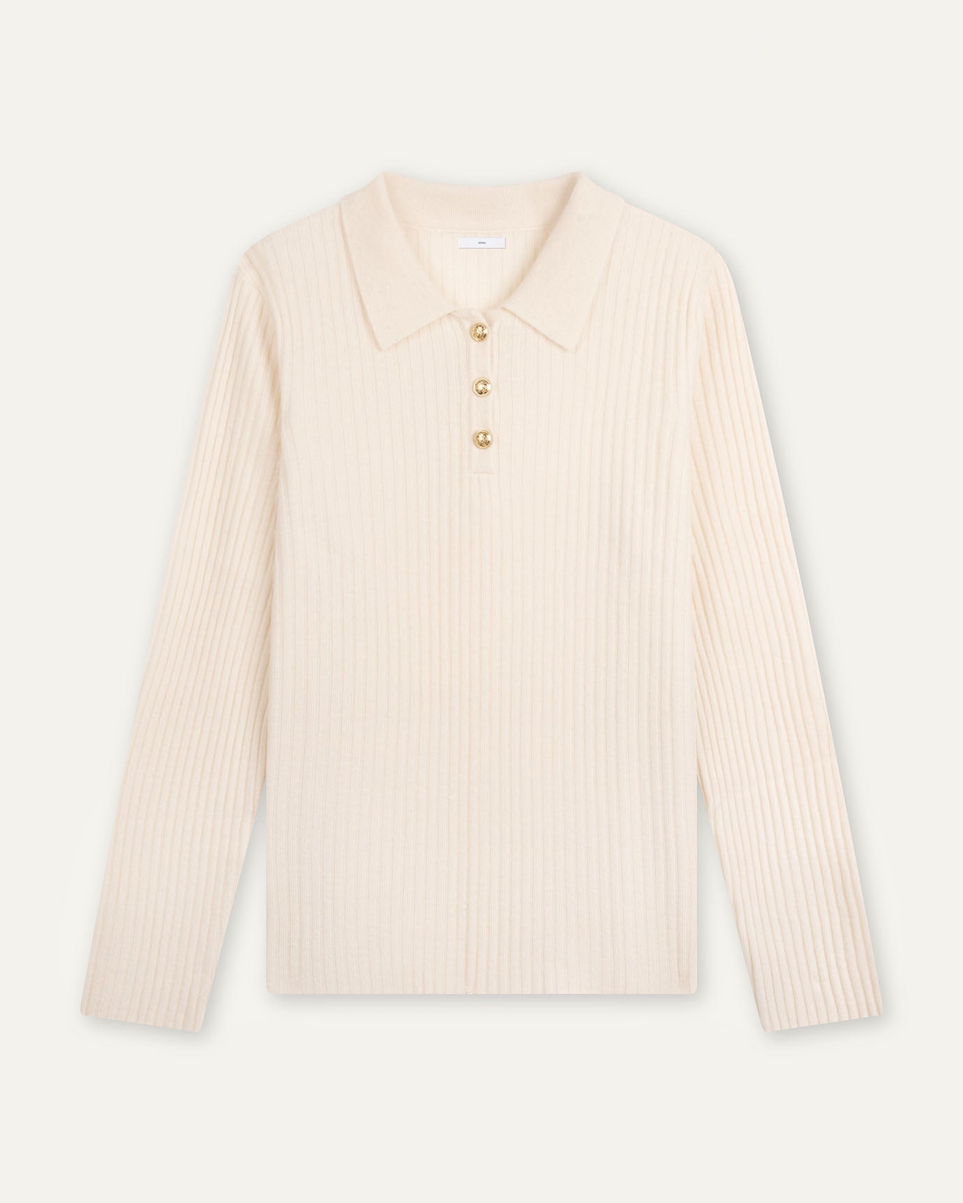
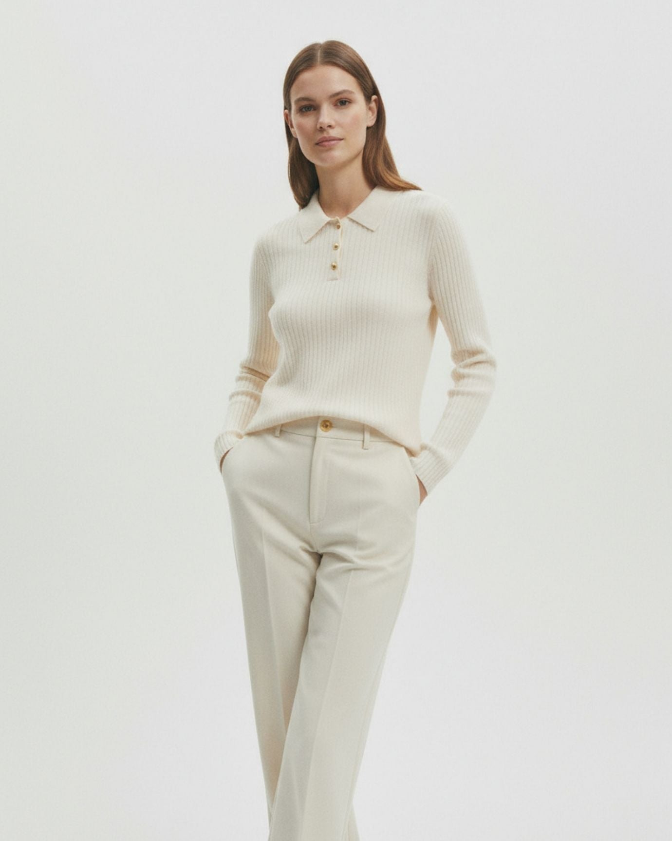
Pure, bright white is clinical. It reads as a uniform, as a lab coat, as a cheap fast-fashion shirt that will go grey after three washes. Ivory and cream, by contrast, carry warmth and intention. They suggest quality fabric, careful sourcing, and a person who is not dressing in a hurry.
The difference between white and cream is subtle in a swatch and enormous on the body. Cream flatters a far wider range of skin tones than bright white. It also photographs with depth rather than blowing out in direct light. These are the reasons that cream has been a constant in the wardrobes of the quietly wealthy across Europe and the Americas for generations.
For women, a French niche style white dress in a warm ivory tone achieves exactly this effect: structured, clean, and immediately readable as considered rather than casual. The cut matters as much as the color here. A cream dress in a loose, formless cut reads as beach cover-up. A cream dress with a defined waist and clean lines reads as Parisian lunch.
The psychology behind this specific tone is worth understanding in depth. The article on the psychology behind the color cream covers why it signals what it signals and how to use it without looking washed out.
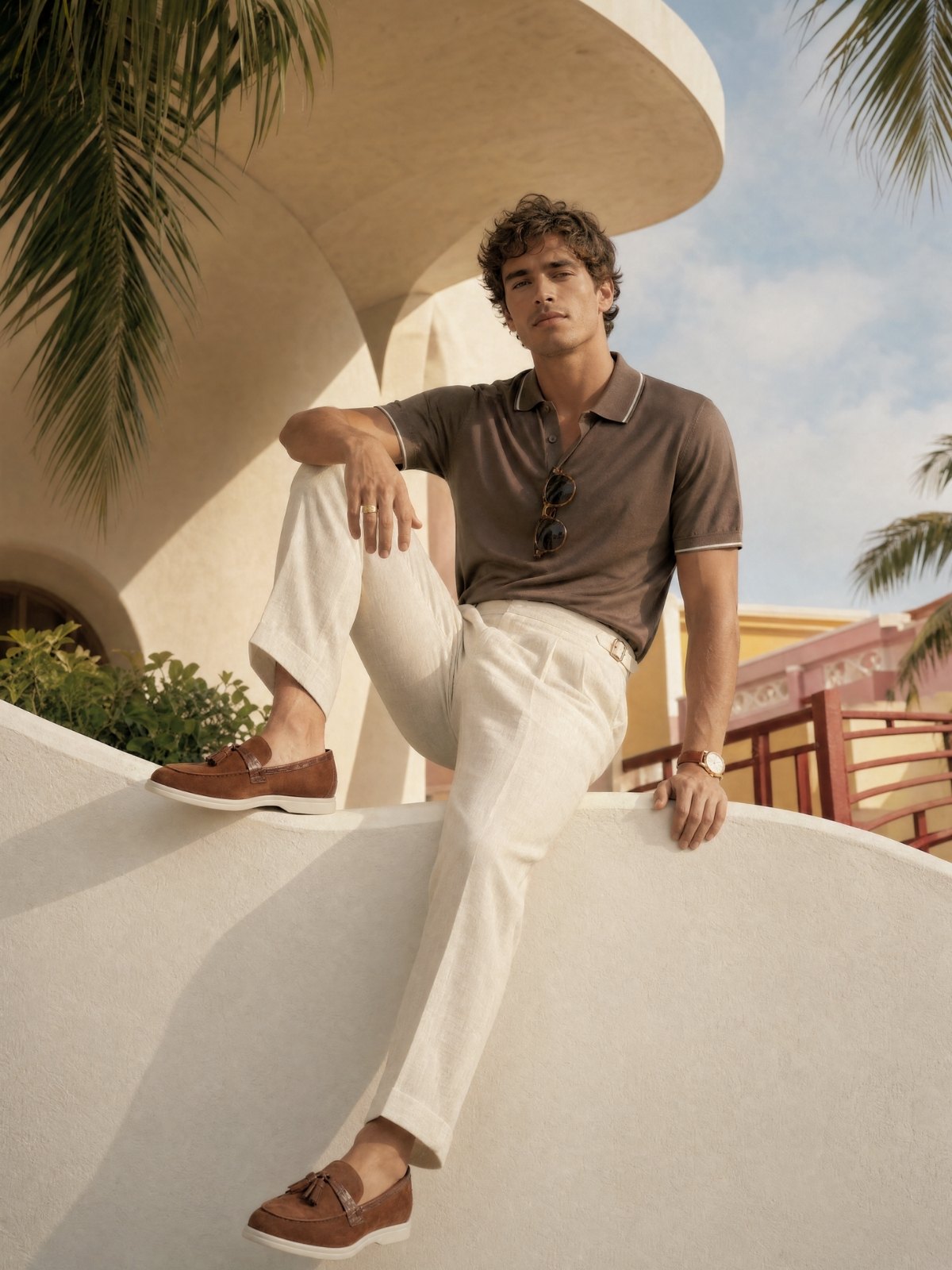
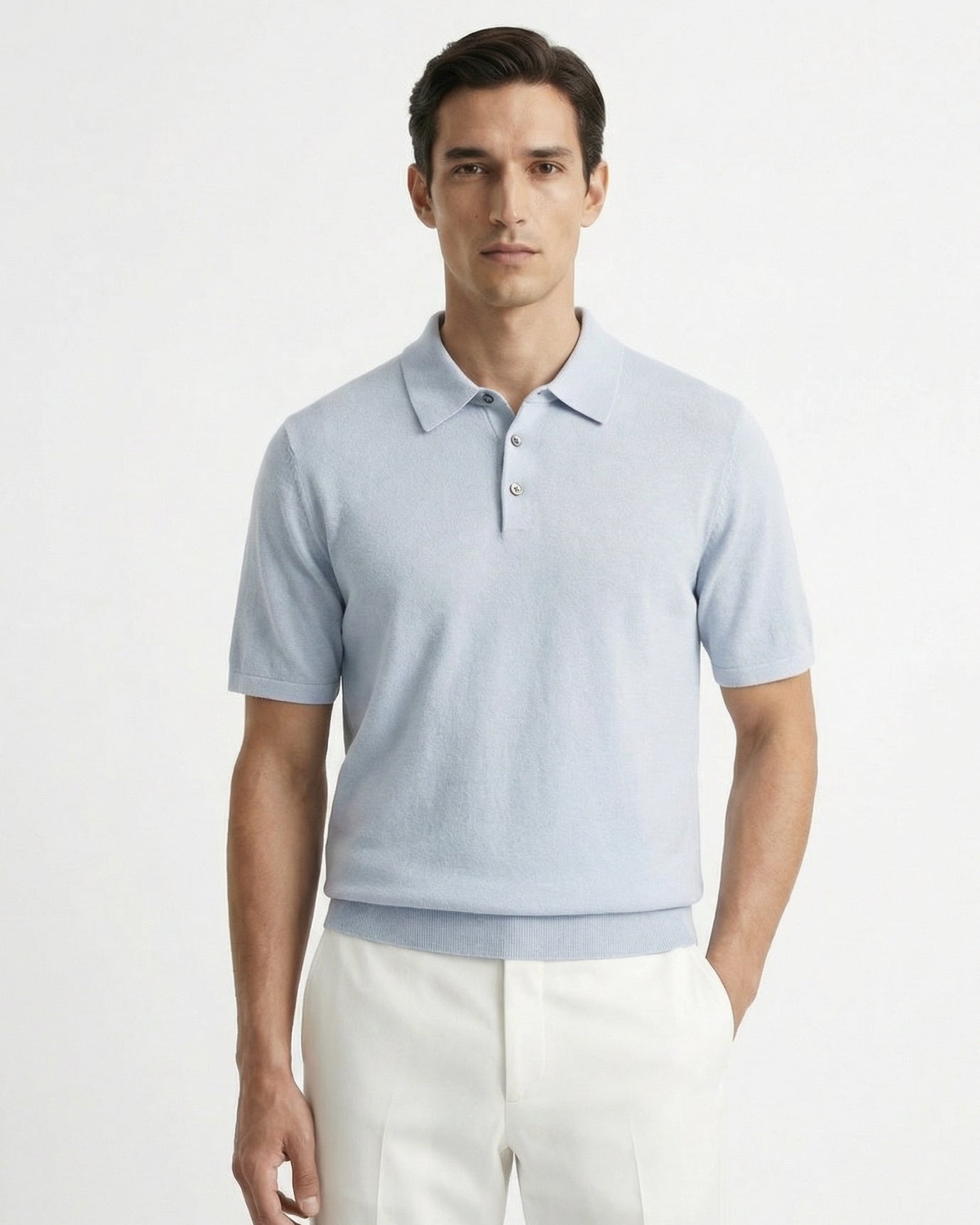
For men, ivory in a linen shirt or a fine knit polo sits beautifully against tanned skin in summer and against navy or charcoal in cooler months. It is a color that rewards good grooming: it is unforgiving of wrinkles but generous with elegance.
Expert insightIf you are unsure whether a white is warm or cool, hold it next to a piece of paper. Paper white is cool. If your garment looks slightly golden beside it, you have found ivory. That warmth is what you want.

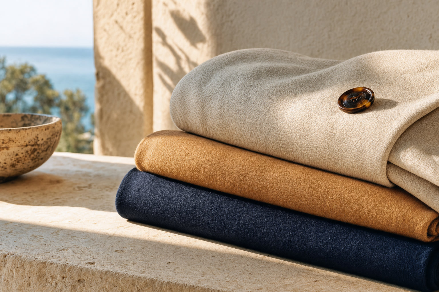
Deep Tones That Command a Room: Forest Green, Burgundy, and Camel
Beyond navy and cream, three additional colors consistently signal wealth when worn correctly: forest green, burgundy, and camel.
Forest green sits in that narrow band between hunter green and olive. It is rich without being aggressive, natural without being casual. In linen or fine cotton, it reads as the kind of color a person chooses when they know exactly who they are. A high count fine green linen shirt in this tone, worn with ivory trousers or dark navy chinos, is a complete statement with zero effort required from accessories.
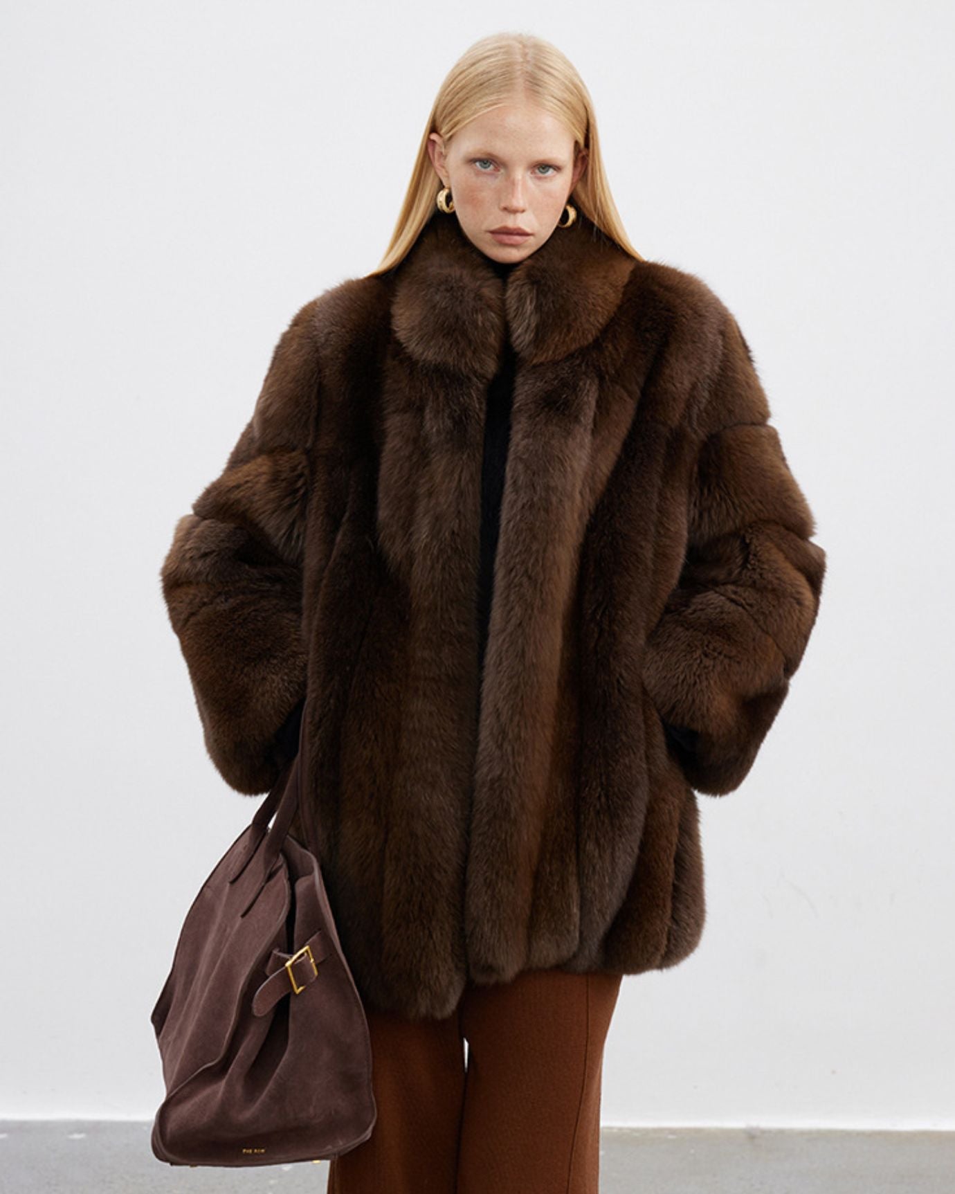
Burgundy and deep wine tones carry centuries of association with wealth and ceremony. They are harder to wear badly than people expect, provided the shade stays deep and does not drift toward bright red. In autumn and winter, burgundy in a fine knit or structured jacket is one of the clearest signals of intentional dressing available.
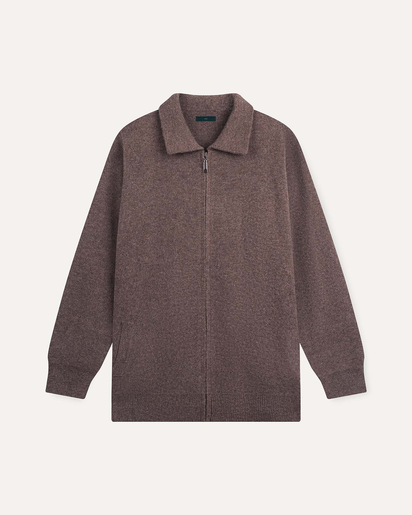
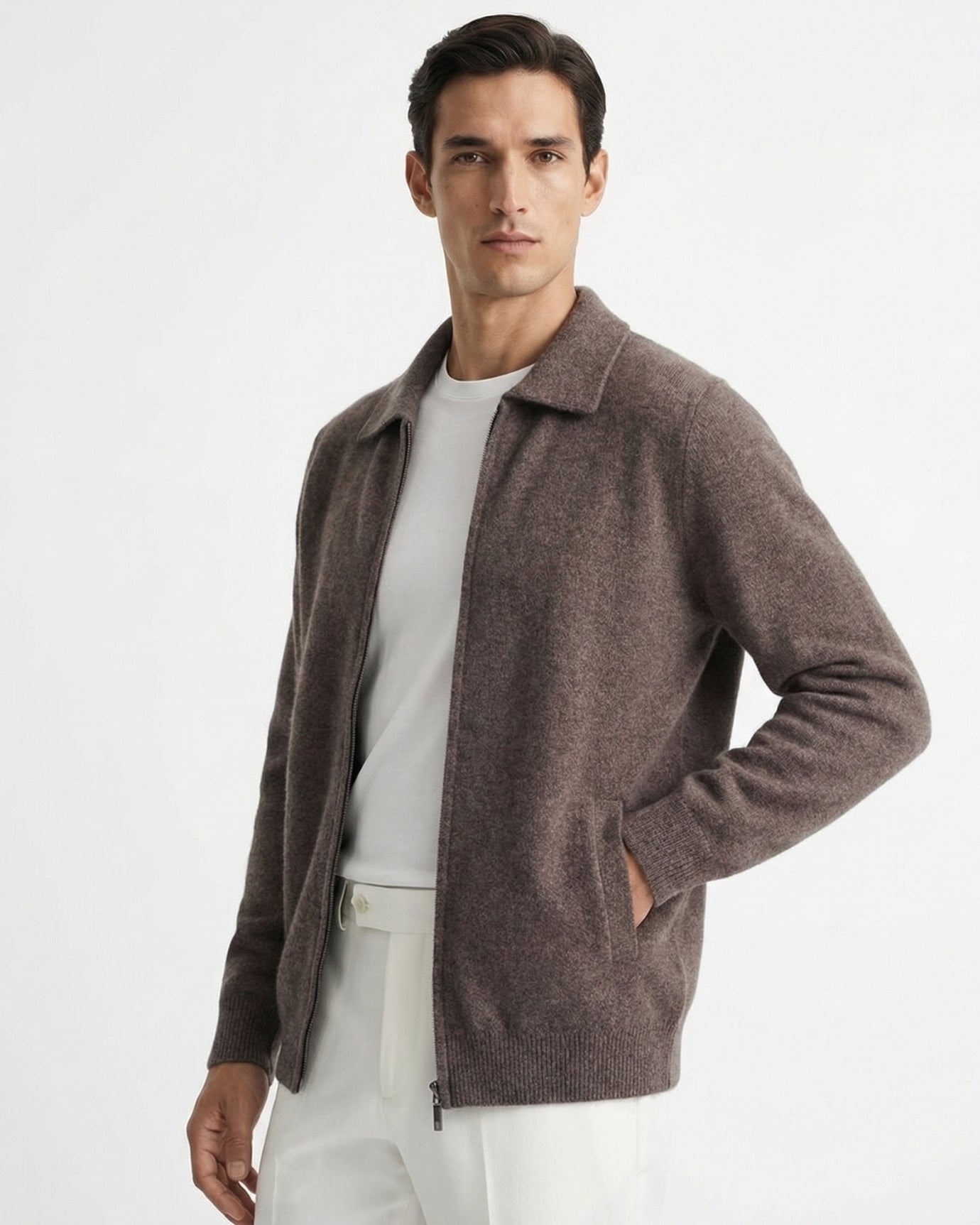
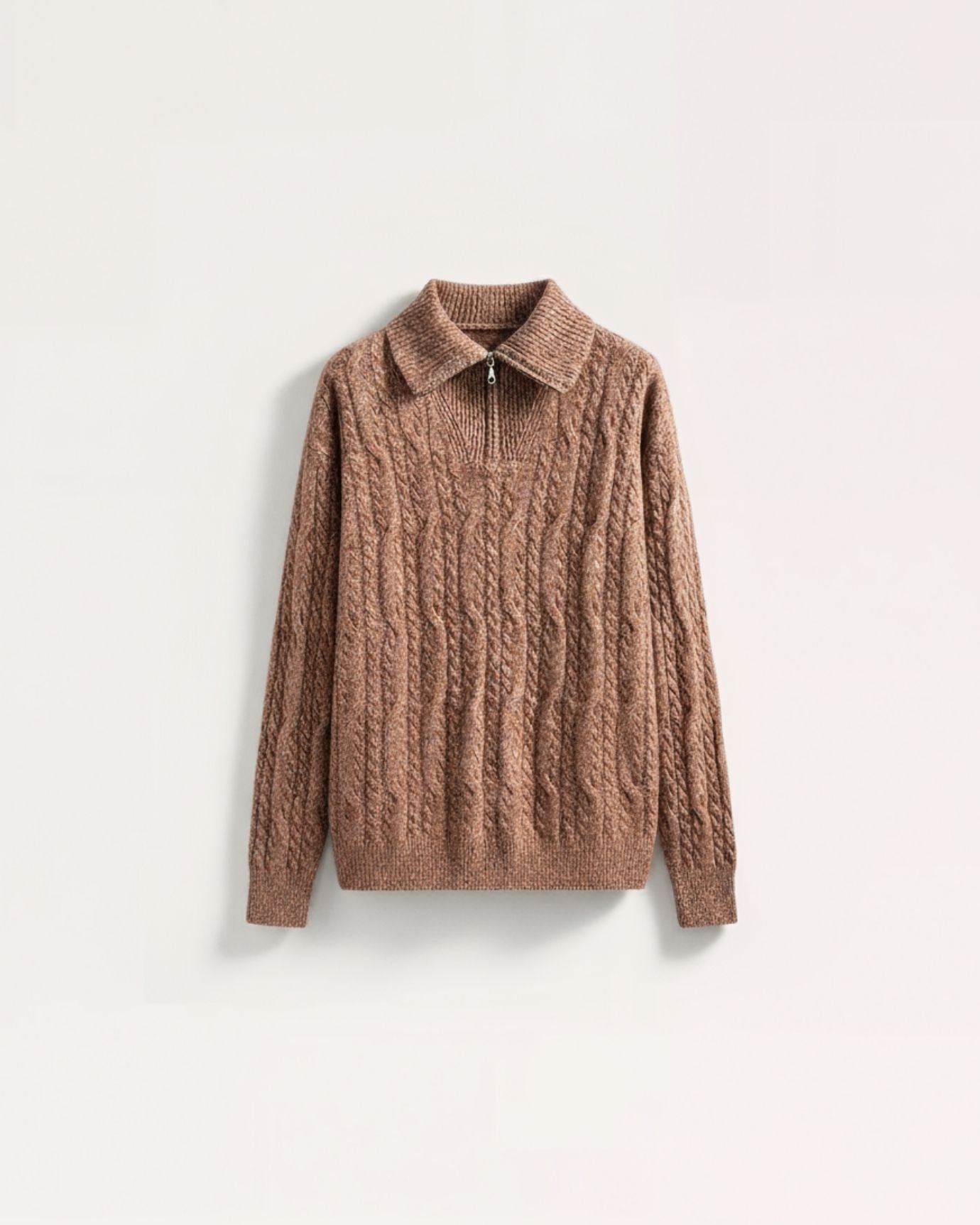
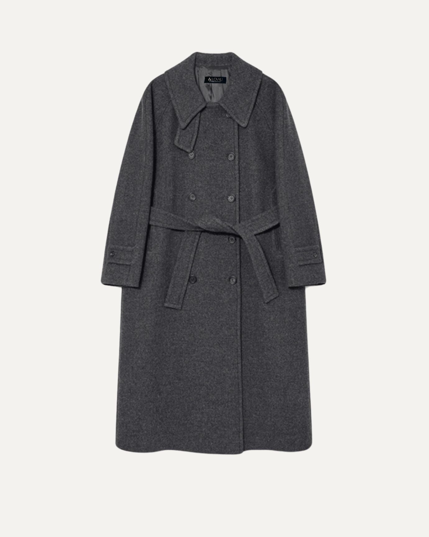
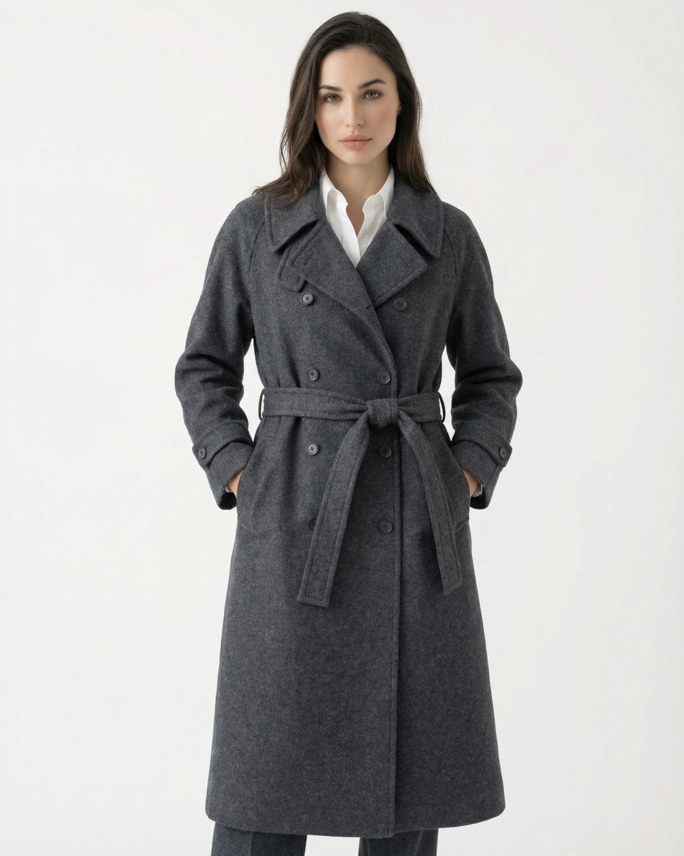
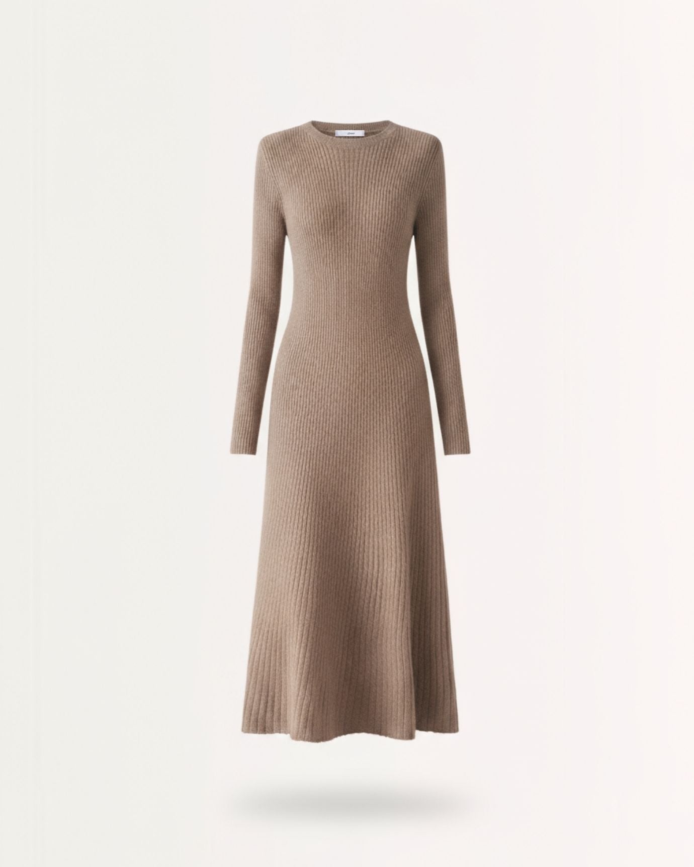
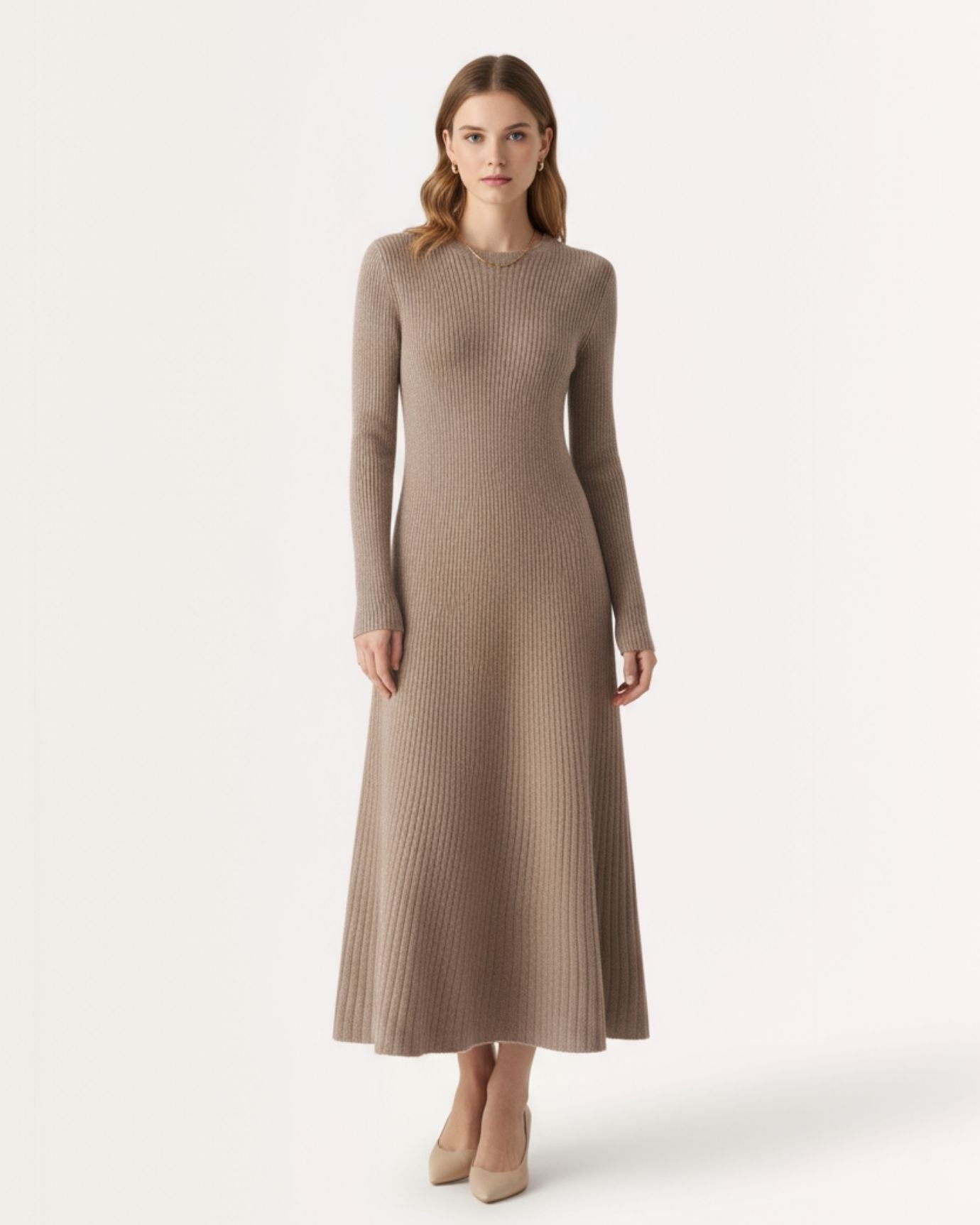
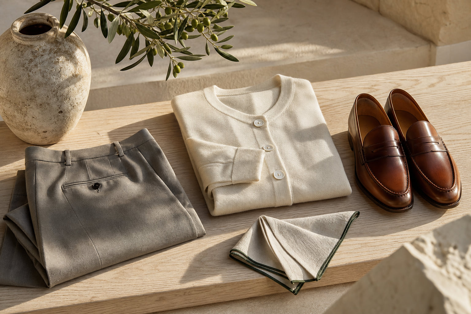
Camel is perhaps the most underestimated color in this group. A true camel, warm, golden-brown, neither too yellow nor too orange, reads as old money in almost any silhouette. It works in coats, trousers, knitwear, and accessories. Paired with navy or ivory, it is immediately Mediterranean. Paired with deep brown leather, it is immediately Continental.
For a complete breakdown of how to build outfits around these warmer earth tones, the guide on earth tones in fashion, including brown, camel, and coffee is worth reading alongside this one.

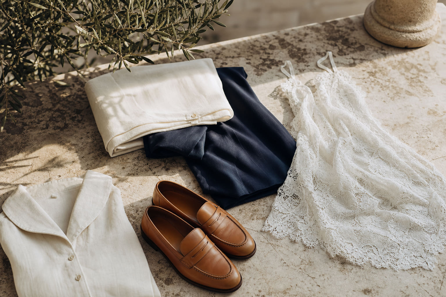
How to Build a Rich-Looking Outfit Around These Colors
Knowing the colors is the first step. Using them correctly is the second. The principles are specific and learnable.
Rule one: maximum three tones per outfit. The wealthiest-looking wardrobes are built on restraint. Two tones is often better than three. One dominant color, one supporting neutral, and optionally one accent in an accessory. More than that and the eye has nowhere to land.
Rule two: match the color depth to the occasion. Deep tones, navy, forest green, charcoal, burgundy, carry weight. They are appropriate for evening, for business, for occasions that require presence. Lighter tones, ivory, camel, pale sage, carry ease. They belong to daytime, to leisure, to the kind of lunch that lasts three hours.
Rule three: fabric must support the color. A beautiful deep navy in a thin, pilling synthetic reads as cheap within one hour of wear. The same navy in double pleated linen shorts or fine cotton reads entirely differently. The color is the promise; the fabric is the proof.
For women, a coordinated set in a single deep or neutral tone is one of the most effective ways to create a rich-looking impression. The Mandelieur color-blocked short cardigan jacket and pencil skirt set demonstrates how two tones within the same family, handled with precision in the cut, read as a complete and considered look rather than separates pulled from different places.
For men, the same principle applies in a different form. A high end mulberry silk and worsted cashmere set in a single deep tone is the kind of outfit that requires no further thought. The color does the work; the fabric confirms it.
For the colors to actively avoid when trying to look expensive, the article on best colors to avoid if you want to look expensive is a direct companion to this one.

Colors to Build On: The 2026 Palette in Practice
The specific tones gaining traction in 2026 are not new colors. They are refinements of the classics: warm ivory shifting slightly toward sand, navy deepening toward midnight, forest green cooling slightly toward slate-green, and camel warming toward cognac.
What is new is the emphasis on texture over pattern. In 2026, the interesting work is happening in fabric construction, woven texture, fine ribbing, linen slub, silk-blend sheen, rather than in print or color novelty. This means a single rich color in a beautifully constructed fabric is carrying more visual interest than it did in previous seasons.
For women, this plays out in pieces like the Lira two-piece lazy sweater and long skirt, where the tone and the fabric weight together create the impression. For men, it appears in the texture of a fine French retro striped knit polo, where the stripe is tonal and the construction is the detail.
The broader principle for 2026 is this: choose colors from the core palette, dress them in quality fabric, and let the restraint speak. The best neutral colors that never go out of style covers the foundational wardrobe logic that makes all of this sustainable across years, not just seasons.
According to Vogue's ongoing coverage of quiet luxury dressing, the movement toward considered, low-key color choices is not a passing moment. It reflects a fundamental shift in how dressed confidence is being read, particularly among younger European and American audiences who associate restraint with sophistication rather than with conservatism.

| Color | Best Season | Best Occasion | Strongest Pairing | Fabric That Works Best |
|---|---|---|---|---|
| Navy blue | Year-round | Business, evening, casual | Ivory, cream, white | Fine linen, wool, cotton |
| Ivory / Cream | Spring, Summer, early Autumn | Daytime, coastal, brunch, evening | Navy, camel, forest green | Silk, fine cotton, linen |
| Forest green | Autumn, Spring | Casual, country, weekend | Camel, ivory, navy | Linen, cotton twill, fine knit |
| Camel | Autumn, Winter | Business casual, travel, weekend | Navy, ivory, deep brown | Wool, cashmere, fine cotton |
| Charcoal | Autumn, Winter | Business, evening, formal | Ivory, pale blue, burgundy | Wool, worsted, fine flannel |
| Burgundy | Autumn, Winter | Evening, dinner, formal | Ivory, camel, navy | Silk, fine knit, velvet |
Frequently asked questions
What is the single color that most reliably makes you look wealthy?
Navy blue. It is deep, versatile, historically associated with authority and quality, and it works in every fabric from linen to wool. Worn in a well-cut garment with clean lines, navy requires nothing else to read as expensive. For men specifically, the guide on the best colors for old money men shows how navy anchors an entire wardrobe.
Does black make you look rich?
Black can read as expensive, but it depends entirely on fabric and fit. Cheap black fabric pills, fades to grey-black unevenly, and reflects light poorly. High-quality black in fine linen, wool, or silk reads as sophisticated. The problem with black as a wealth signal is that it is so common that it no longer carries automatic distinction. Navy, forest green, and deep charcoal often read as more considered choices.
Are bright colors ever considered wealthy-looking?
Occasionally, but the rules are strict. A single bright tone, say a true cobalt or a deep coral, worn in a high-quality fabric with a clean silhouette and no competing colors, can read as confident wealth. The moment you mix bright colors or wear them in cheap fabric, the reading collapses. The safe position is always to anchor a bright accent against a deep or neutral base.
How many colors should a wealthy-looking outfit contain?
Two is the ideal. One dominant color and one supporting neutral. Three works when the tones are closely related in depth and temperature. Four or more colors in a single outfit almost always read as busy rather than refined, regardless of the quality of individual pieces. Restraint in color is one of the clearest signals of a considered wardrobe.
Color is not decoration. It is communication. The colors in this guide, navy, ivory, camel, forest green, charcoal, burgundy, have been communicating wealth, restraint, and confidence for long enough that the association is essentially permanent. The work is not in finding new colors. It is in wearing these ones correctly: in the right fabric, the right combination, and the right proportion. If you want to go deeper on building the full palette, the article on best neutral colors that never go out of style is the natural next step.