

The Neutral Color Codes of Old Money Fashion (Beige, Cream, Navy & More)
When it comes to old money fashion, nothing is louder than neutral tones—and that’s precisely the point. These subtle shades speak volumes about restraint, sophistication, and confidence without needing to shout. Neutrals are the backbone of the old money aesthetic, relied upon for their timeless appeal and unmatched versatility. In this guide, we break down the key neutral colors favored by old money wardrobes, how to wear them, and what they communicate about the wearer.
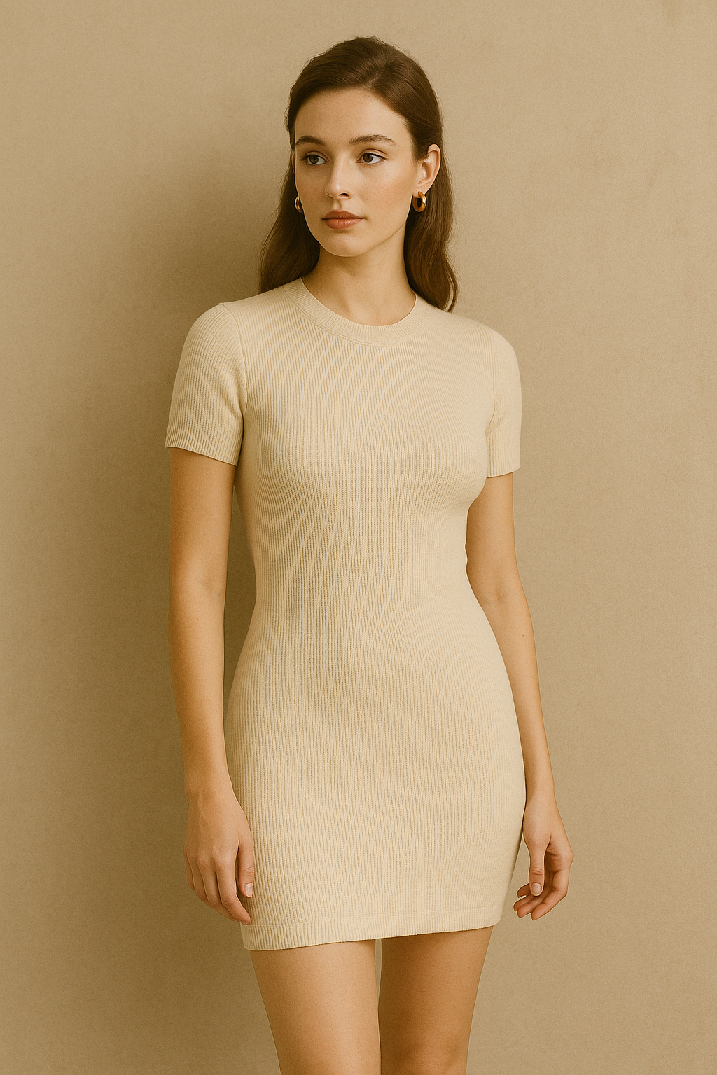
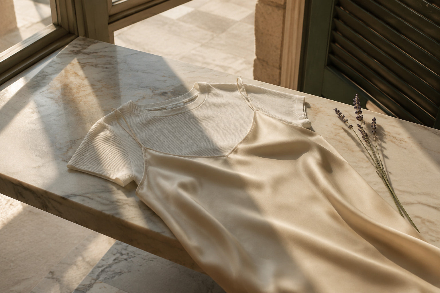
1. Beige: The Soft Foundation of Elegance
No color is more symbolic of old money understatement than beige. Often dismissed as “plain,” in refined fashion circles it’s the color of quiet confidence. Whether in the form of tailored trousers, coats, or fine knitwear, beige offers endless styling flexibility.
Why it works:
Beige pairs beautifully with every other neutral and soft color, making it the ultimate layering tone. It suggests ease, grace, and quiet authority.
Wear it with:
-
White for summer minimalism
-
Camel or brown for autumn richness
-
Navy or gray for professional polish

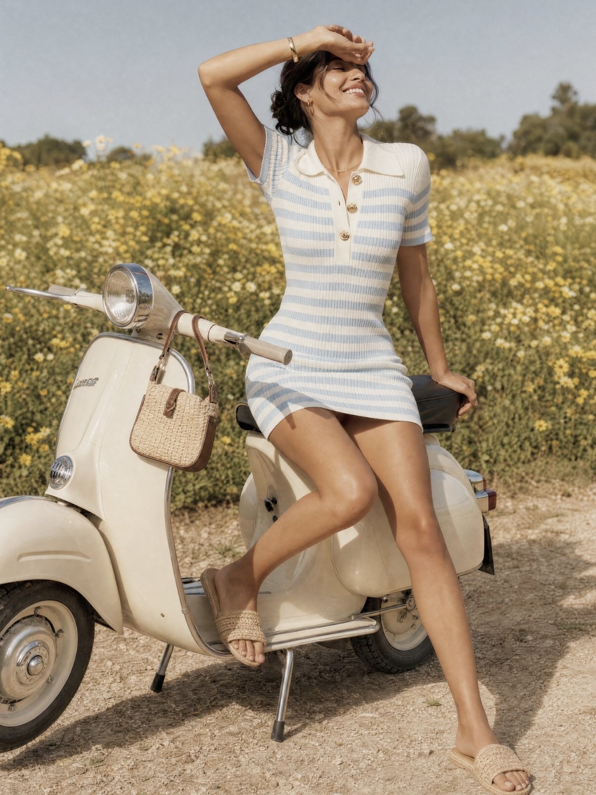
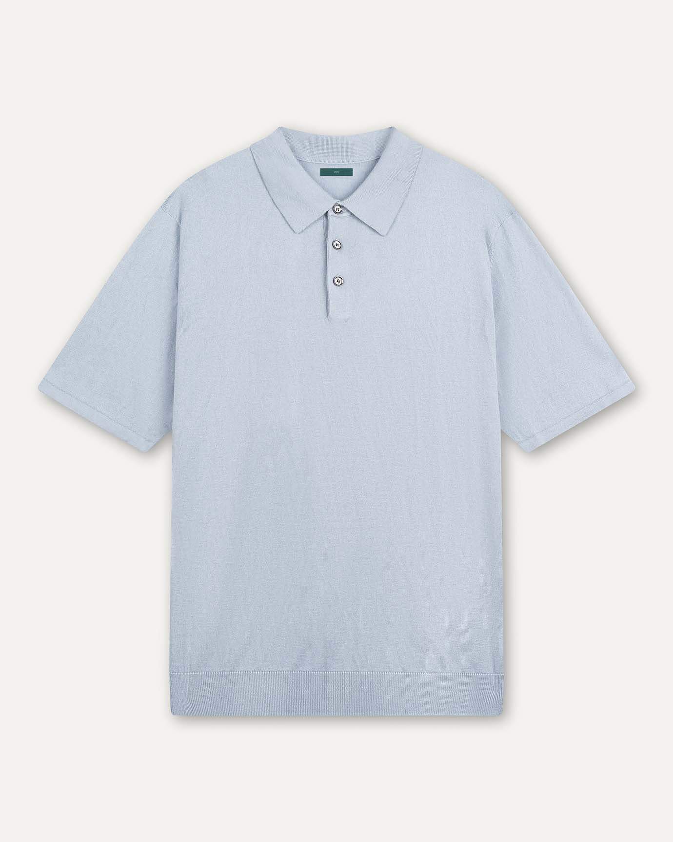
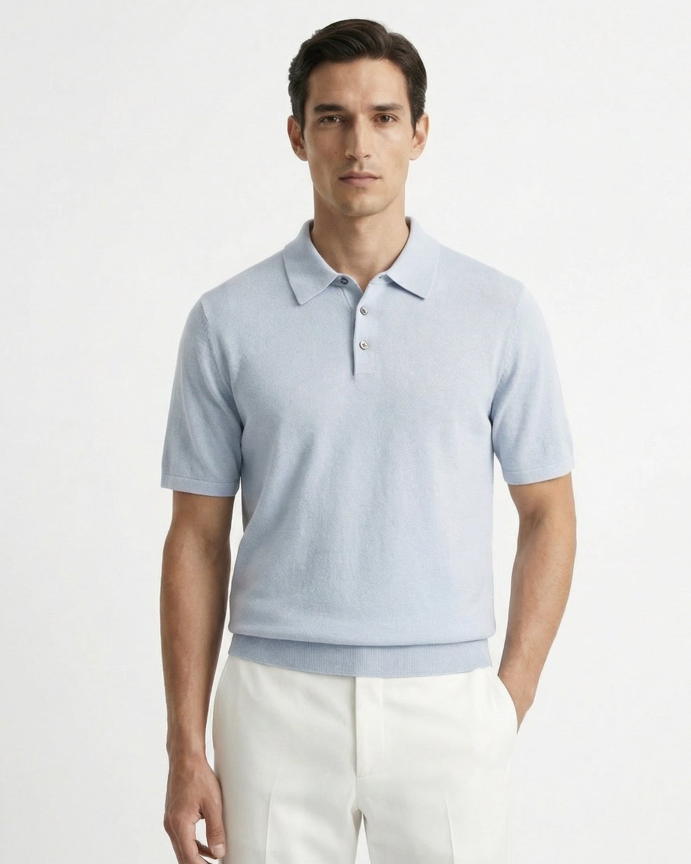
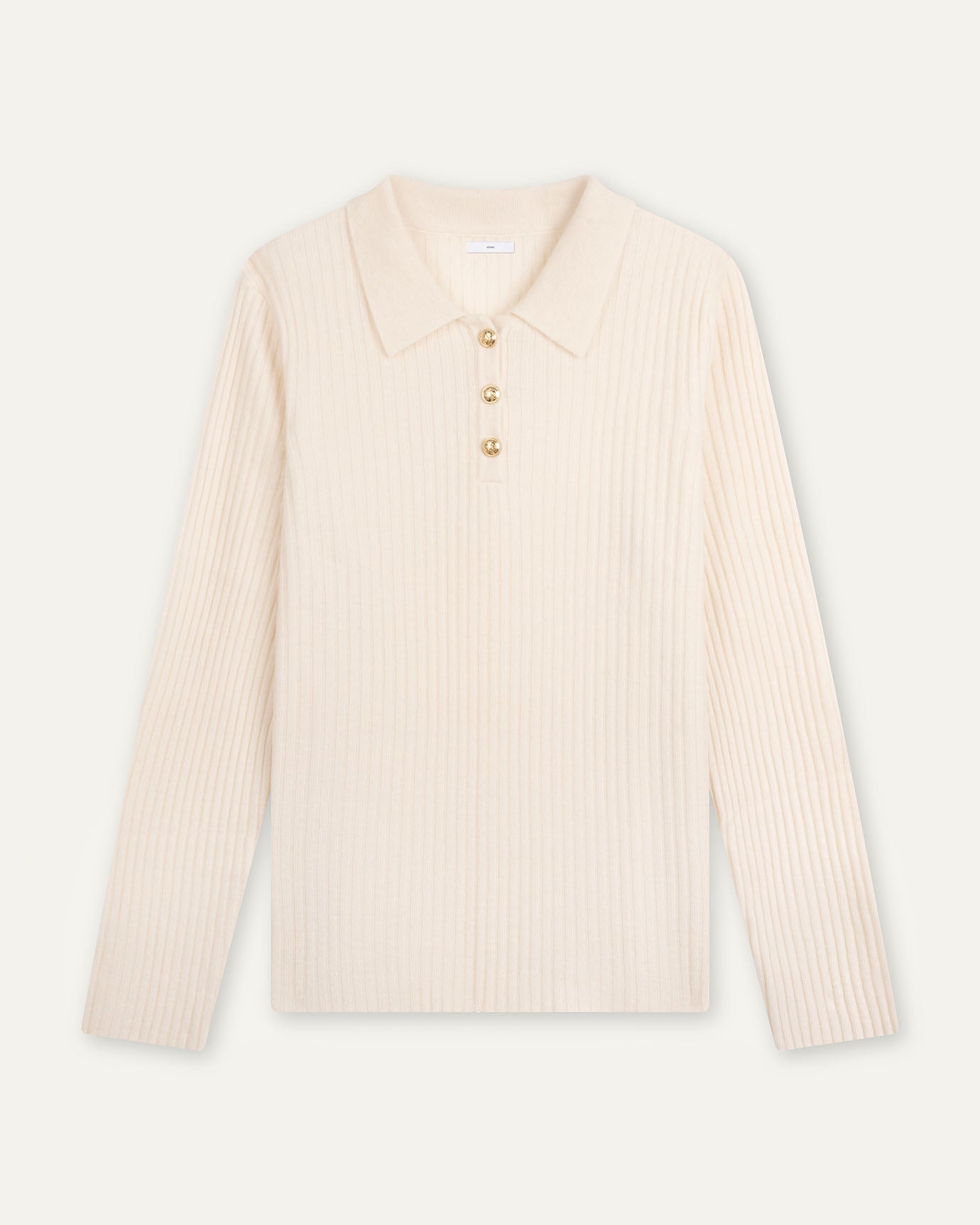
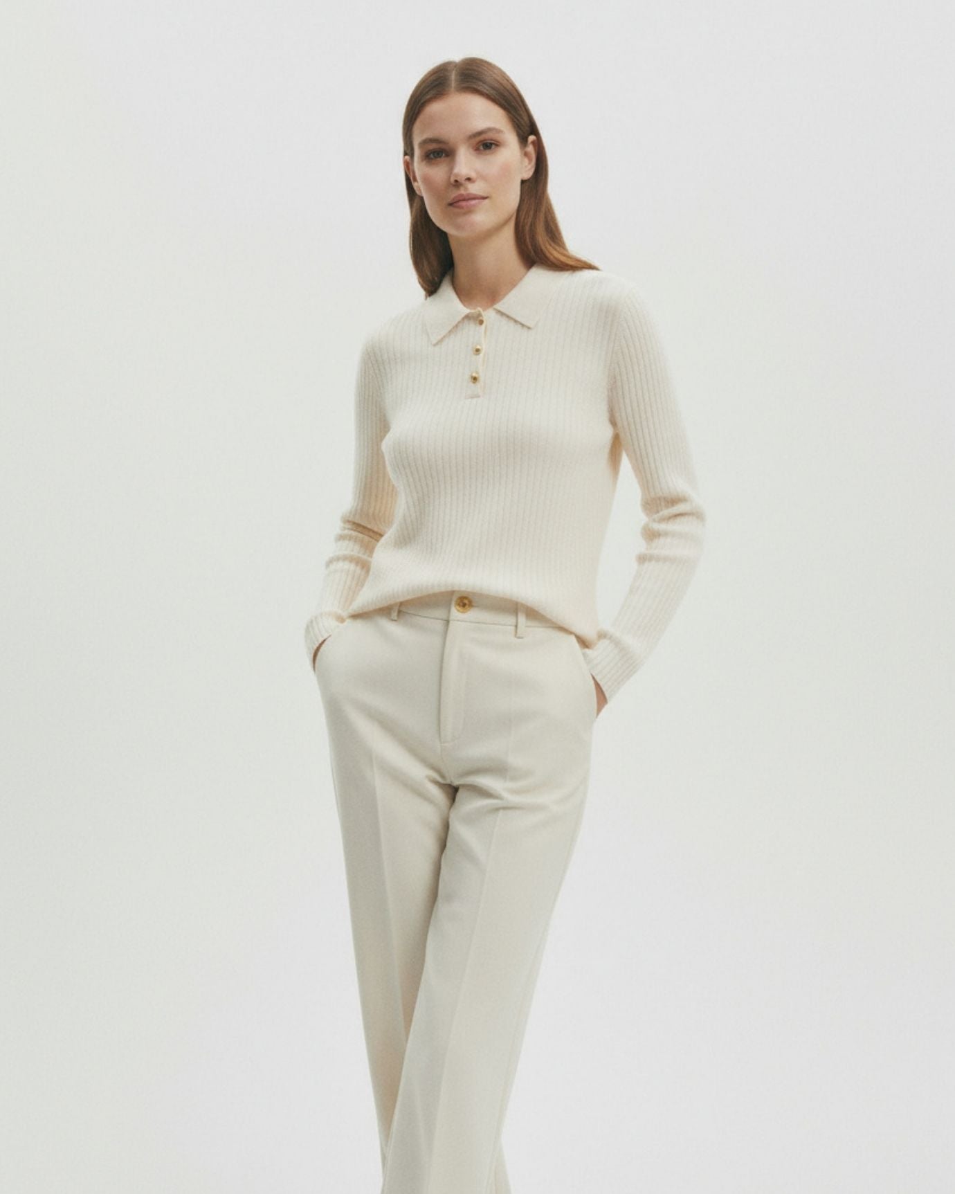
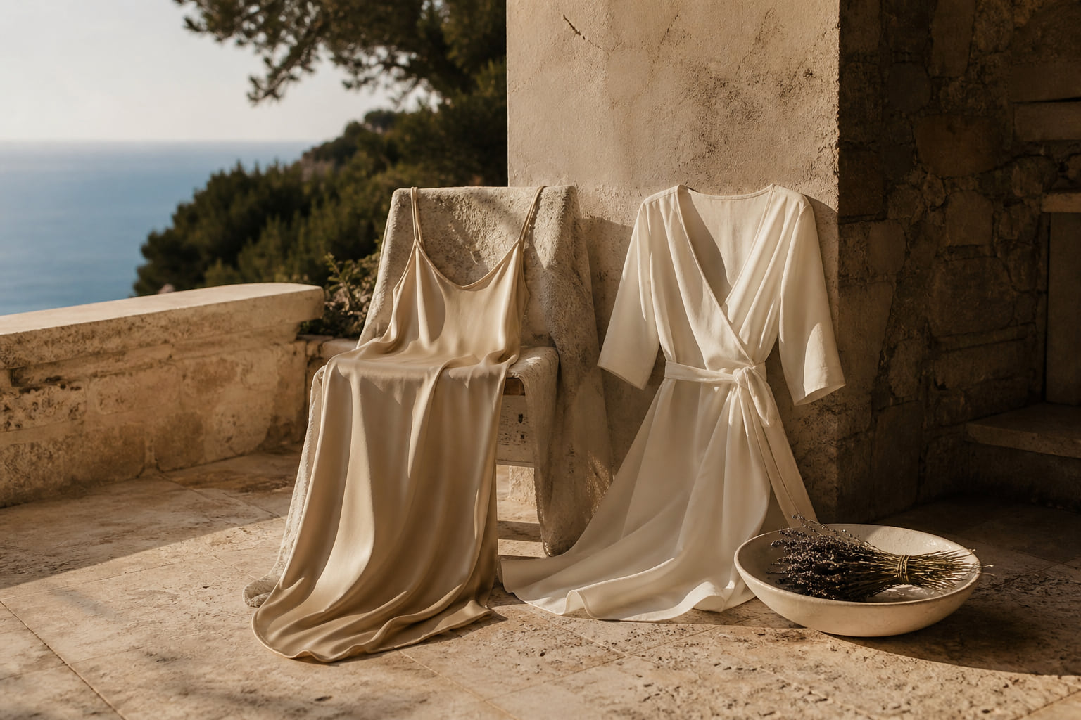
2. Cream: Light, Luxe, and Polished
A step warmer than white, cream adds richness without harshness. It exudes freshness and wealth—especially in high-quality fabrics like silk, cashmere, and fine wool.
Why it works:
Cream avoids the stark contrast of bright white while maintaining its clean, fresh look. It feels softer and more natural—perfect for blouses, trousers, coats, or scarves.
Pair with:
-
Beige for a tonal ensemble
-
Charcoal or navy for balanced contrast
-
Blush or taupe for a romantic touch
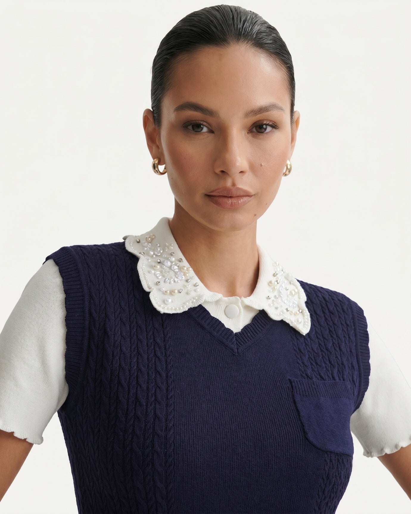
3. Navy: The Aristocratic Blue
While neutrals are often thought of as beige or gray, navy holds a special place in the old money wardrobe. It’s the go-to alternative to black—a color deemed too harsh or modern in many classic circles.
Why it works:
Navy is both serious and versatile. It’s perfect for suiting, knitwear, outerwear, and accessories. It conveys trust, tradition, and quiet intelligence.
Best matches:
-
Cream or white for nautical charm
-
Brown leather accents for heritage style
-
Gray or olive for masculine refinement
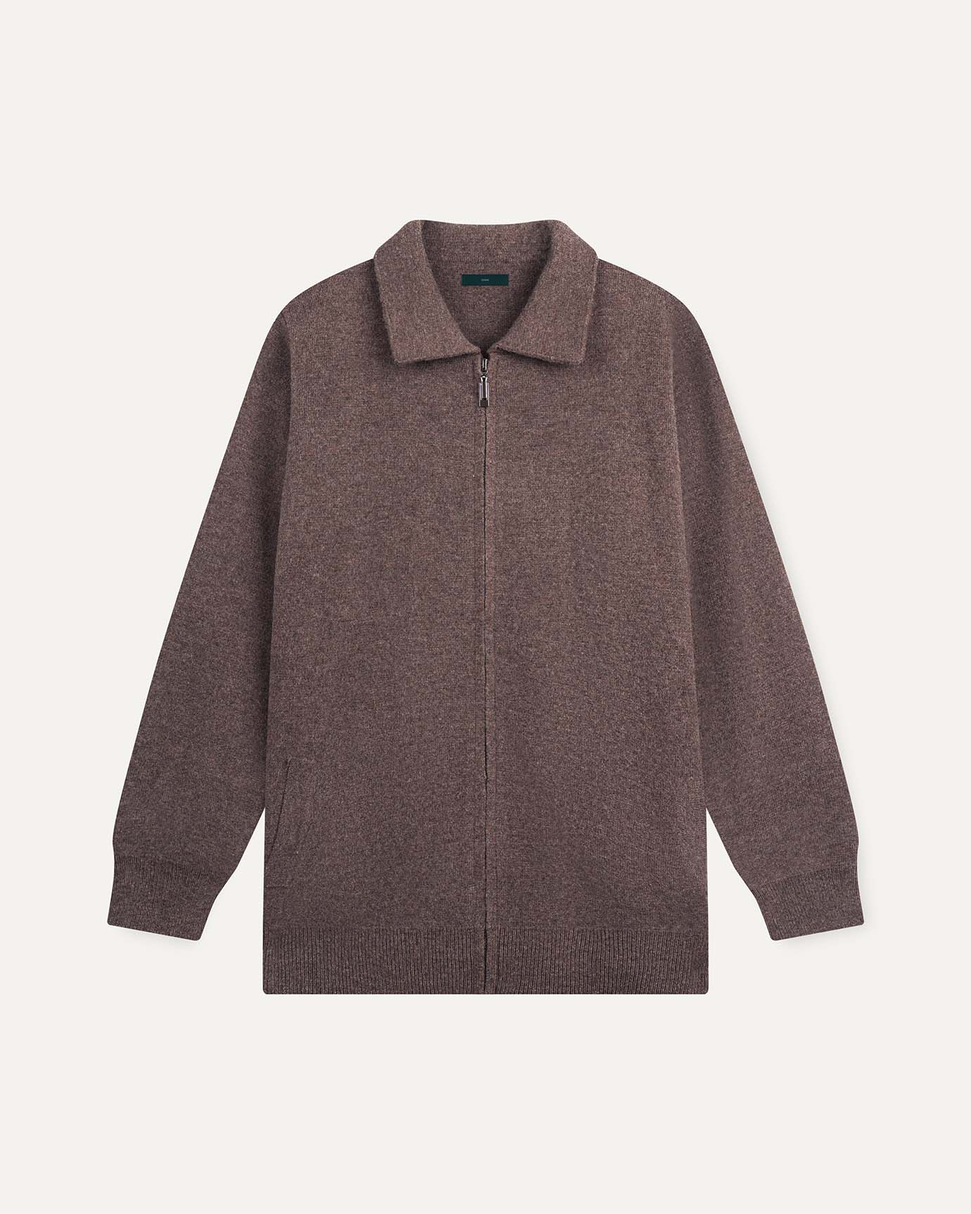
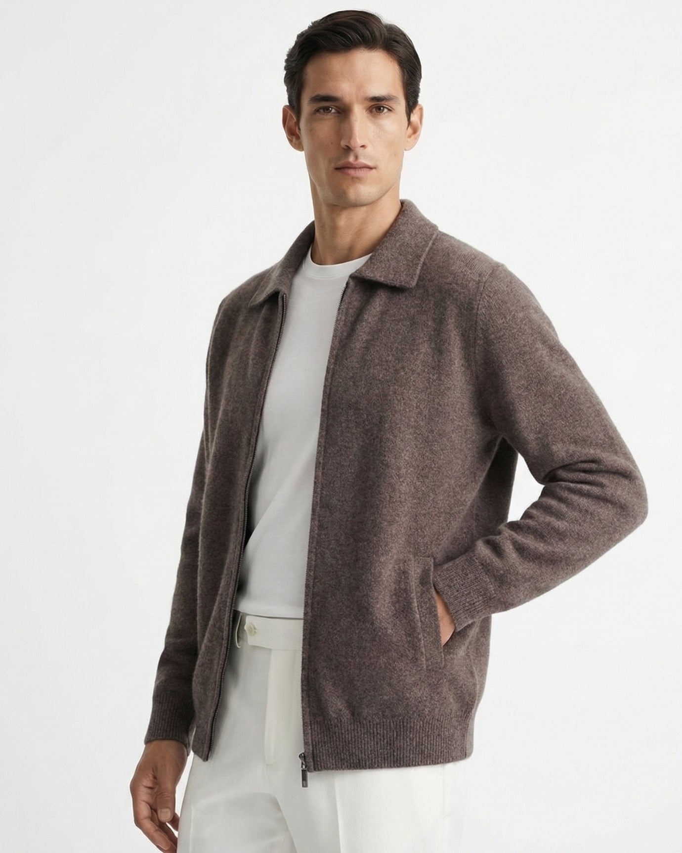
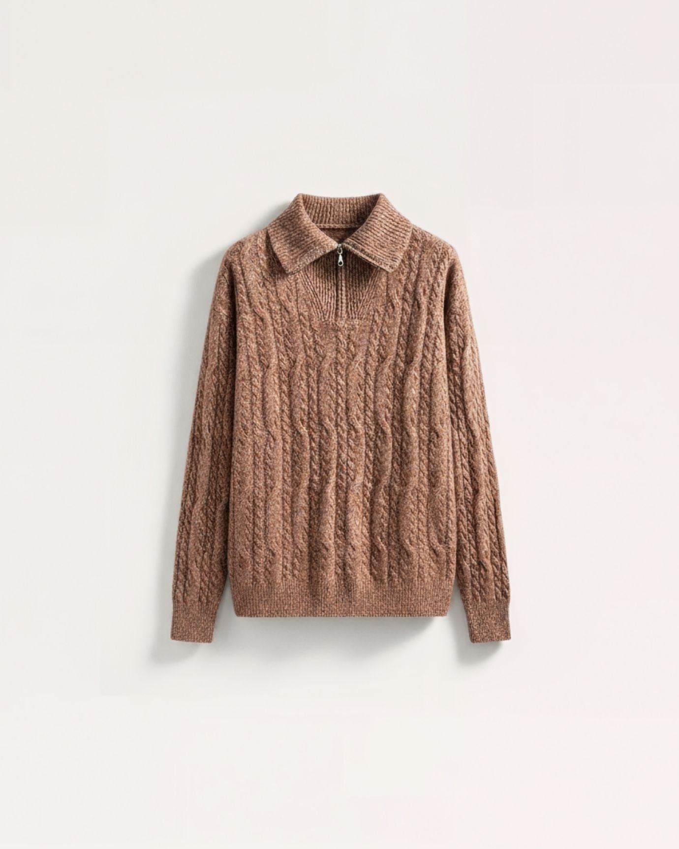
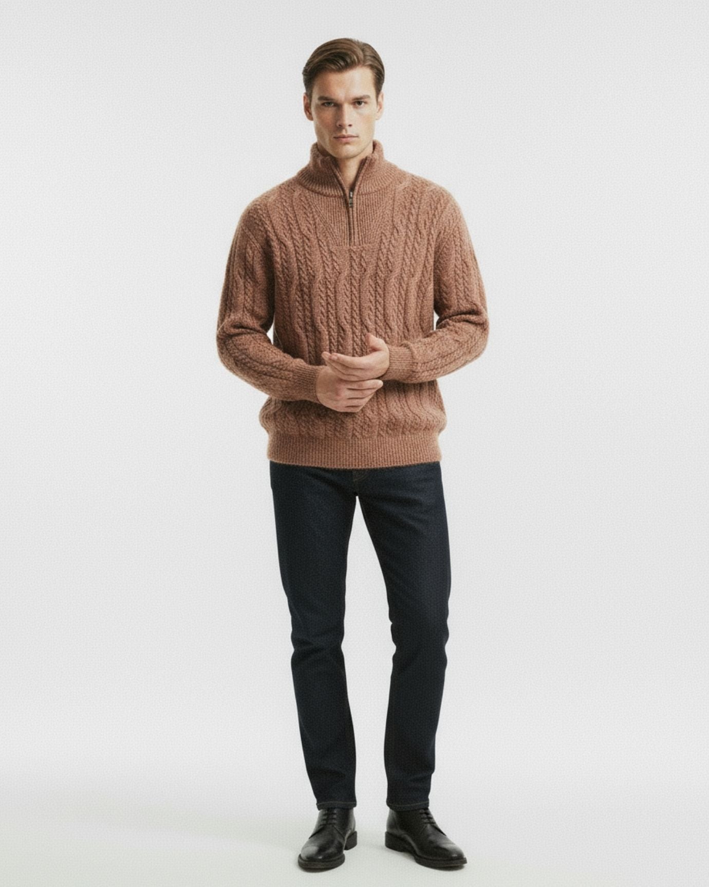
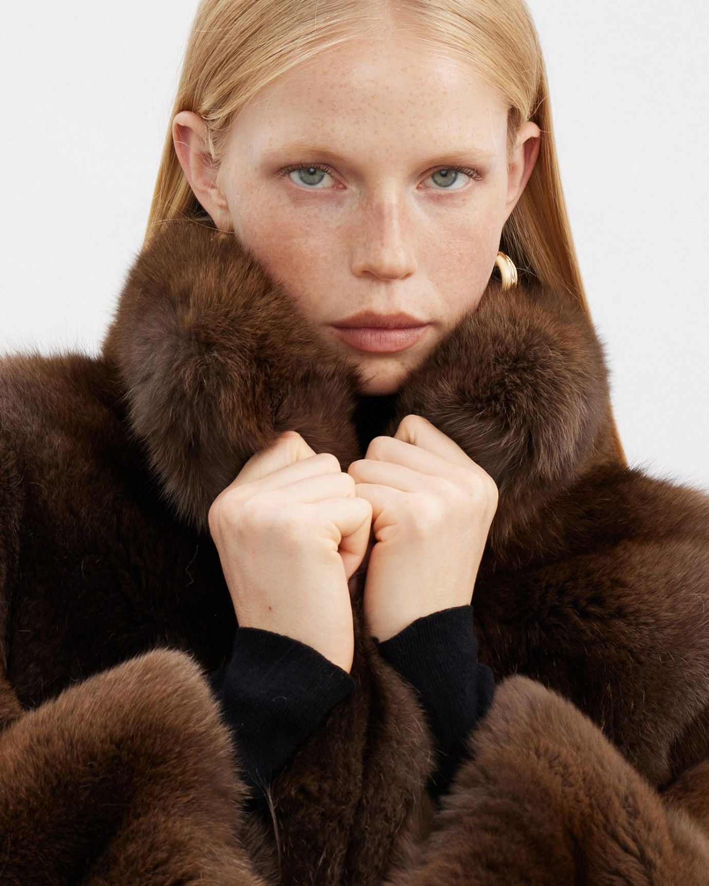
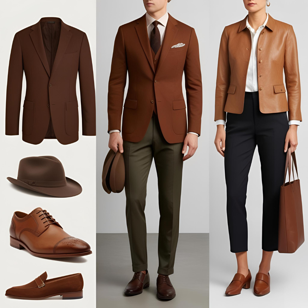
4. Camel: The Crown Jewel of Neutrals
Rich and regal, camel is a warmer, deeper evolution of beige. Think of camel-hair coats, tailored trousers, and wool skirts. This color radiates luxury and is almost synonymous with wealth passed down through generations.
Why it works:
It instantly upgrades any look. Camel flatters every skin tone and works with nearly any other neutral—making it the centerpiece of countless old money outfits.
Style it with:
-
Black for bold contrast
-
Cream or ivory for soft layering
-
Burgundy or forest green for seasonal elegance
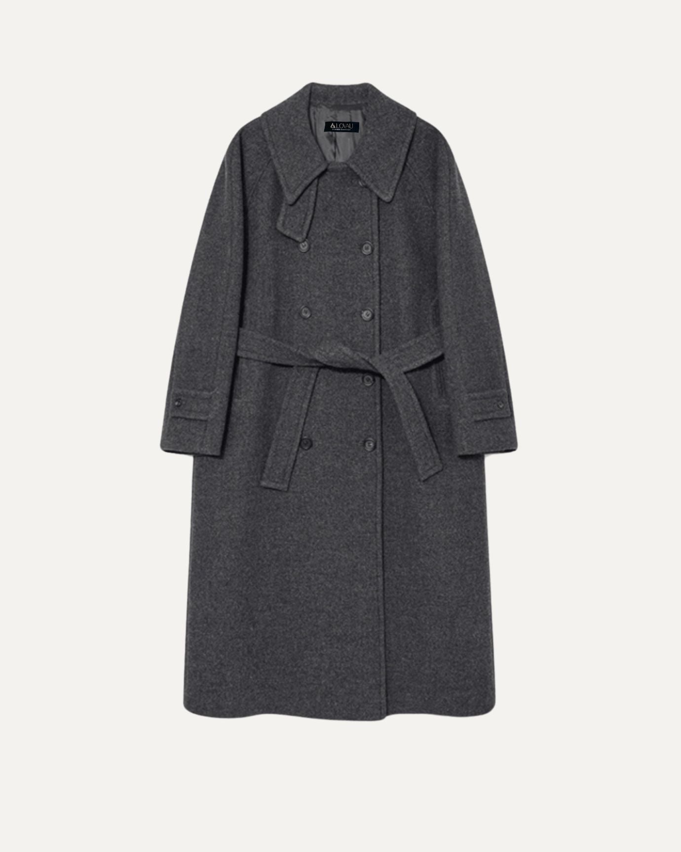
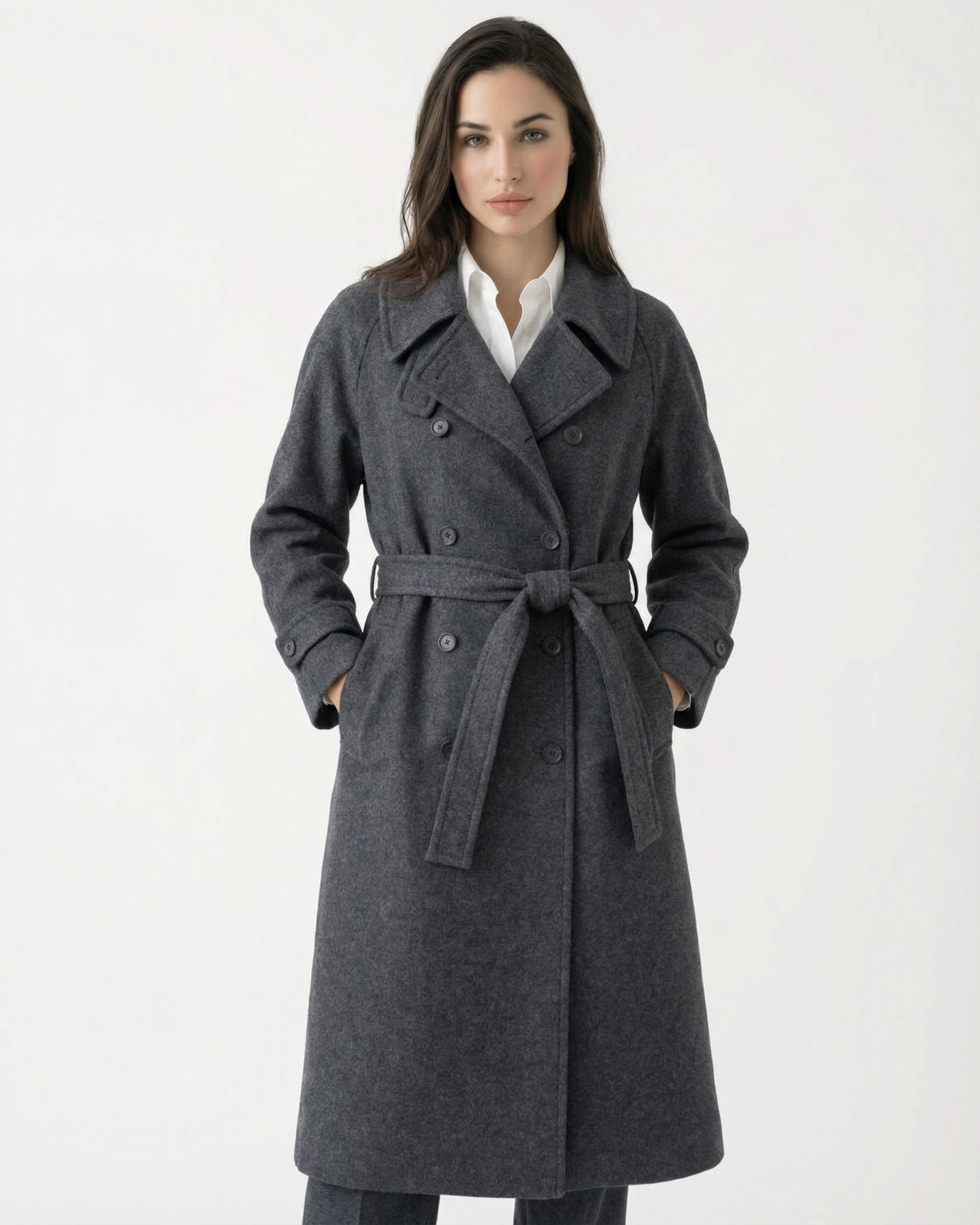
5. Gray: The Intellectual Neutral
Gray is for the thinker, the professor, the well-traveled individual who values discretion over drama. In its many shades—from dove to charcoal—gray plays a central role in cold-weather wardrobes.
Why it works:
Gray pairs effortlessly with every color, particularly other neutrals. It’s a subtle, grounding hue that adds depth without drawing attention.
Try with:
-
White for contrast
-
Navy for smart, tailored combinations
-
Blush or soft blue for a hint of personality
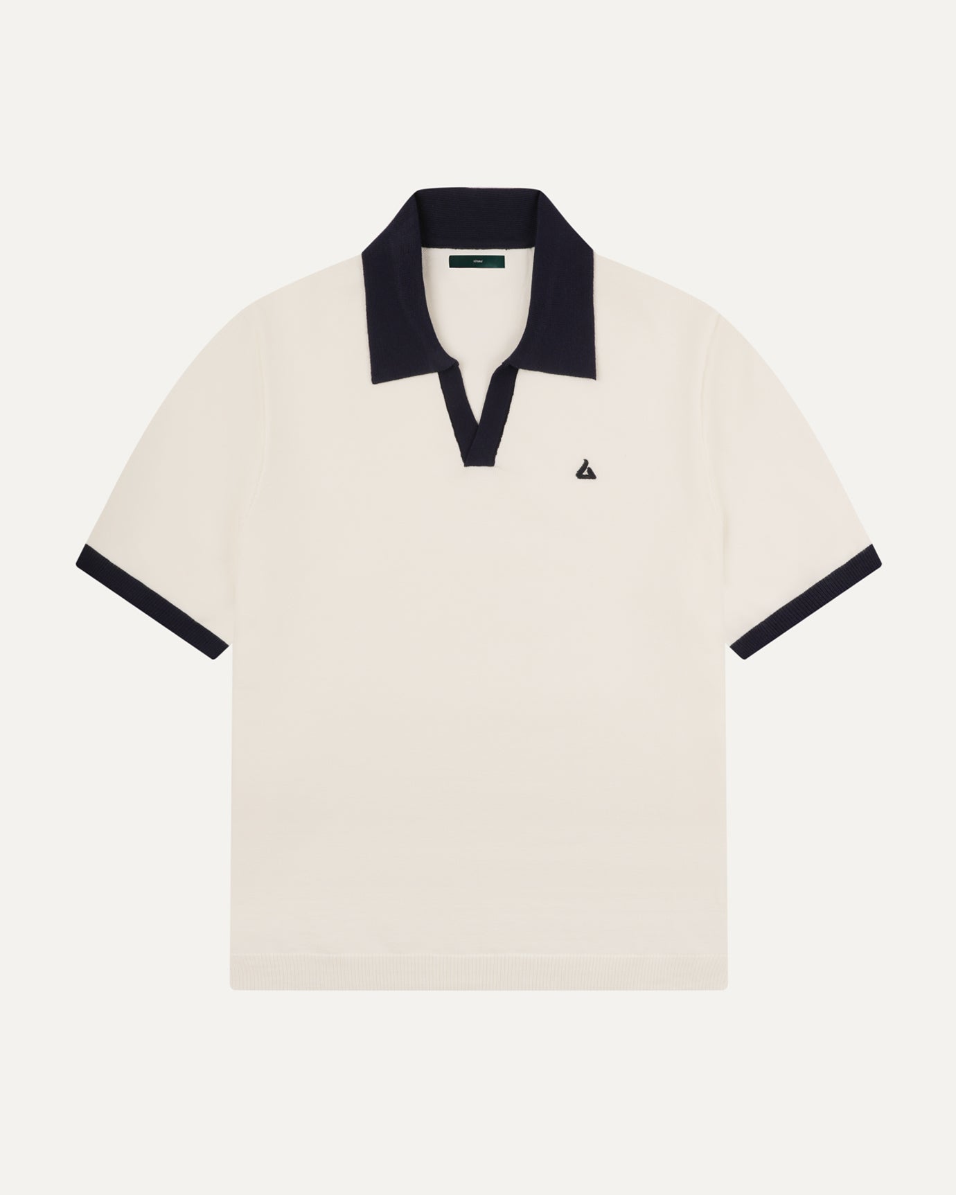
6. White: Clean and Reserved
Used strategically, white offers structure and crispness. While cream and ivory may dominate, true white adds a fresh edge to tailored shirts, linen blazers, or summer ensembles.
Why it works:
It’s sharp, precise, and timeless when kept clean and pressed. In the old money wardrobe, it’s not about trendy sneakers or graphic prints—it’s about immaculate presentation.
Combine with:
-
Navy for maritime chic
-
Beige for tonal softness
-
Gray or camel for balanced contrast
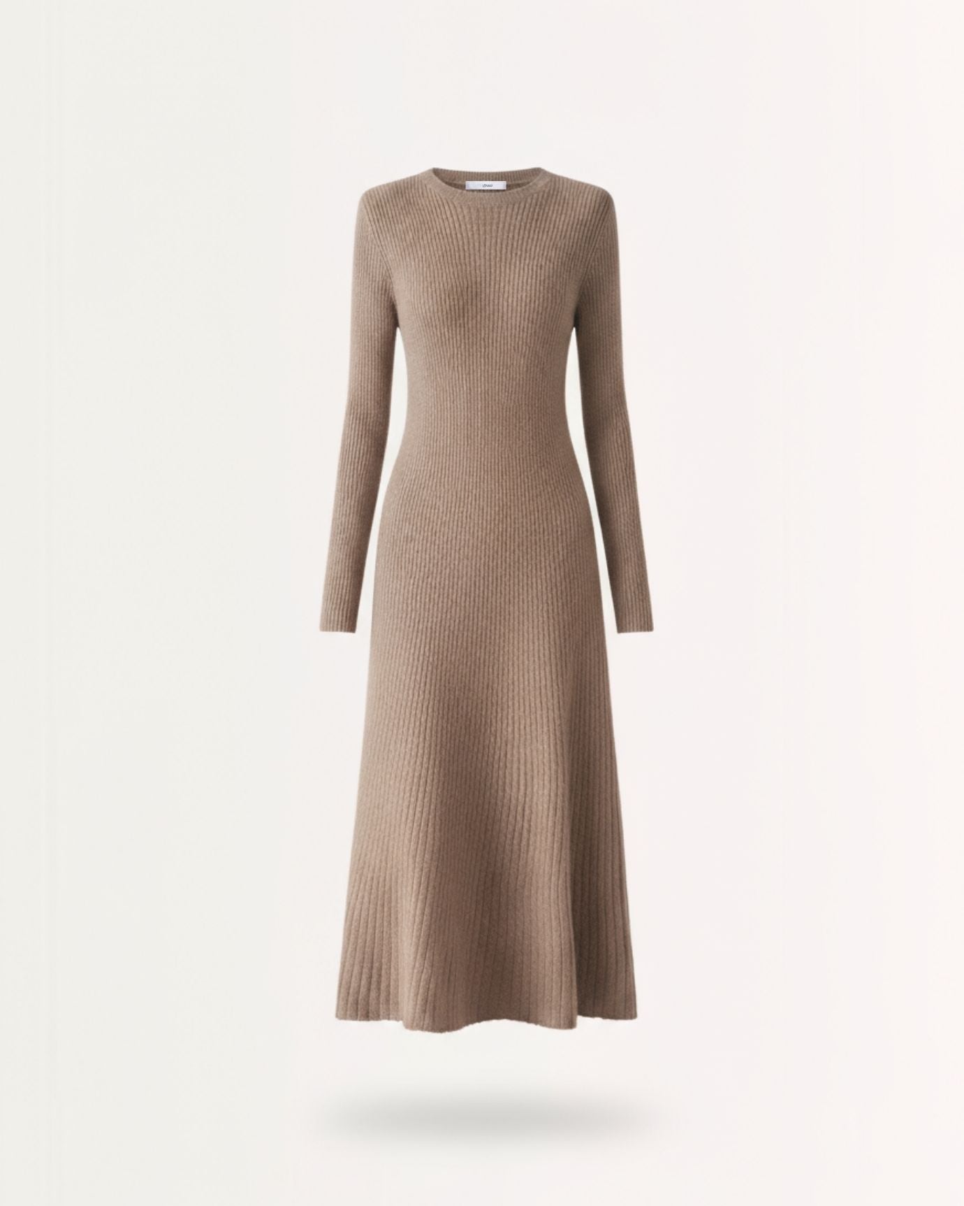
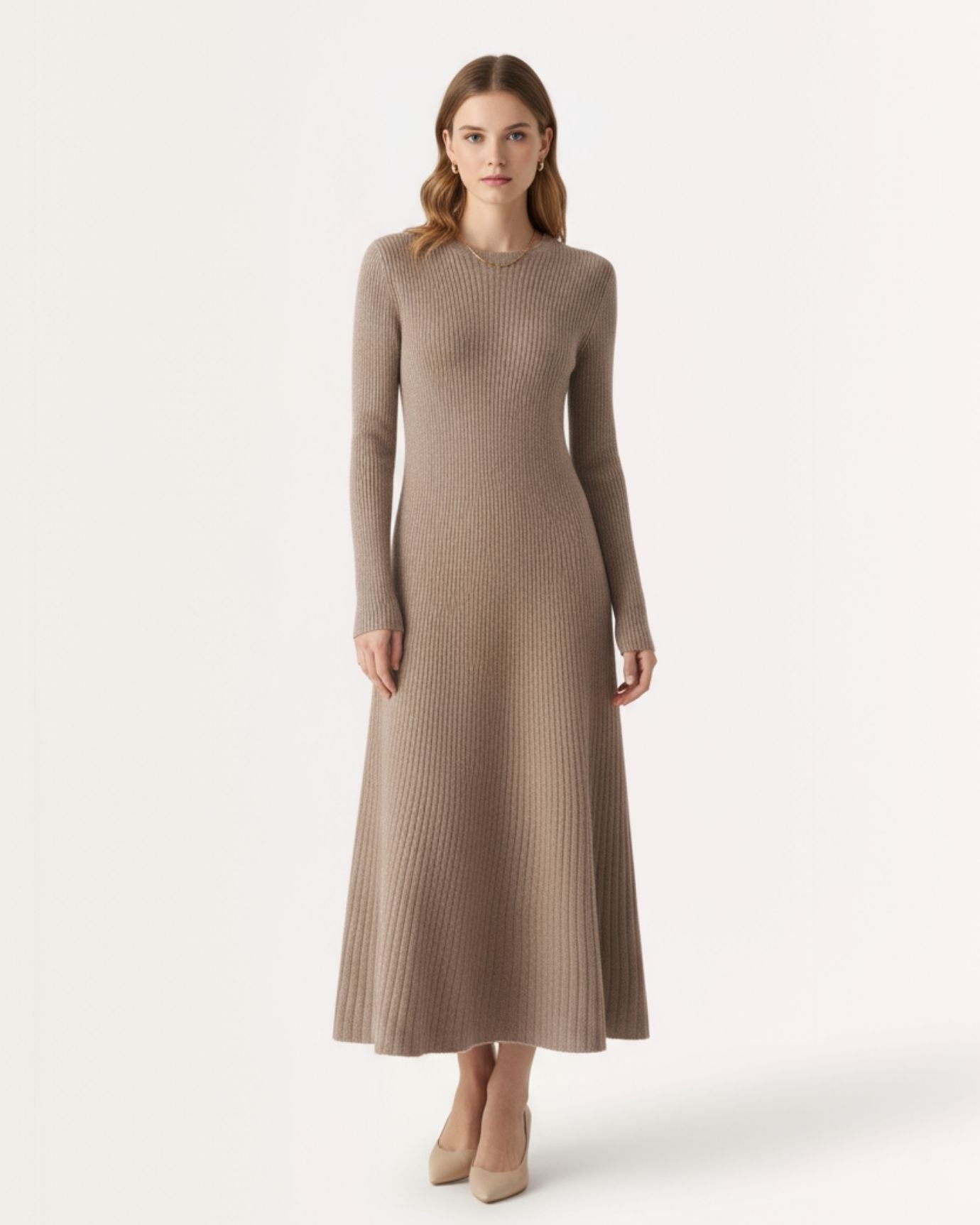
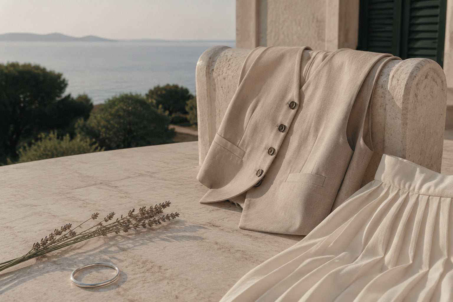
7. Taupe: The Blended Neutral
Sitting between beige and gray, taupe is a true hybrid—cooler than camel, warmer than gray. It’s the unsung hero of coats, suiting, and accessories.
Why it works:
Taupe is adaptable. It can play warm or cool depending on your outfit. It’s particularly flattering on women when worn in elegant fabrics like silk or suede.
Wear with:
-
Cream or blush for femininity
-
Olive or navy for modern sophistication
-
Charcoal for a refined mix
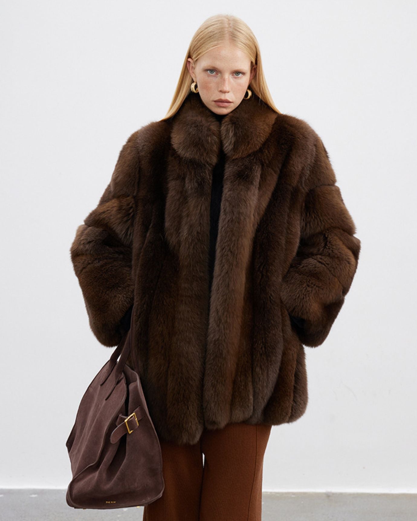
8. Olive: The Earthy Neutral
Though often considered a color, olive is used as a neutral in aristocratic dressing. With roots in military and hunting traditions, it’s especially beloved in countryside and autumn wardrobes.
Why it works:
It has heritage built into it—practical, functional, and grounded. Olive doesn’t seek attention, which makes it perfect for outerwear and accessories.
Pair with:
-
Cream or ivory for contrast
-
Brown for rustic elegance
-
Navy or burgundy for depth
9. Black: The Selective Sophisticate
While not a typical staple in old money wardrobes, black still has its place. It’s worn more frequently in urban, evening, or highly formal settings. Think of it as a tool, not a base.
Why it works:
Black provides structure and sharpness. When worn with care and quality, it can be strikingly elegant—especially in shoes, bags, and eveningwear.
Use it sparingly:
-
With camel or beige for contrast
-
In accessories only—belts, gloves, sunglasses
-
For formal occasions like opera or evening events

Final Thoughts: Neutral Doesn’t Mean Boring
The power of the old money palette lies in its subtlety. These colors aren't chosen for attention, but for longevity, adaptability, and harmony. They’re the canvas upon which a timeless wardrobe is built. By mastering these hues, you don’t just look polished—you carry the visual language of generational wealth and refined restraint.