The Psychology of Color in Old Money Fashion
In old money fashion, nothing is accidental—especially not color. Each hue chosen reflects a deeper story, a set of values, and a psychological signal. Unlike fleeting trends, old money style draws from heritage, subtlety, and inner assurance. Understanding the psychology behind the color palette of generational wealth allows us to decode what these shades say without uttering a word.
Why Color Psychology Matters in Old Money Aesthetics
Color isn’t just visual—it’s psychological. It influences perception, behavior, and even how others judge your social standing. In old money wardrobes, colors aren’t loud or flashy because those who come from wealth don’t feel the need to prove it. The result? A palette of understated, thoughtful tones that signal timeless sophistication.
1. Cream & Ivory: The Language of Quiet Power
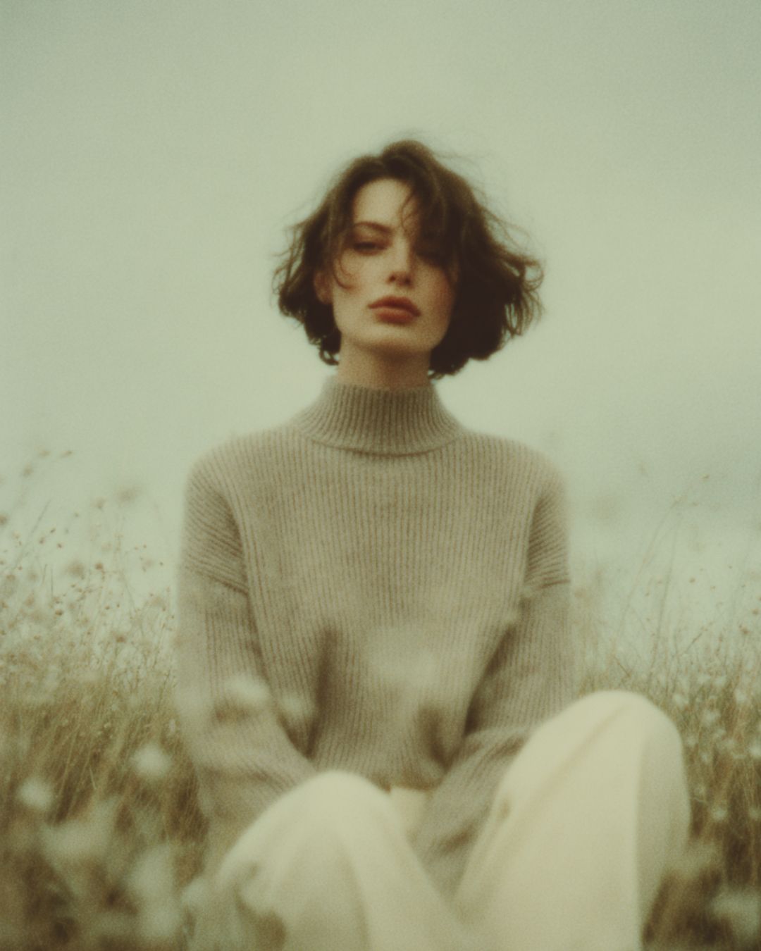
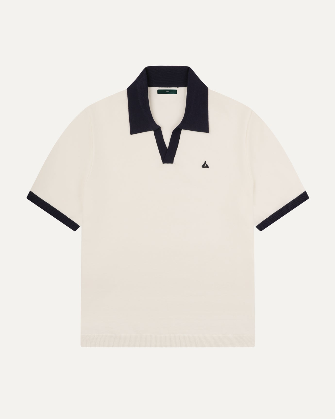
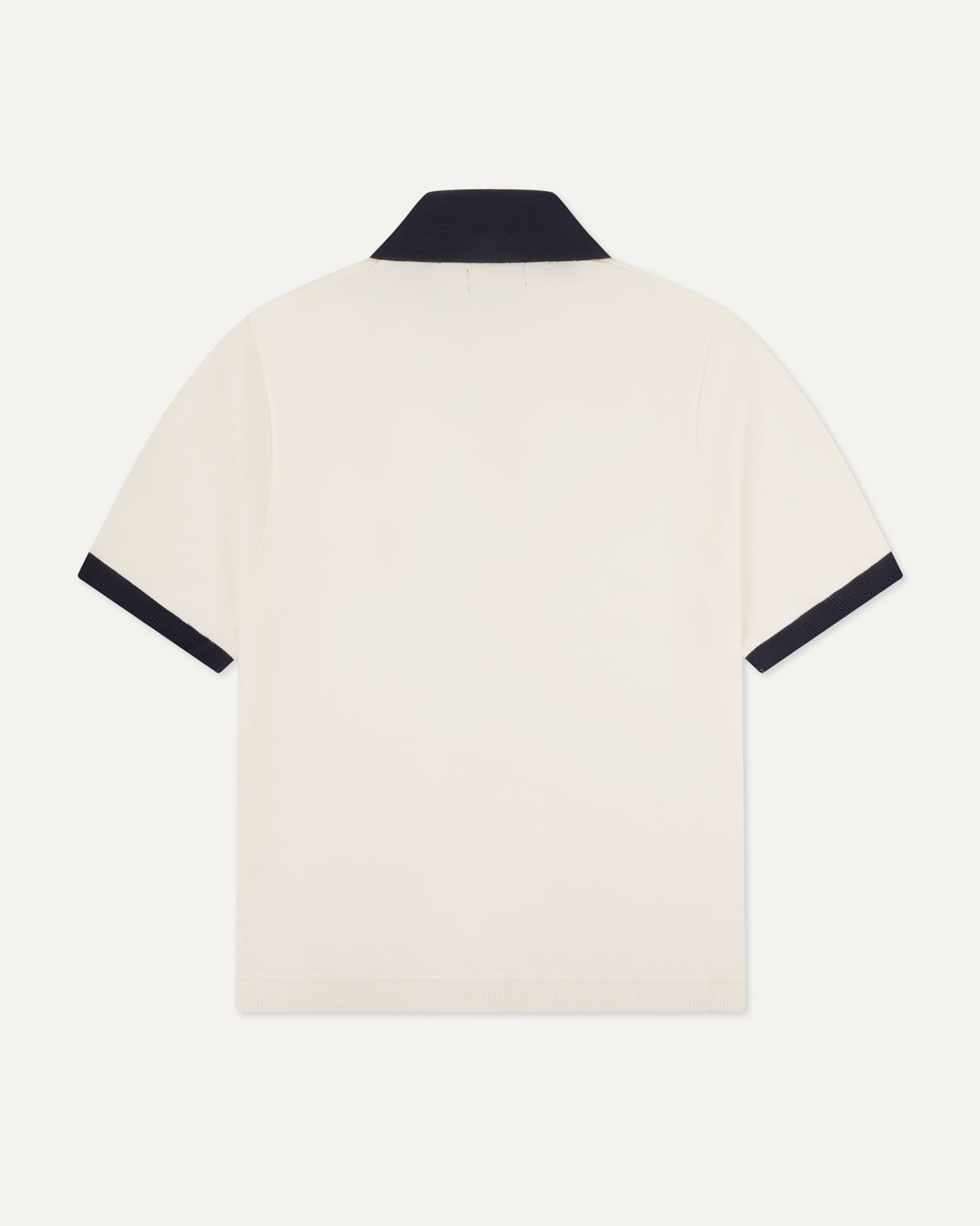
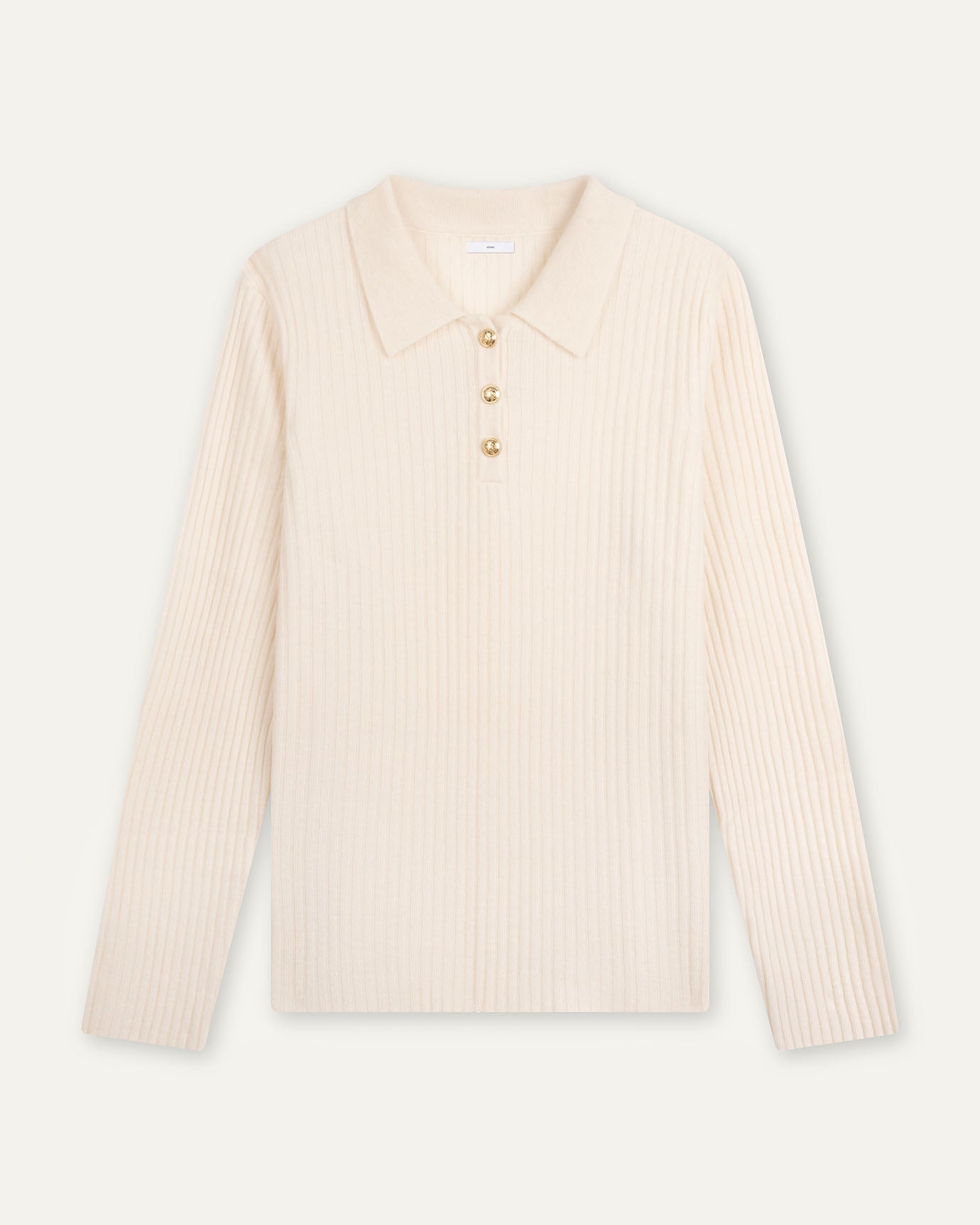
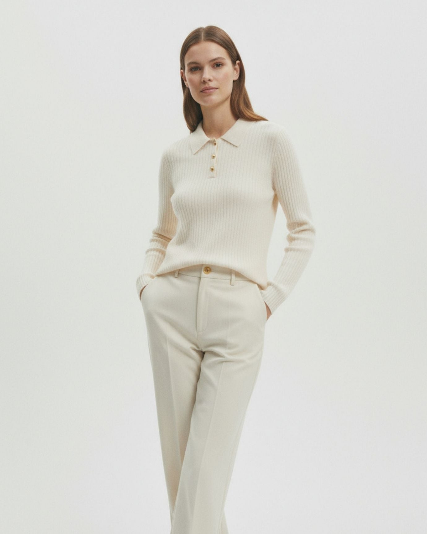
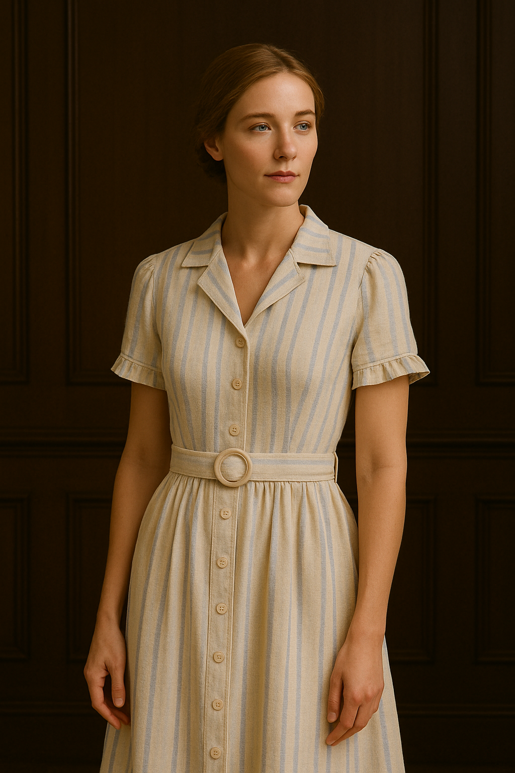
Nothing captures restraint and refinement quite like cream. It's the color of confidence without attention-seeking, and in the realm of old money fashion, it's used to signal grace and exclusivity.
-
Psychological cue: Cream evokes calmness, cleanliness, and composure.
-
Where it shines: Cashmere sweaters, linen trousers, silk blouses, and heritage coats.
Wearing cream suggests you’re not afraid of spills—because you don’t rush, and you control your surroundings.
2. Navy Blue: Authority Without Aggression
Navy is one of the most dependable colors in the old money palette. It's less aggressive than black but still communicates strength, discipline, and intelligence.
-
Psychological cue: Trust, tradition, and discretion.
-
How it’s worn: Tailored blazers, boat shoes, structured dresses, and pea coats.
Navy signals leadership, especially among aristocrats, military families, and Ivy League alumni.

3. Olive & Sage: Earthy, Grounded, and Classically Masculine
In both men's and women’s fashion, olive green and sage suggest a relationship with the outdoors, family estates, and a love for tradition.
-
Psychological cue: Stability, reliability, and depth.
-
Style associations: Waxed jackets, countryside knitwear, equestrian outfits, and vintage utility wear.
These tones are deeply tied to aristocratic leisure—think fox hunts, garden parties, or afternoons in the English countryside.
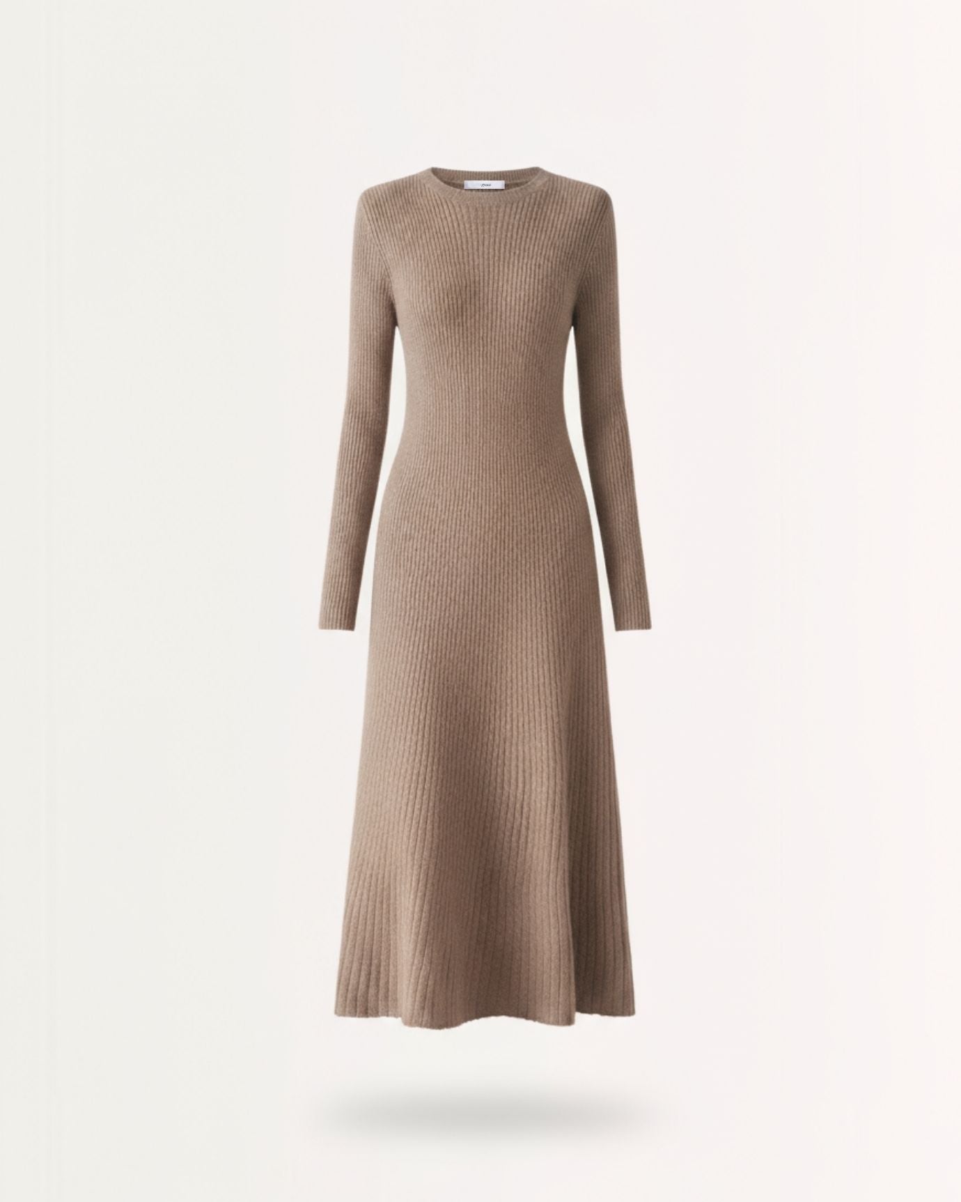
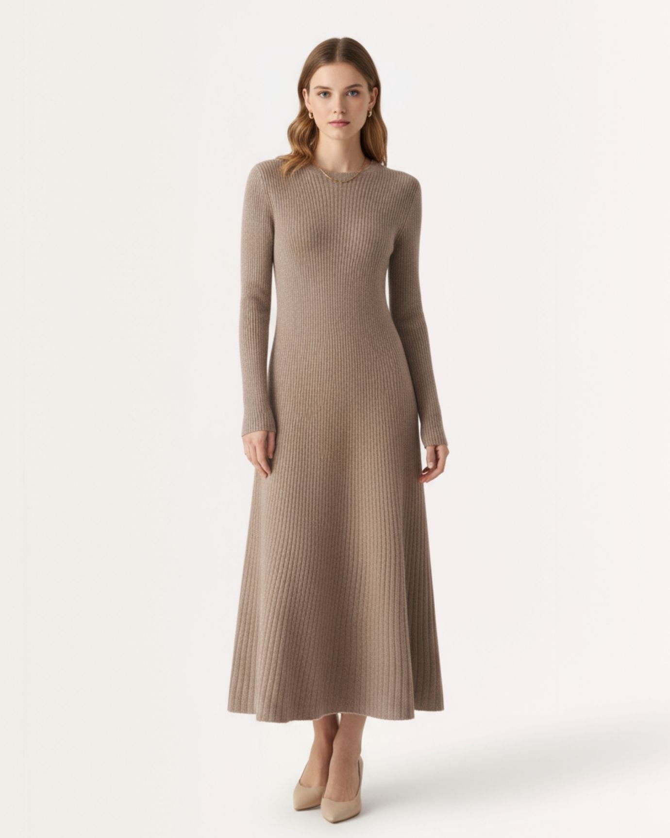
4. Camel & Beige: Reserved Elegance
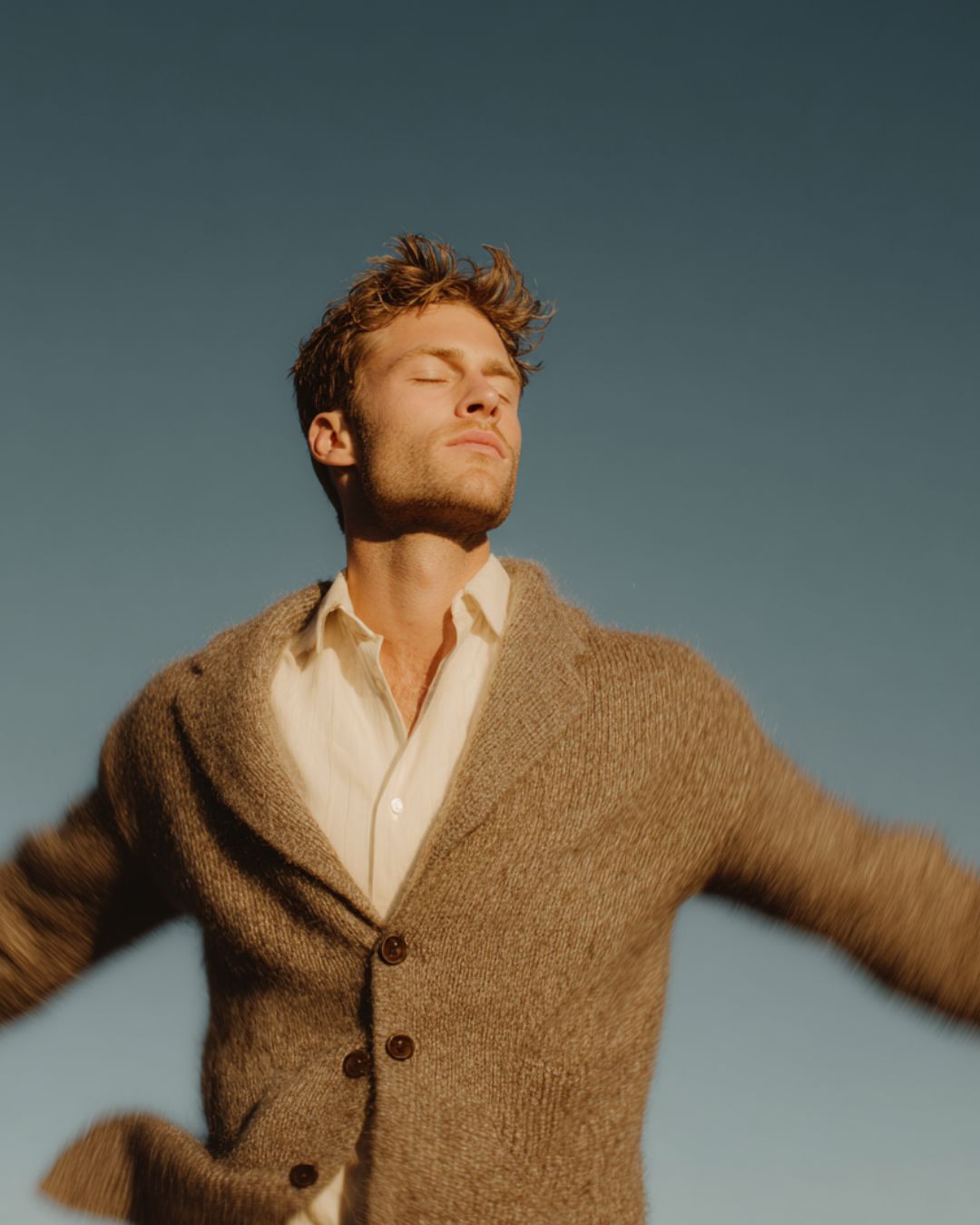
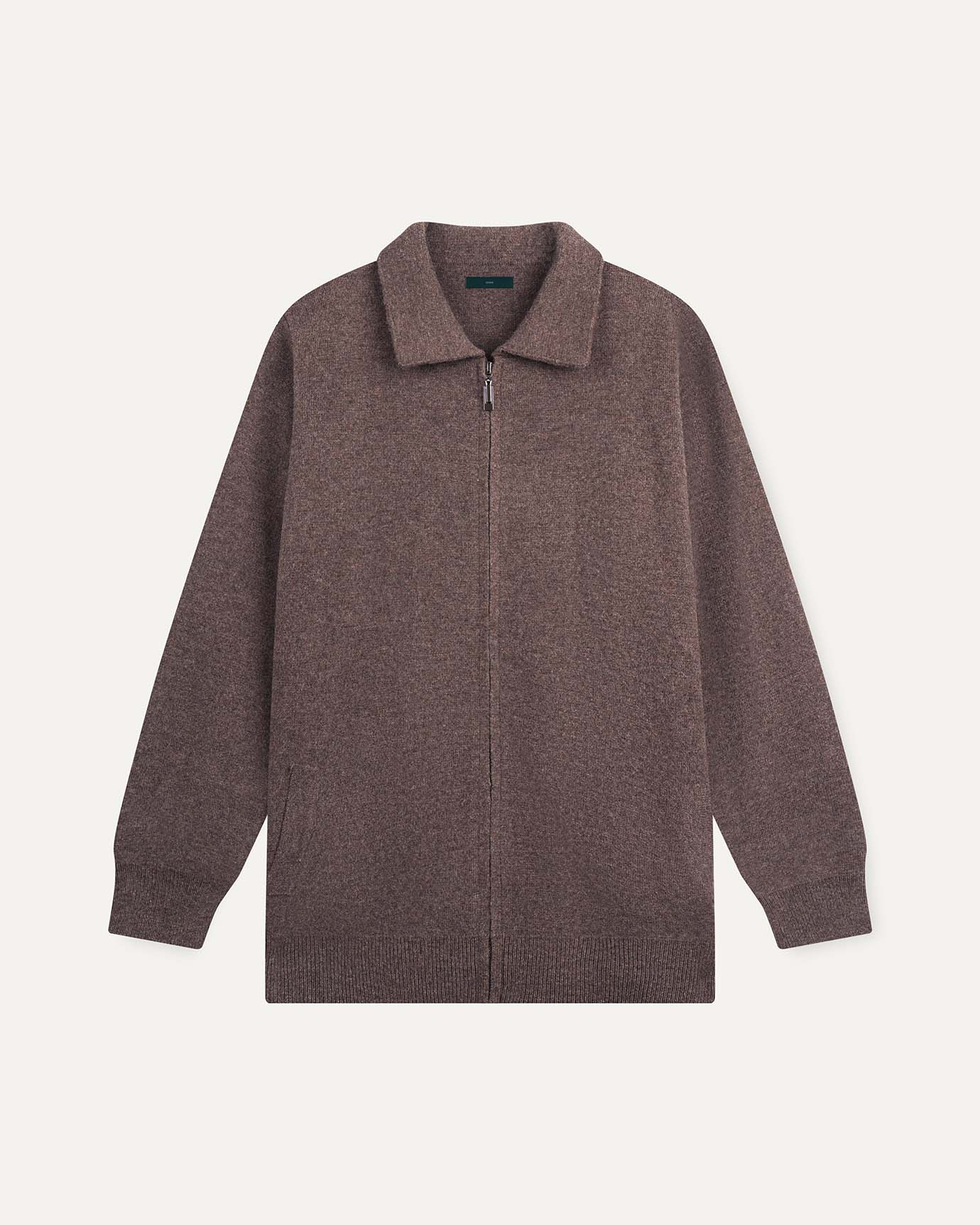
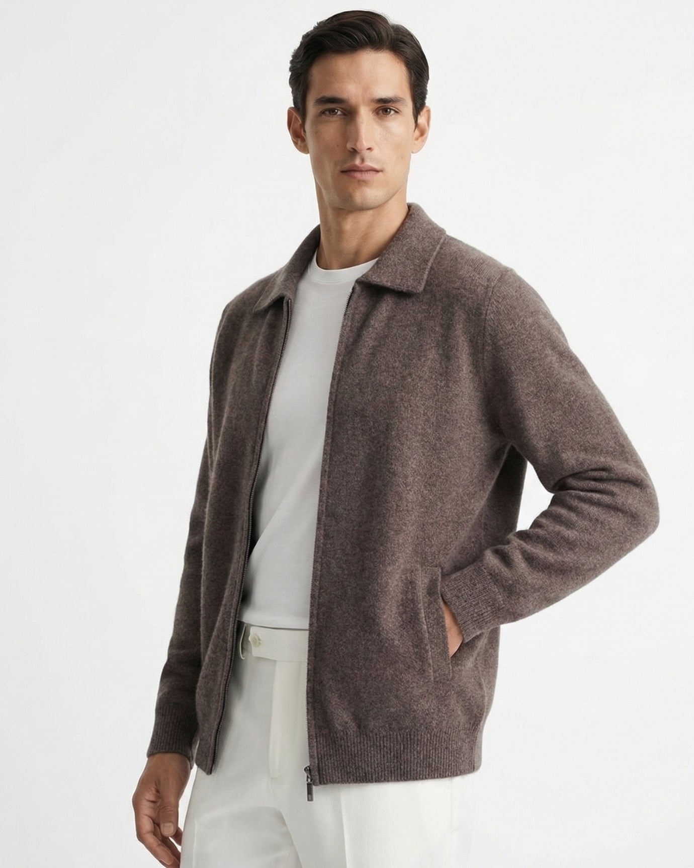
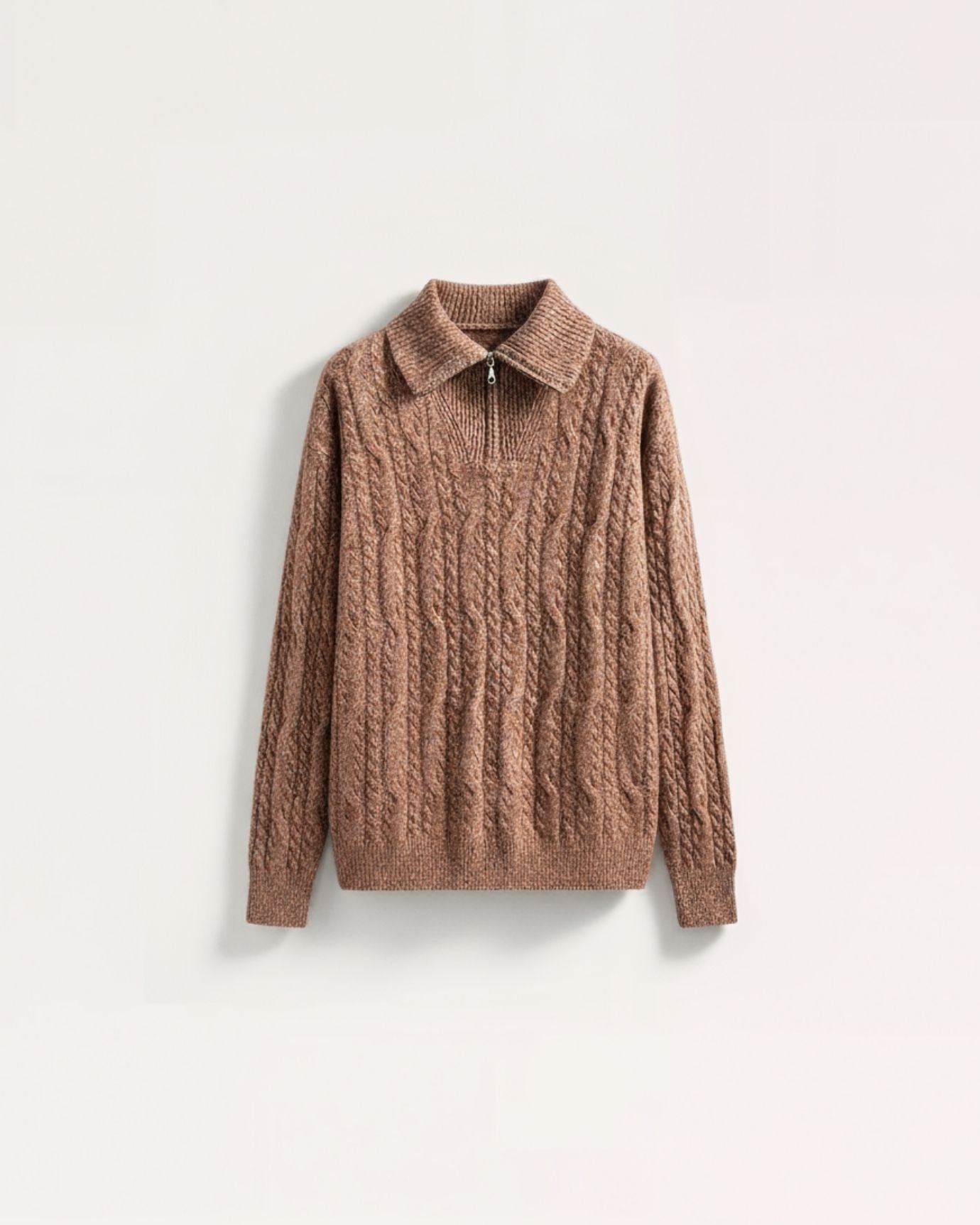
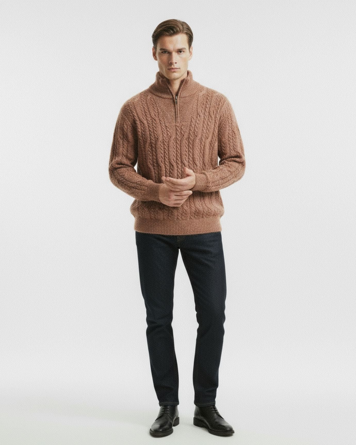
The most beloved outerwear in old money circles often comes in camel or beige—not black. These hues are neutral, harmonious, and non-confrontational.
-
Psychological cue: Soft power, warmth, and quiet luxury.
-
Worn as: Wool coats, leather loafers, trousers, and trench coats.
These tones avoid drama and give off an air of "old family money" rather than "new money splash."
5. Muted Pastels: Feminine Poise Without Excess
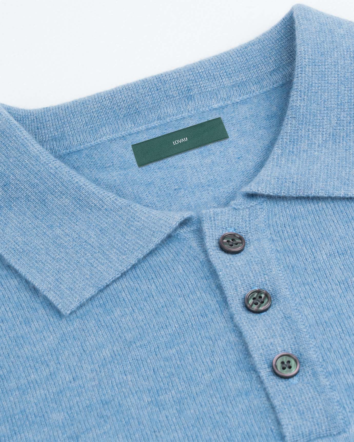
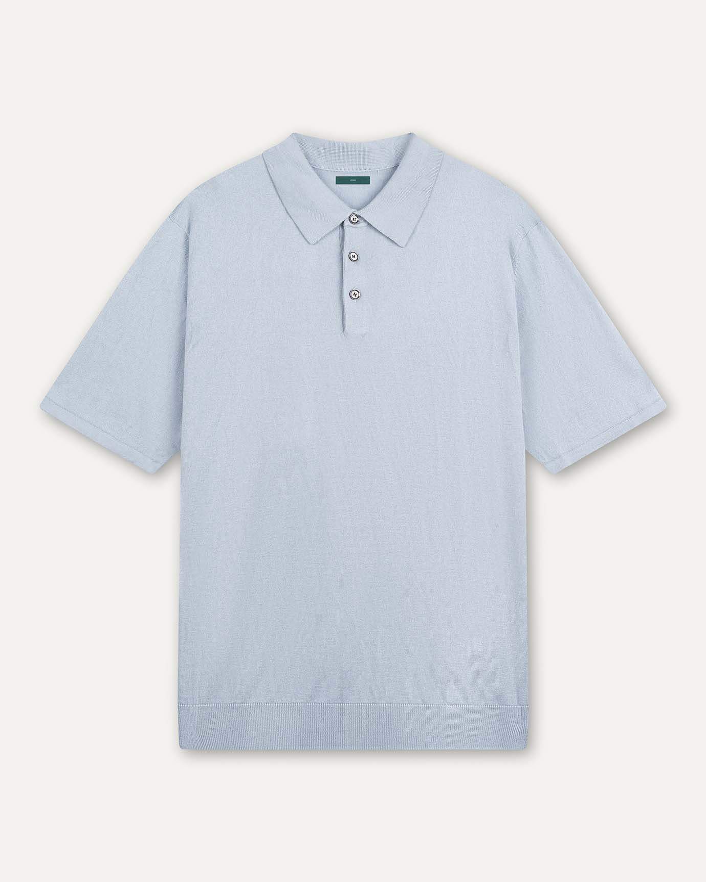
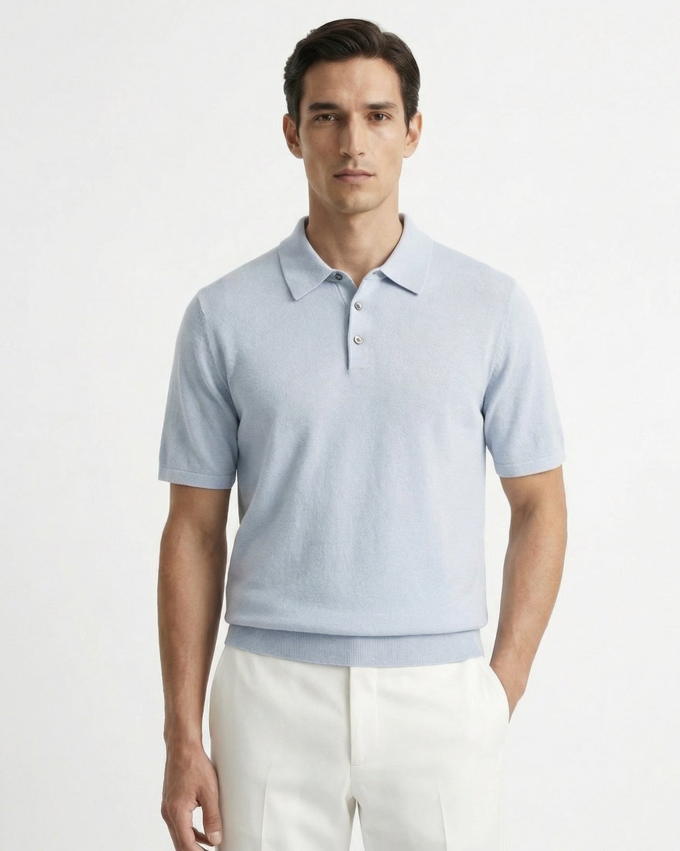
Old money women are often seen in dusty rose, soft lavender, sky blue, or pale mint. These aren’t candy colors—they’re softened, vintage tones that whisper instead of shout.
-
Psychological cue: Gentleness, composure, and subtlety.
-
Perfect for: Garden parties, weddings, resort wear, or lunch at the country club.
These hues allow femininity to shine without appearing girlish or trendy.
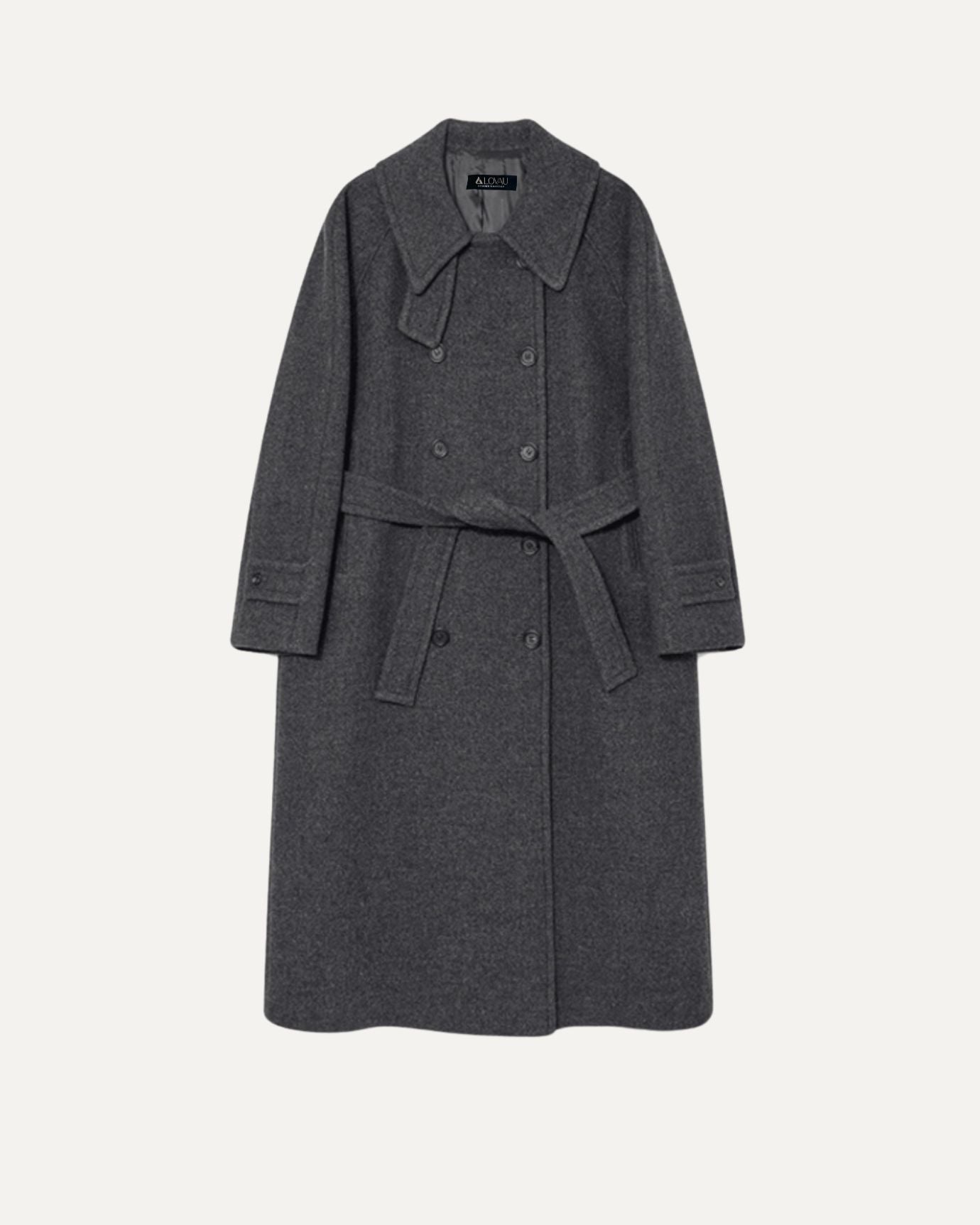
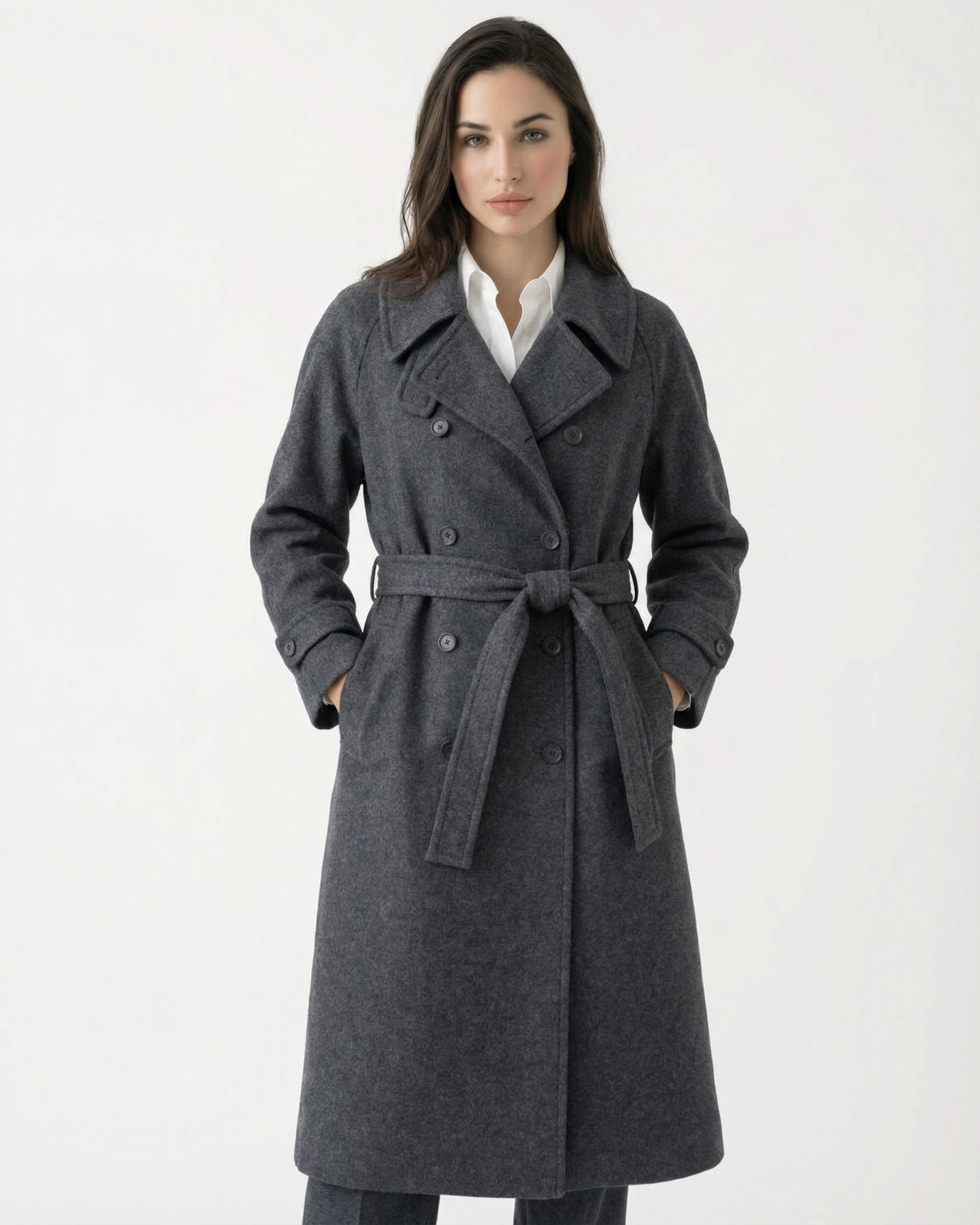
6. Charcoal Gray: Discipline and Nobility
Gray is the middle ground—neither dark nor light, rich nor poor. But in old money style, charcoal or heather gray serves as a visual cue for maturity and wisdom.
-
Psychological cue: Respect, balance, and intellect.
-
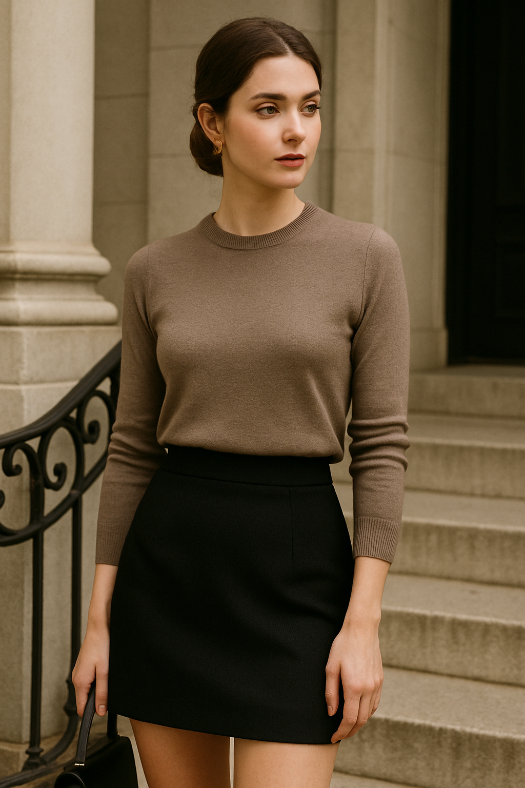
Old money staples: Double-breasted suits, wool coats, tailored skirts, and riding breeches.
Gray is worn by those who have nothing to prove—and the money to prove it if they wanted to.
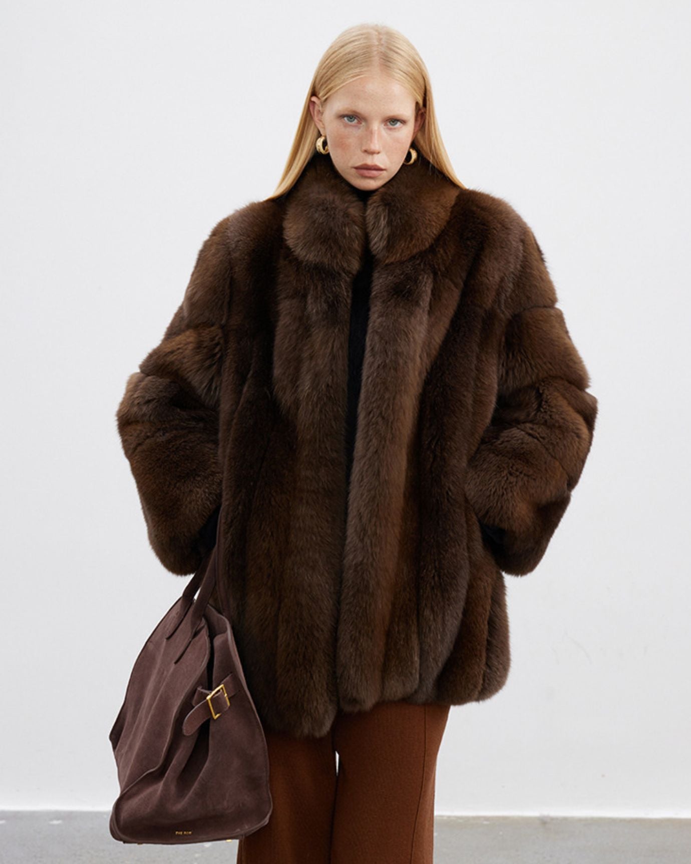
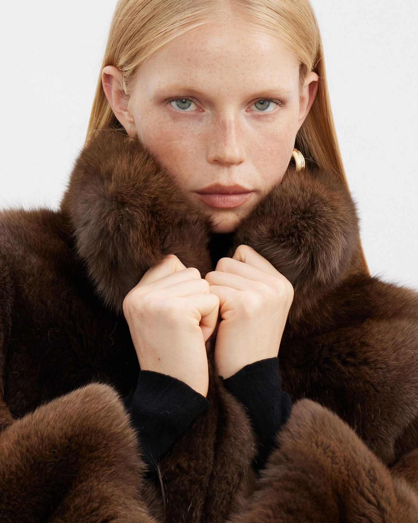
7. Burgundy & Oxblood: Aristocratic Richness
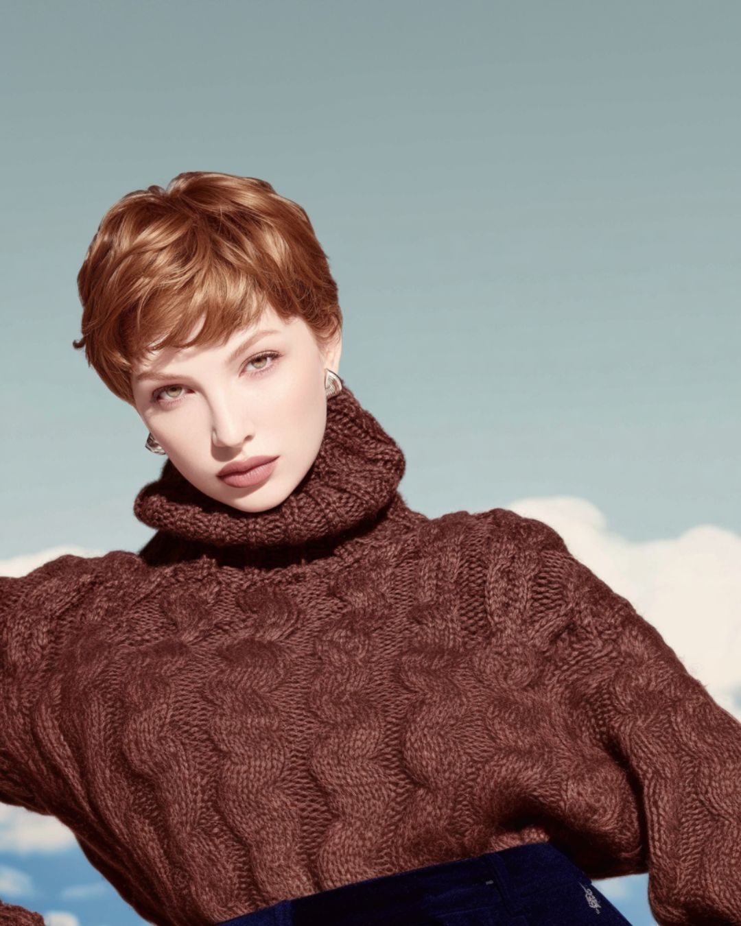
When old money uses color for depth, burgundy is the go-to. It’s rich but not bright, dramatic but still reserved.
-
Psychological cue: Heritage, wealth, and ceremonial tradition.
-
Where it shows up: Velvet smoking jackets, leather gloves, heirloom handbags, or crested ties.
These shades are deeply connected to European nobility and old university halls.
8. White: Purity, Prestige, and Immaculate Taste
True white—unlike cream—carries a different weight in old money wardrobes. It’s worn when making a statement of flawless control and timeless etiquette.
-
Psychological cue: Order, wealth, and status.
-
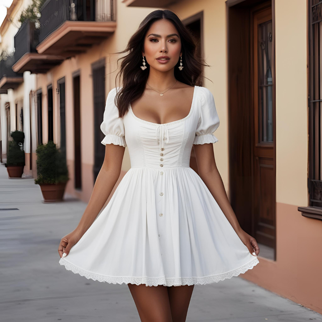
Typical uses: Crisp button-down shirts, tennis dresses, and vintage yacht wear.
Wearing white casually sends a clear message: I live in a world where stains don’t happen.

9. Black: Reserved for Formality and Mourning
As discussed in detail in our previous post, black is used with caution in old money circles. It’s a color of solemnity, not daily wear.
-
Psychological cue: Authority, formality, and quiet mourning.
-
Most appropriate in: Evening gowns, tuxedos, winter outerwear, or funerals.
In casual wear, black can feel too urban or severe for the soft aesthetics of true wealth.
10. Gold & Brass Accents: The Power of Detail
While not used as dominant colors, gold and brass accents in jewelry, belt buckles, watch details, or buttons hold visual weight in old money fashion.
-
Psychological cue: Permanence, royalty, and tradition.
-
Effect: These subtle elements elevate an outfit without turning it ostentatious.
Think of them as the punctuation marks in an otherwise quiet visual sentence.
Color Pairing Rules in Old Money Style
-
Soft with soft: Pair cream with taupe, sage with ivory.
-
Contrast gently: Burgundy with navy, or gray with pastel blue.
-
Avoid clashing: Neons, saturated reds, or over-reliance on pure black can break the aesthetic.
-
Layer tones, not shades: Instead of monochrome, use gradients and textures to build richness.
Final Thoughts: Color as Identity
In old money style, color is less about fashion and more about identity. These hues have history, psychology, and prestige baked into them. Wearing them signals more than taste—it signals belonging. To dress like old money is to understand how every shade plays its role, not in standing out, but in standing apart.


