

How to Wear All-Beige Outfits Without Looking Washed Out
Reading time 13 min • 2689 words
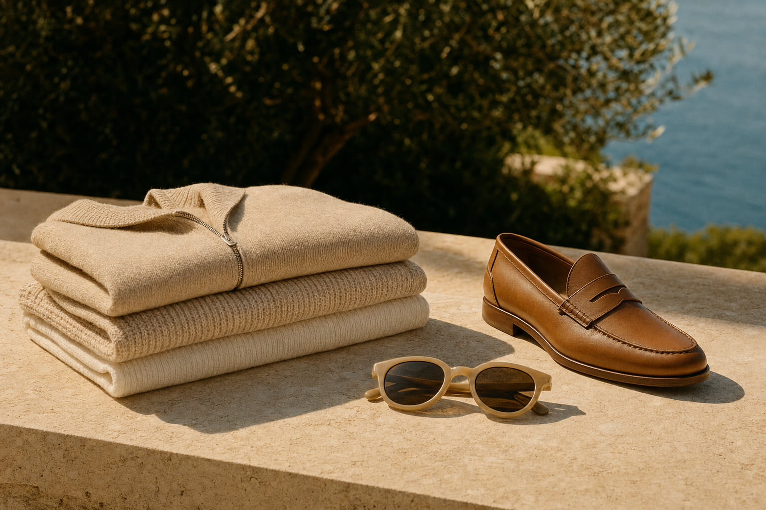
Beige is the colour most people reach for when they want to look polished and most people wear it badly. The problem is almost never the colour itself. It is the assumption that beige is neutral enough to take care of itself, that you can put on a cream shirt, sand trousers, and a biscuit-coloured coat and walk out looking put-together. Without deliberate tonal contrast and considered fabric choices, the result is a silhouette that disappears into itself.
The wardrobe tradition that informs the Lovau aesthetic, rooted in the Mediterranean coast and the understated European approach to dress, has always treated beige as a full palette rather than a single colour. Oatmeal, ecru, camel, honey, sand, greige: these are distinct shades that behave differently on different skin tones and fabrics. Learning to distinguish between them and to layer them with intention is what separates a monochrome outfit that reads as elegant from one that reads as unfinished.
This guide covers the specific mechanics: which shades to anchor the look with, how to use texture as a substitute for colour contrast, how to dress for your complexion, and which accessories hold a tonal outfit together without breaking the palette.
Key takeaways
- Anchor the look with one deep camel piece to give the eye a reference point and stop the outfit reading as one flat wash of colour.
- Mix at least two fabric textures, such as a matte wool knit against a smooth woven trouser, to create visual definition without introducing a second colour.
- Choose your beige shade based on your skin's undertone: cool, pinkish complexions carry pale oatmeal well; warm, olive or deeper complexions suit rich camel and honey tones.
- Fit is the single most important variable in a tonal outfit. Anything slightly too loose collapses into shapelessness when there is no colour contrast to define the silhouette.
- A single metallic accessory, warm gold rather than silver, gives an all-beige look a focal point without breaking the palette.
In this guide
- Why All-Beige Outfits Go Flat and How to Fix It
- Choosing the Right Beige Shade for Your Complexion
- Using Texture to Create Contrast Without Adding Colour
- Building the Outfit: Proportions, Fit, and Silhouette
- Accessories That Anchor an All-Beige Look
- Occasion Dressing in All-Beige: What Works Where
- Frequently asked questions
Why All-Beige Outfits Go Flat and How to Fix It
The technical reason a monochrome beige outfit looks washed out is a lack of value contrast. In colour theory, value refers to the relative lightness or darkness of a tone. When every piece in an outfit sits at the same value level, the eye has no natural resting point and the figure reads as a single undifferentiated shape.
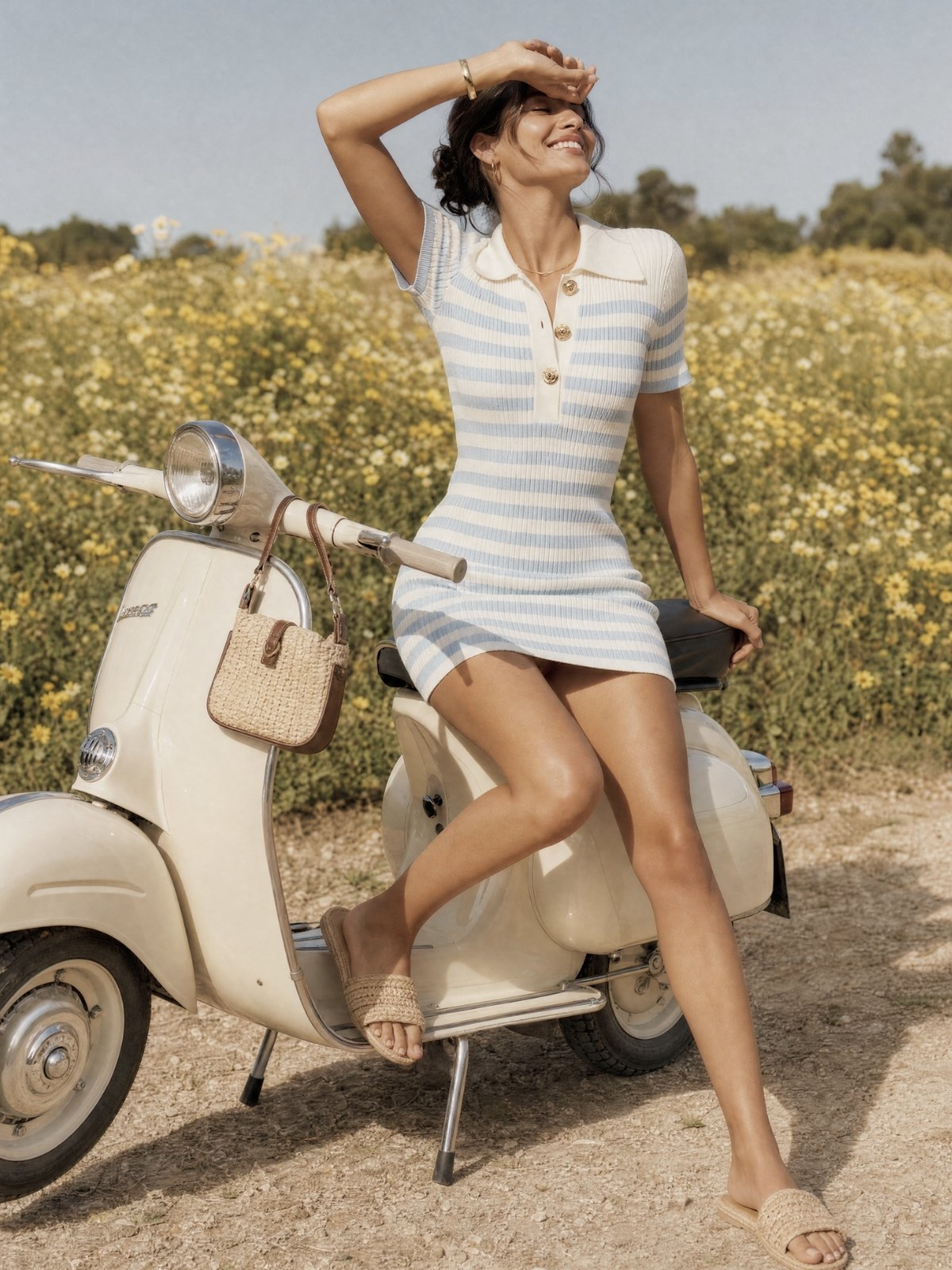
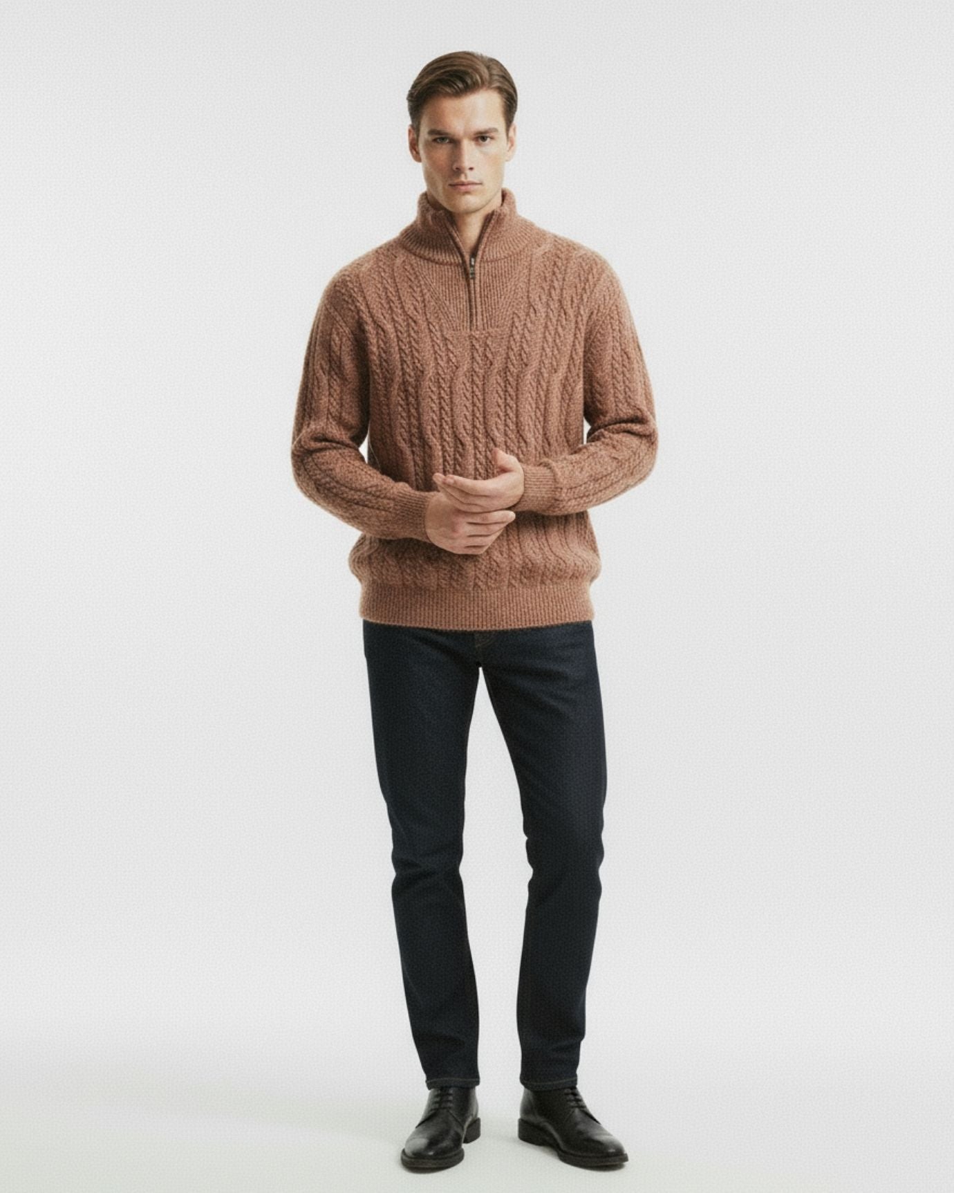
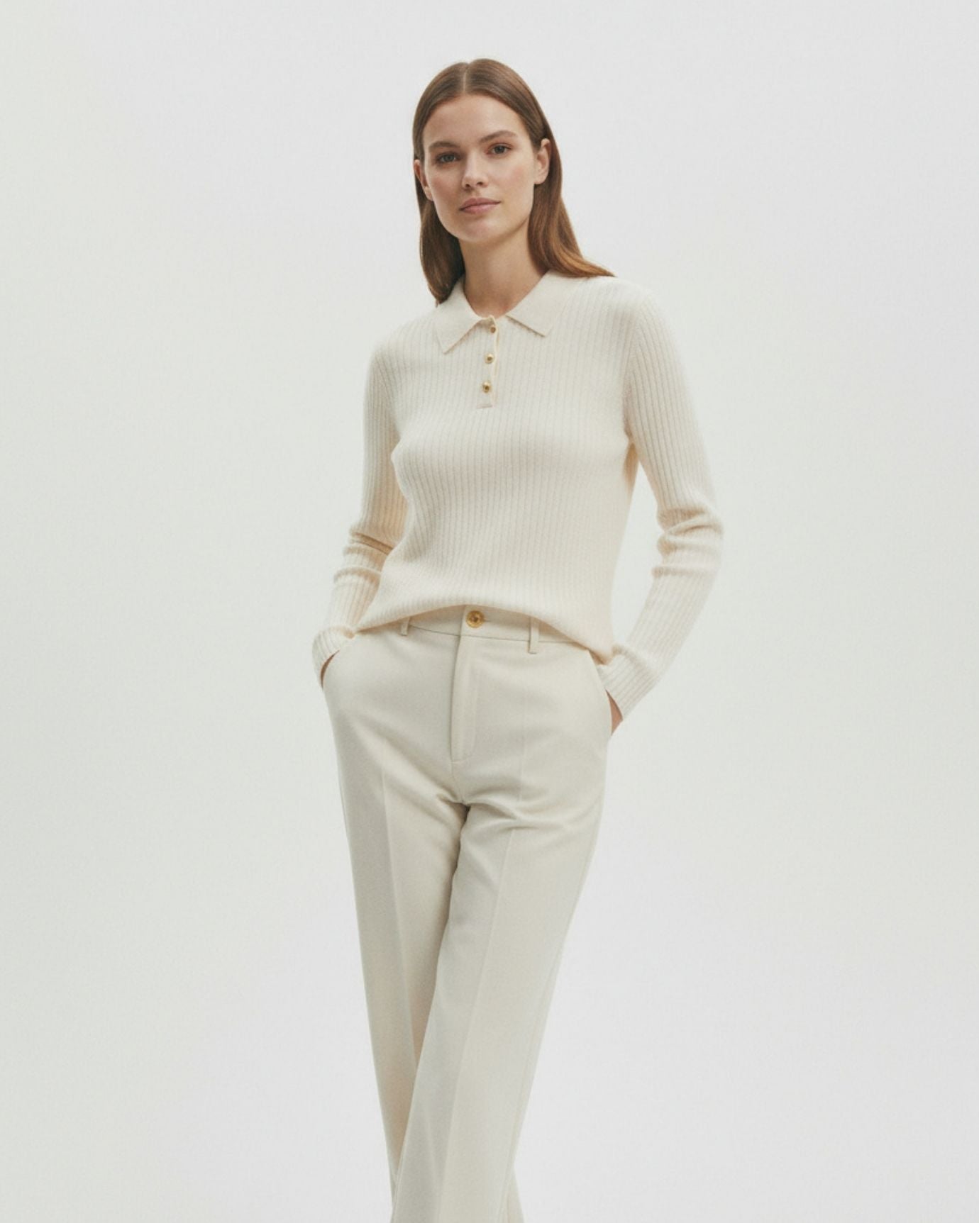
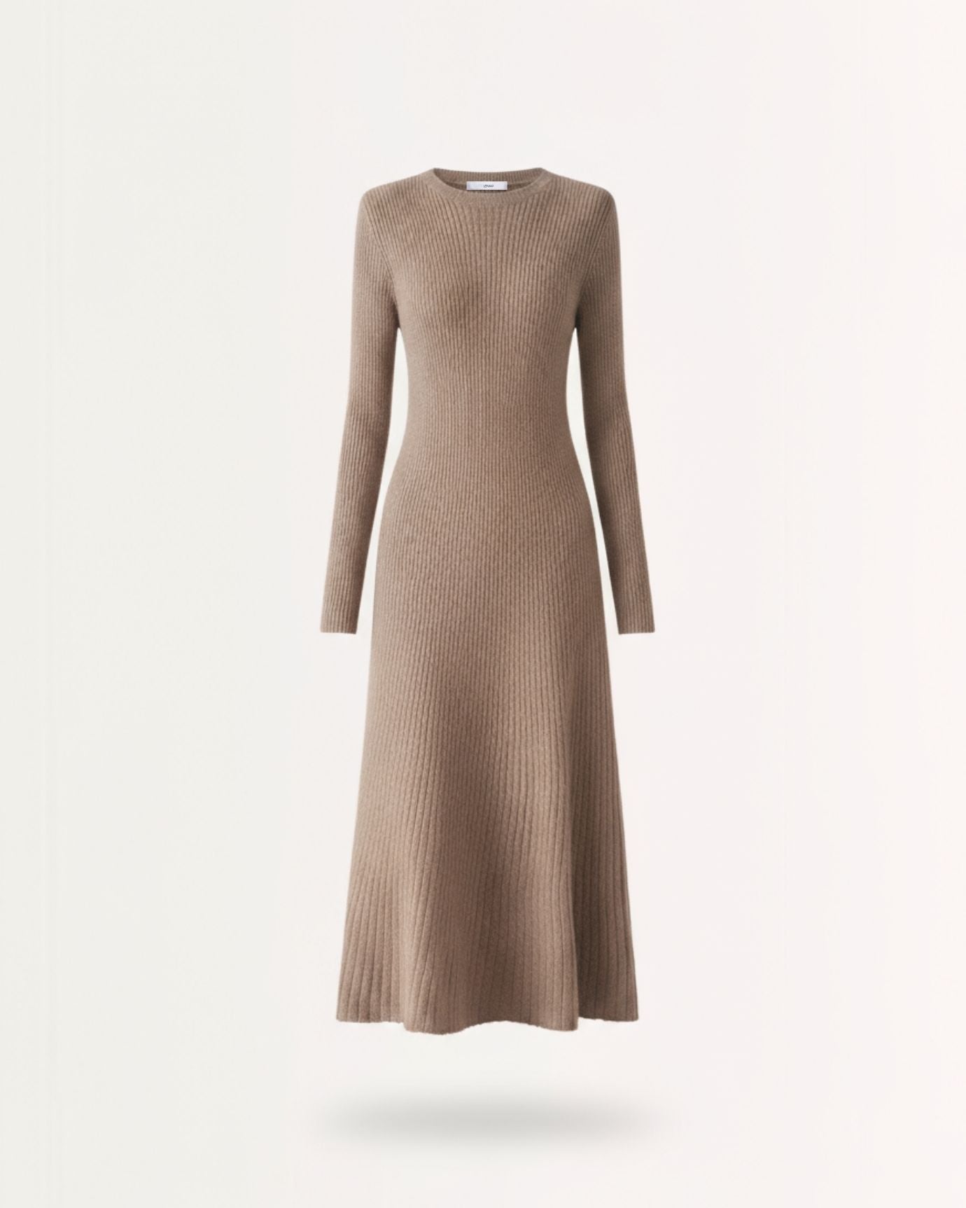
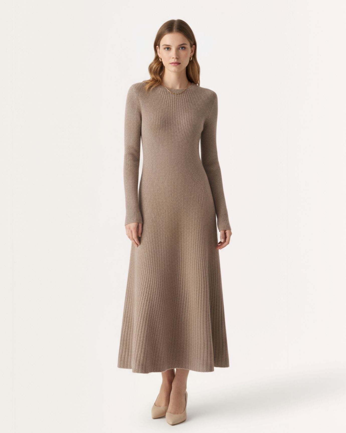
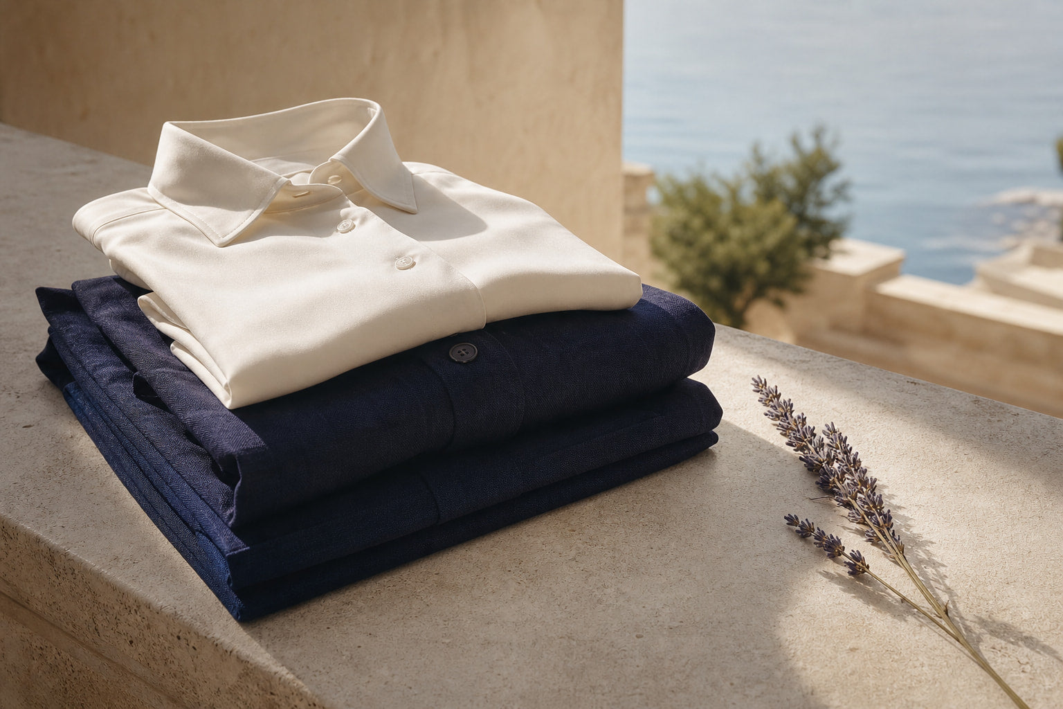
The fix is not to introduce a different colour. It is to introduce a darker shade within the beige family. This is the principle behind the oatmeal and camel combination that appears throughout classic European dress. Oatmeal sits at the pale end of the spectrum. Camel sits at the warm, medium-dark end. Together they create enough value contrast to define a silhouette without breaking the tonal palette.
In practice, this means treating one piece as your anchor shade and building lighter tones around it. A camel-coloured trouser or skirt anchors the lower half. An oatmeal or ecru knit sits above it. The eye reads the division between them, the silhouette becomes legible, and the outfit no longer collapses into a single beige mass.
For a deeper look at how this principle plays out across a full wardrobe, the editorial piece on wearing all beige correctly covers the styling logic in more detail.
Expert insightA useful rule of thumb: if you hold your outfit pieces next to each other and cannot tell where one ends and the other begins, you need a darker anchor shade before you add anything else.
Choosing the Right Beige Shade for Your Complexion
Beige is not universally flattering in the same shade. The reason some people look drained in a cream-coloured outfit while others look luminous comes down to the relationship between the garment's undertone and the skin's undertone.
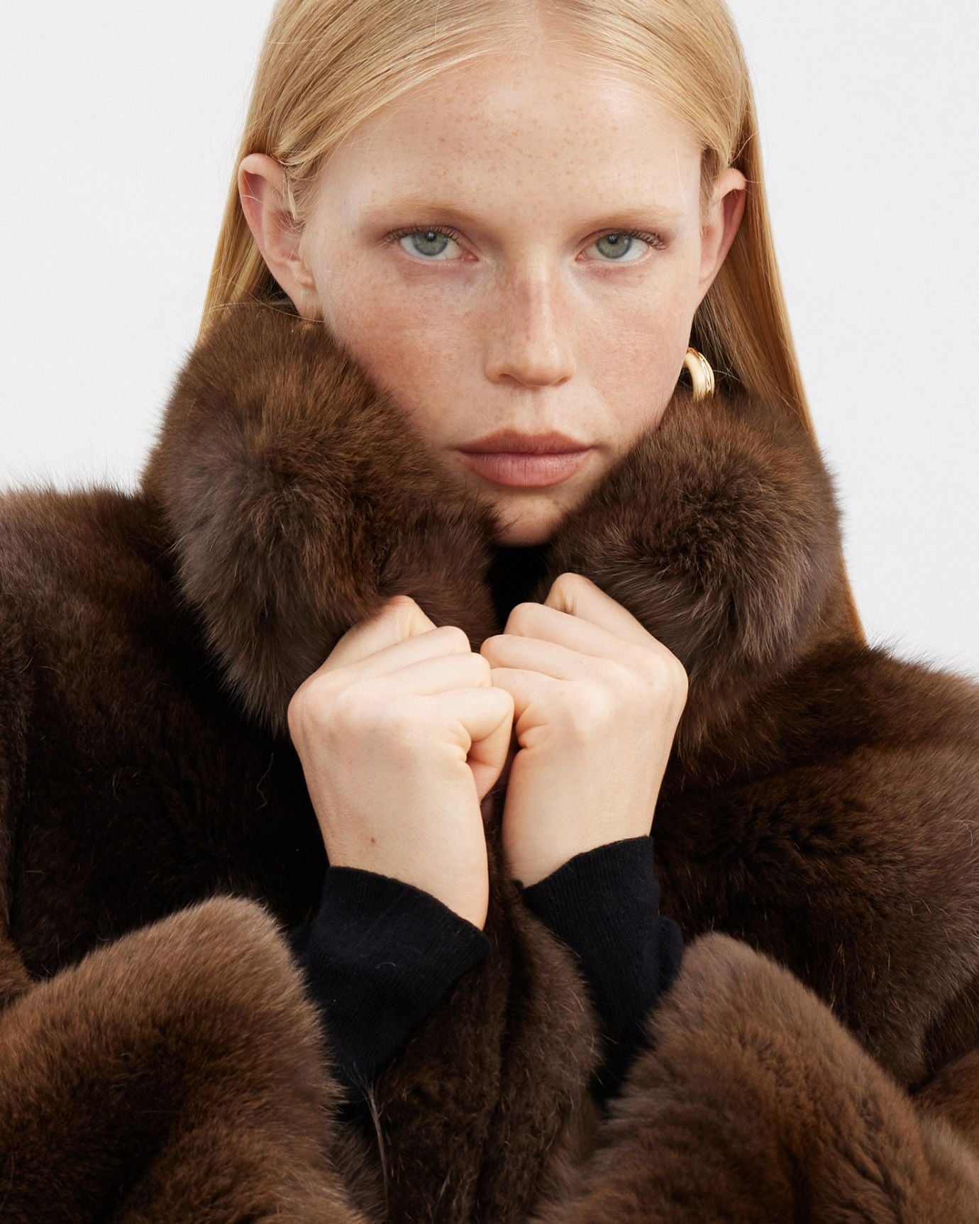
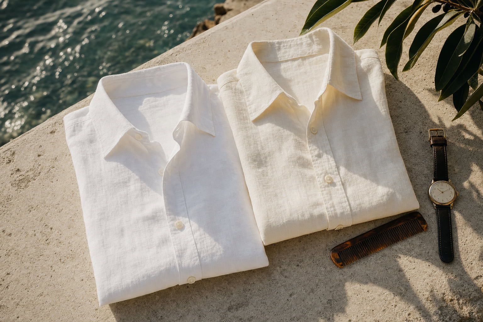
Cool and pinkish complexions (common in Northern and Central European skin tones, and in lighter East Asian complexions) are flattered by pale, slightly grey-beige shades: ecru, oatmeal, and greige. These tones share a cool or neutral undertone that does not compete with the skin's natural pink.
Warm, olive, and deeper complexions (common across Mediterranean, South Asian, Middle Eastern, and African heritage) carry rich camel, honey-beige, and warm sand tones far better than pale cream, which can read as too stark or too close to the skin's surface. The warmth in the fabric shade resonates with the warmth in the complexion.
Very deep complexions can carry the full spectrum of beige, but the most striking combinations tend to use the deepest camel shades alongside an oatmeal contrast piece, which creates the value separation described above without any risk of the look reading as washed out.
If you are unsure where you sit, hold a piece of warm camel fabric and a piece of cool ecru fabric against your face in natural daylight. Whichever one makes the skin look more even and alive is your guide. For women exploring this palette, the ready-to-wear woman collection includes both oatmeal and camel-adjacent pieces worth comparing in this way.
Expert insightSunglasses in a warm sand-beige frame, such as the Zira Light Beige Gold in limited edition, serve a dual function in a monochrome outfit: they reinforce the palette and frame the face with the warm gold hardware that prevents the overall look from reading as too pale.

Using Texture to Create Contrast Without Adding Colour
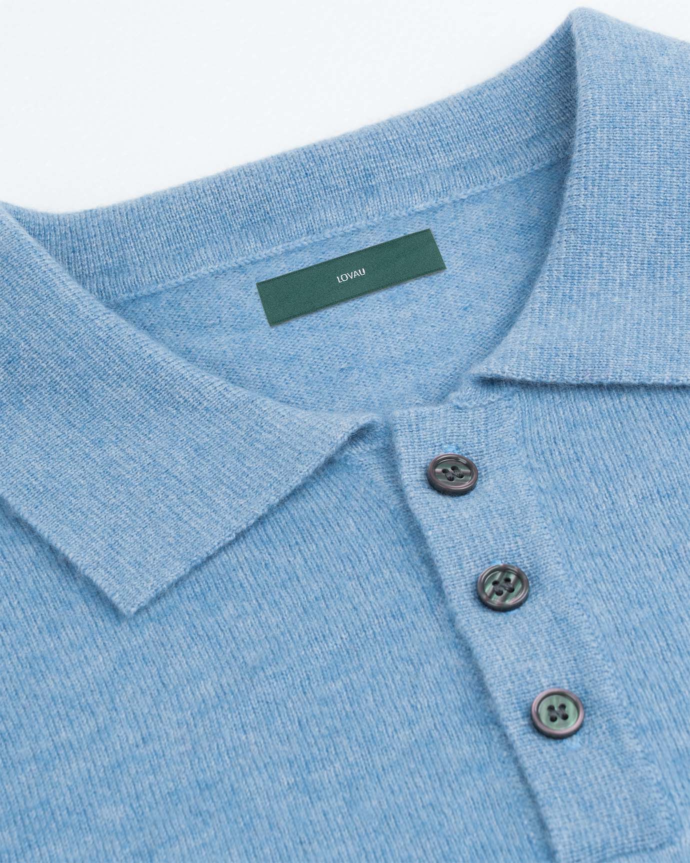
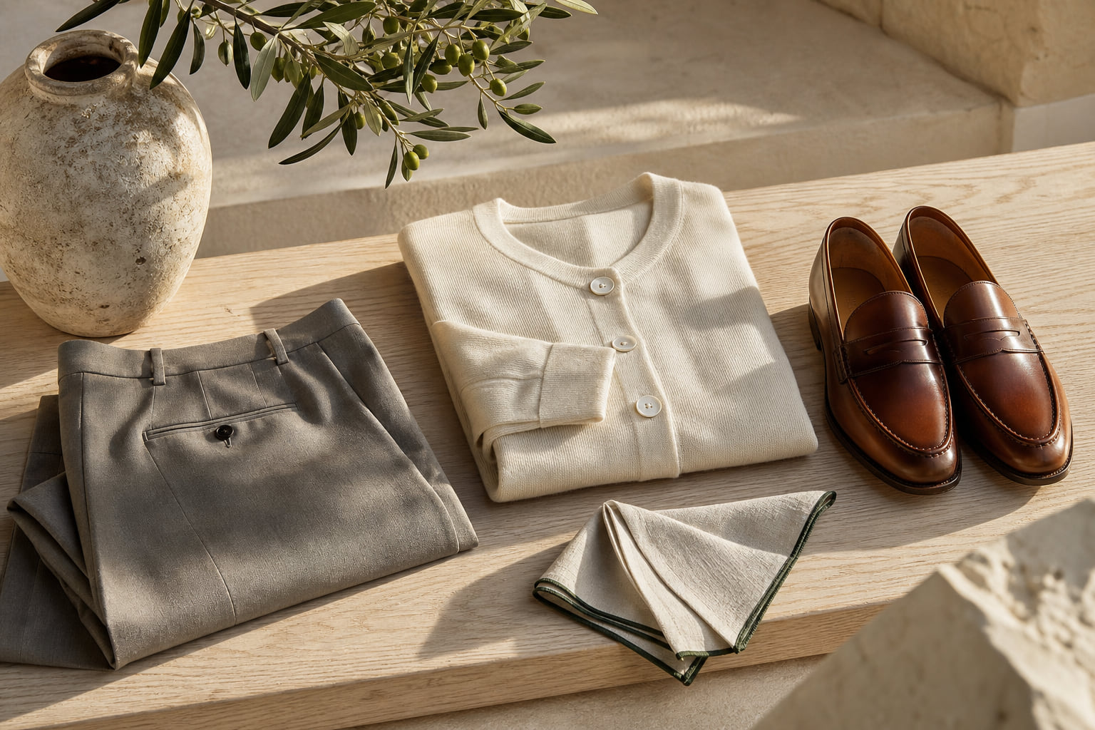
Once you have your tonal range sorted, texture is the most powerful tool you have. A matte surface absorbs light. A smooth or slightly lustrous surface reflects it. When you place the two in the same outfit, you create visual contrast that the eye reads as definition, even when both pieces are technically the same shade of beige.
Specific fabric pairings that work within the beige palette:
- Wool knit against woven cotton or linen: The knit's surface has visible texture, the woven piece is smooth. The contrast is tactile and visual at once.
- Cashmere against worsted wool: Cashmere has a soft, slightly diffused surface. Worsted wool is tighter and more structured. Together they create a quiet luxury effect that reads as intentional rather than accidental.
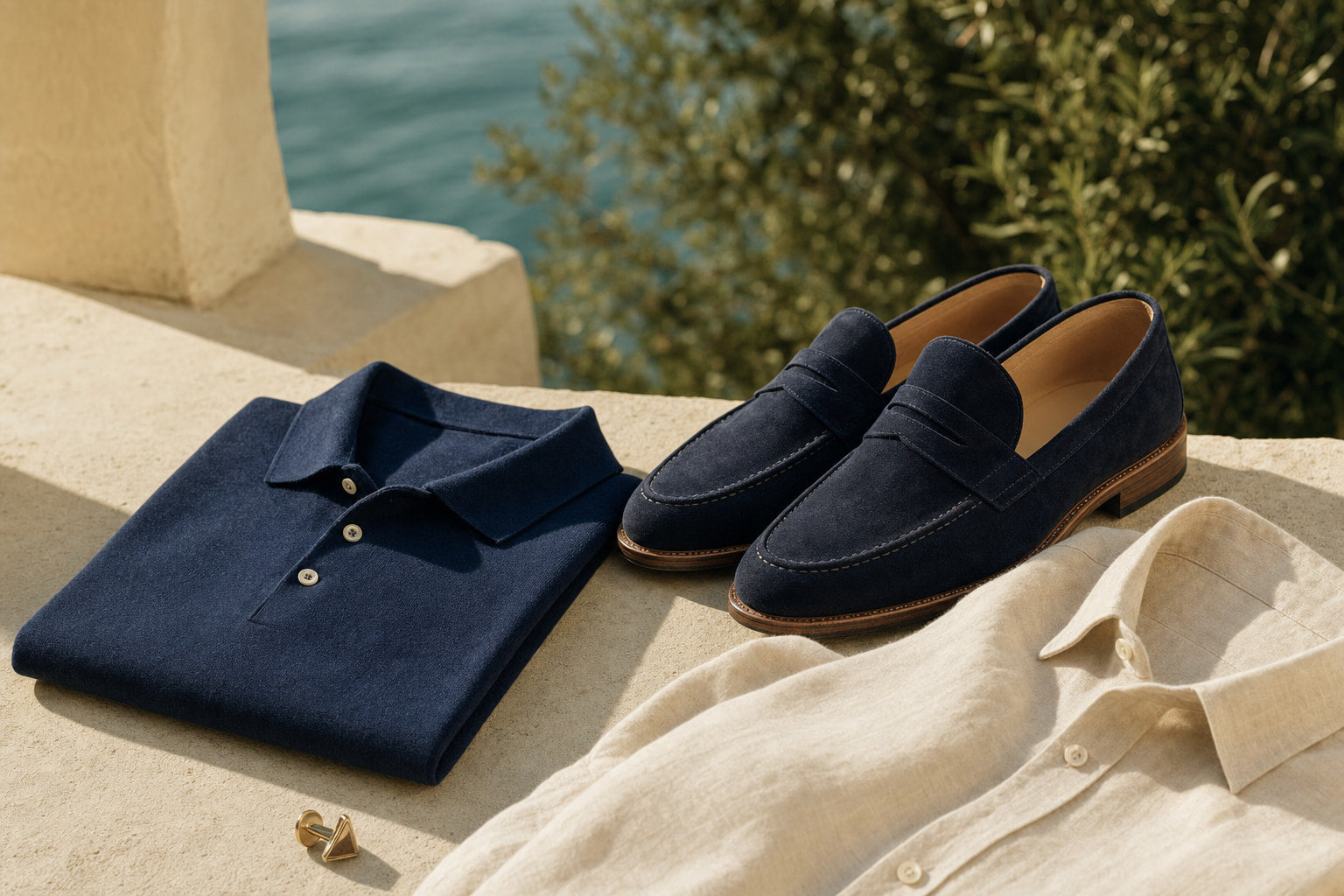
- Suede against fine cotton: Suede's napped surface absorbs light heavily. Fine cotton is flat and clean. The difference between them is immediately legible.
For men, the Mykonos camel slip-on suede loafers illustrate this principle in footwear: the suede nap absorbs light while a smooth camel trouser reflects it, and the two camel tones read as a considered choice rather than a coincidence.
For a coordinated approach to texture mixing, the High End Mulberry Silk and Worsted Cashmere Set pairs two materials with very different surface qualities in a single outfit, handling the contrast question for you.
Women can achieve the same effect by pairing a matte knit sweater with a slightly fluid woven skirt. The Lira Two Pieces Lazy Sweater and Long Skirt in its neutral colourway is a practical example: the knit body and the longer woven skirt read as a tonal outfit with enough surface variation to stay visually interesting.
Expert insightAvoid pairing two matte textures in the same shade. It is the combination that most reliably produces the flat, hospital-corridor effect people associate with failed beige dressing.
Building the Outfit: Proportions, Fit, and Silhouette
In a colourful outfit, a slightly loose fit or an imperfect proportion is forgivable because the eye is occupied by colour. In a tonal all-beige outfit, fit is everything. There is nothing else to look at.
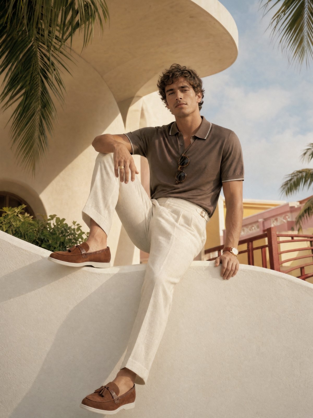
The core principle is one relaxed piece, one structured piece. You do not want both pieces to be oversized, which reads as formless, and you do not want both to be sharply tailored, which can read as rigid. The contrast between a relaxed top and a more structured trouser or skirt, or a structured jacket over a relaxed knit, gives the silhouette a shape that reads as considered.
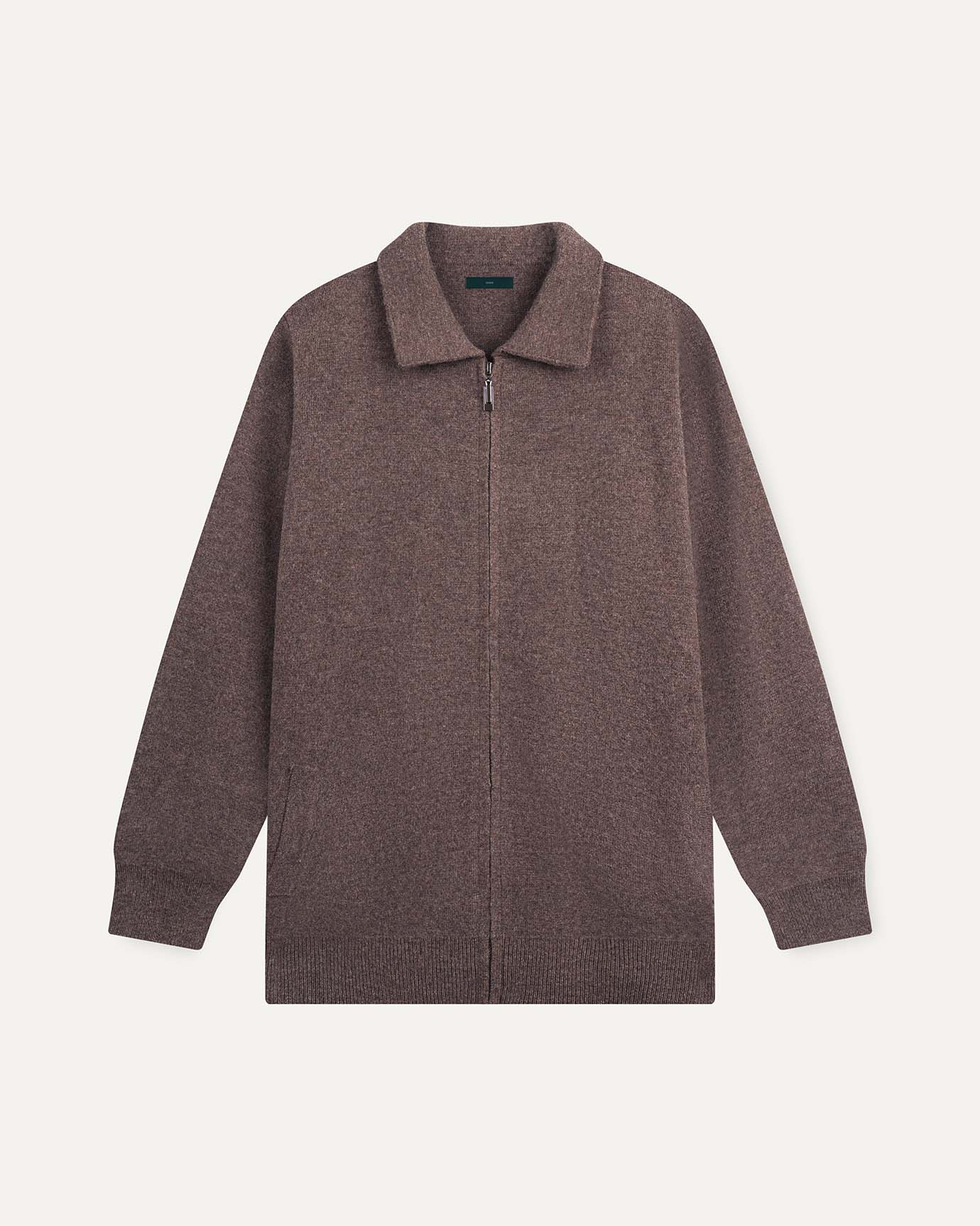
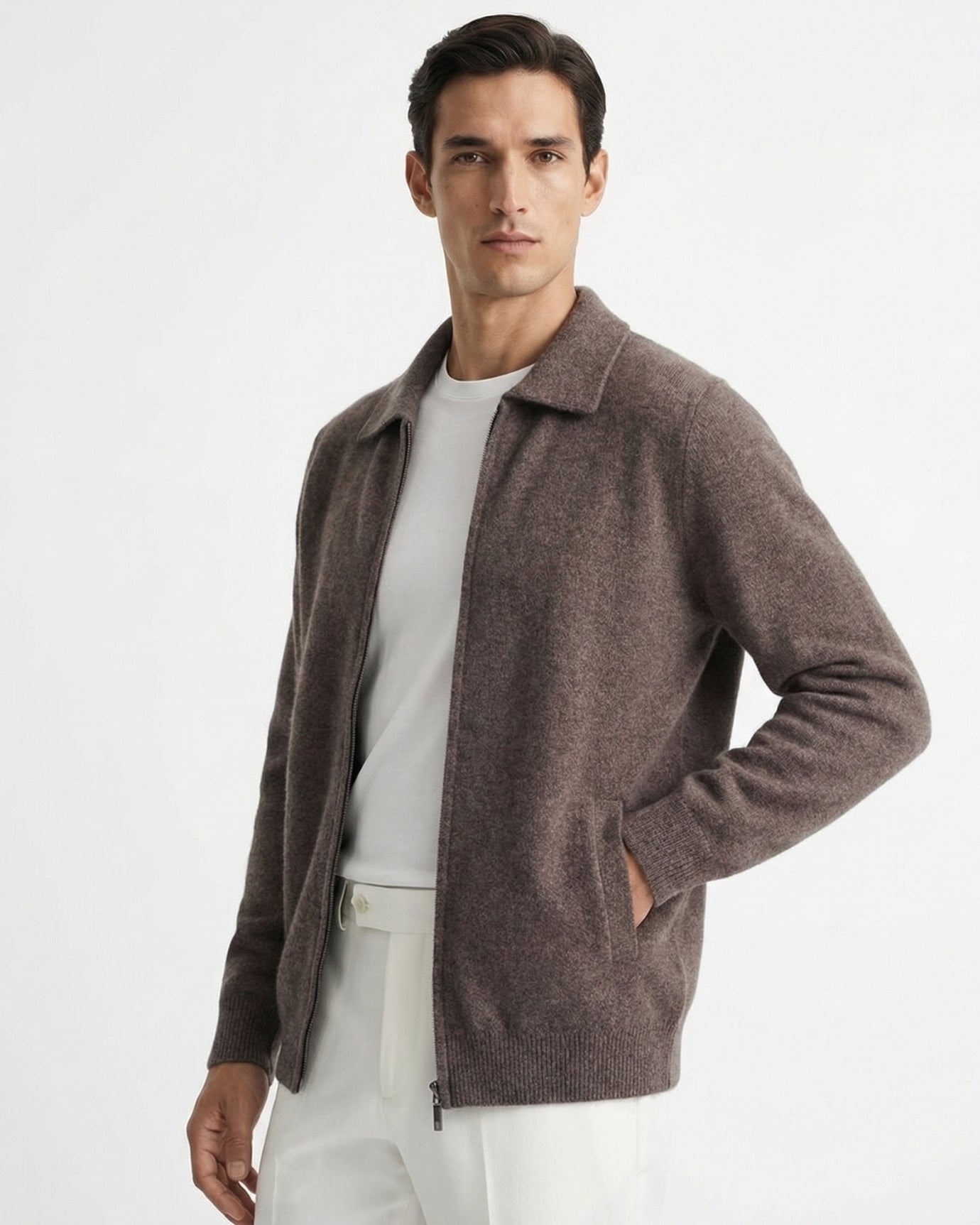
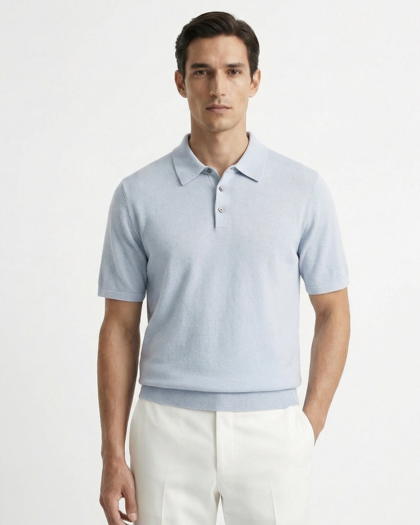
For men, the Florence Summer Shorts in gray-beige worn with a structured camel knit is a summer-weight version of this principle. The shorts have a clean, tailored line while the knit above can afford to be slightly relaxed. The Wool Classy Hoodie in Camel and Light Beige is built for exactly this pairing: the camel body anchors the lower visual weight while the light beige logo detail sits at the chest, drawing the eye upward.
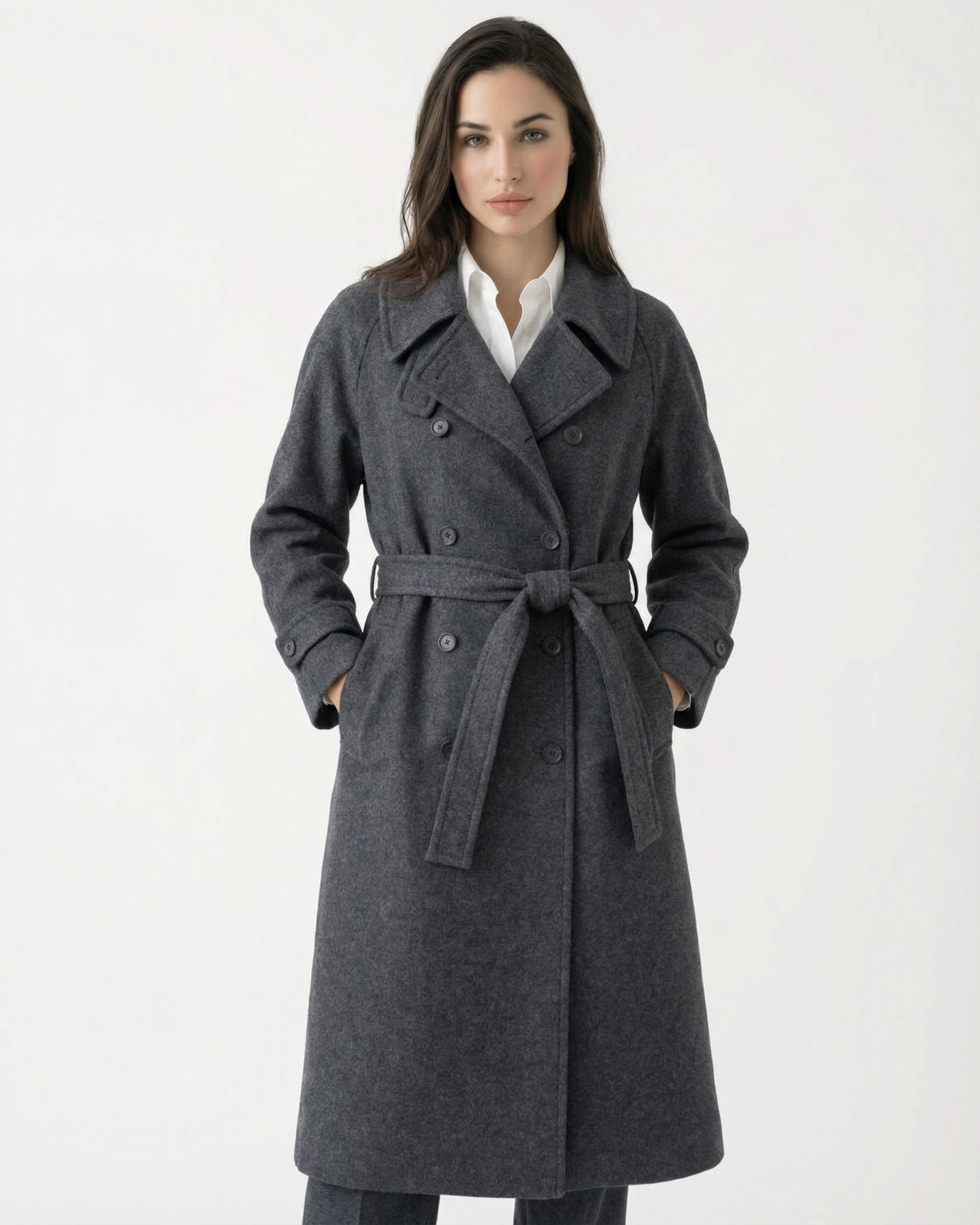
For women, a structured blazer over a fluid skirt is the equivalent move. The Suit Jacket Cut-Out Scarves Blazer in a neutral tone worn over wide, sand-coloured trousers or a long skirt creates the same relaxed-structured dynamic.
For seasonal outfit ideas that use this proportion logic across the year, the article on seasonal old money looks is worth reading alongside this guide.

Accessories That Anchor an All-Beige Look
Accessories in a tonal outfit serve a structural role, not a decorative one. They are the points where the eye lands and rests. Without at least one accessory that provides a subtle contrast, even a well-constructed beige outfit can drift into visual monotony.
Warm gold hardware is the most reliable choice. It reads as part of the warm beige palette while providing enough metallic contrast to create a focal point. Silver hardware reads as cool and slightly disconnected from a warm tonal palette.
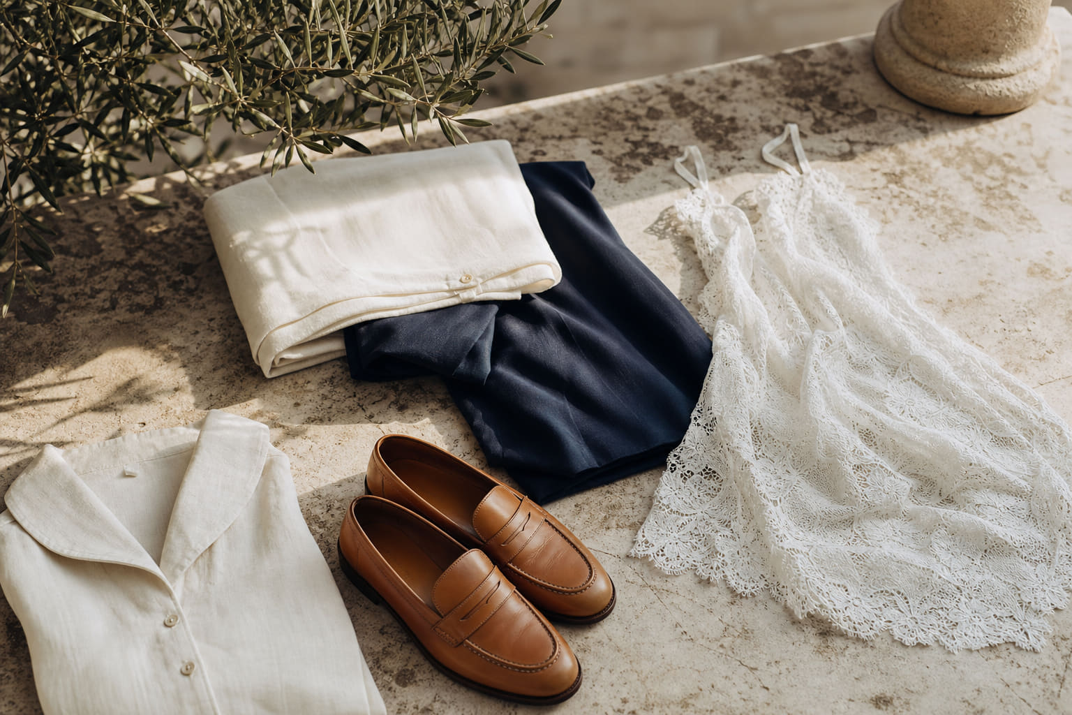
Camel leather goods, whether a belt, a bag, or a shoe, reinforce the anchor-shade principle in accessory form. They give the outfit a grounded, slightly darker note at the periphery.
Tonal sunglasses in sand-beige or warm tortoiseshell complete the palette without introducing a foreign element. The Anna Sand-Beige Brown Sunglasses are designed for exactly this: the sand frame sits inside the beige palette while the brown gradient lens adds the darker value contrast the outfit needs at the face level.
For cooler months, knitwear accessories in a matching or slightly deeper camel shade reinforce the tonal palette at the extremities. The Cashmere Gloves with extended colour-matching edge are built for this purpose: the colour-matched edge detail means they read as part of the outfit rather than an afterthought.
For a broader overview of how accessories work within a neutral palette, the all accessories collection shows the range of options available within the Lovau palette.

Occasion Dressing in All-Beige: What Works Where
The palette is versatile but the execution changes significantly with occasion. A casual all-beige look and a dressed-up all-beige look use the same tonal principles but different fabrics, cuts, and accessory weights.
Casual and weekend: Linen, cotton knit, and washed cotton sit in the relaxed end of the beige fabric spectrum. A camel hoodie with oatmeal-washed cotton pieces reads as considered but not formal. The Wool Classy Hoodie in Beige and Dark Green Logo introduces a single dark green logo detail that functions as the contrast anchor while keeping the overall palette in the beige-neutral range.
Smart casual and city wear: This is where the oatmeal-and-camel combination performs best. Tailored camel trousers, an ecru fine-knit top, suede loafers. The outfit reads as polished without being formal. For men, this is also the occasion for double pleated linen shorts in a warm sand shade paired with a deeper camel polo in warmer months.
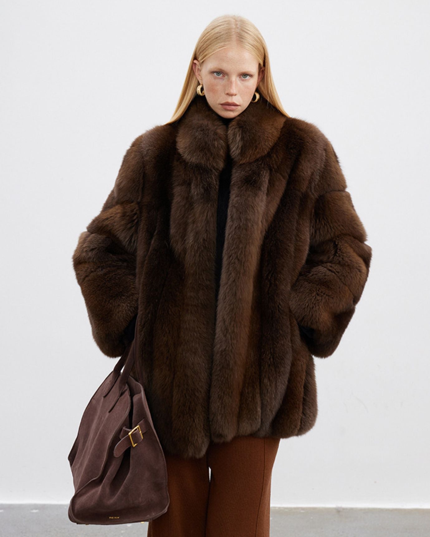
Evening and occasion: At this level, fabric quality becomes the primary signal. Silk, cashmere, and fine worsted wool in beige tones read as genuinely luxurious. The texture contrast principle still applies, but the fabrics themselves carry more weight. The article on earth tones in fashion covers how camel and warm brown tones work in more formal dressing contexts, which is useful if you are building an all-beige outfit toward the dressed-up end of the spectrum.
What to avoid at any occasion level: Matching separates in an identical shade and identical fabric. This reads as a uniform rather than an outfit. The two pieces need to differ in at least one of three ways: shade, texture, or silhouette.

| Shade | Undertone | Works Best On | Strongest Fabric Pairing | Avoid With |
|---|---|---|---|---|
| Ecru / Oatmeal | Cool neutral | Fair, cool-pink complexions | Smooth woven linen or cotton | Another pale cool-neutral in the same fabric |
| Warm Sand | Warm neutral | Most complexions, especially medium | Washed cotton, light wool knit | Stark white or bright ivory |
| Camel | Warm golden | Olive, warm, and deeper complexions | Worsted wool, suede, cashmere | Cool grey-beige in the same weight fabric |
| Honey-Beige | Warm amber | Deep and warm-toned complexions | Silk, fine cashmere | Pale ecru at the same value level |
| Greige | Cool grey-beige | Cool and neutral complexions | Structured cotton twill, fine wool | Warm camel in equal proportion |
Frequently asked questions
Can I wear all-beige if I have very fair skin?
Yes, but shade selection is critical. Fair, cool-pink complexions should stay in the ecru and oatmeal range for the piece closest to the face, and use a deeper camel or warm sand as the anchor shade lower in the outfit. Avoid placing a pale cream or white-beige directly against a very fair complexion: the tones are too close and both the fabric and skin lose definition. A warm gold accessory at the collar or wrist helps create a separating note.
What is the easiest way to start wearing tonal beige without getting it wrong?
Start with two pieces rather than a full head-to-toe look. A camel trouser or skirt paired with an oatmeal knit is the most forgiving entry point because the value contrast between the two shades does the work for you. Add your existing brown or tan leather shoes and you have a complete tonal outfit without needing to buy anything new except possibly the knit. For more outfit frameworks built on this logic, the minimalist old money outfit ideas article is a useful starting point.
Do I need to buy all-new pieces to wear all-beige, or can I work with what I have?
In most cases you can work with what you have. The key is identifying which beige-adjacent pieces you already own and sorting them by value: pale at one end, deep camel or tan at the other. Build outfits by pairing pieces from opposite ends of that range. Tan chinos you already own, an oatmeal knit you already own, and camel leather shoes you already own can form a complete tonal outfit. New pieces are worth adding when you identify a gap in your value range, typically a deeper anchor shade if everything you own sits in the pale-to-mid range.
Are there colours I can add to a beige outfit without breaking the tonal effect?
Warm white and off-white sit close enough to the pale end of the beige palette that they read as part of the same family rather than a contrast colour. Deep chocolate brown at the shoe or belt level functions as a natural extension of the camel anchor. Dark olive green, used sparingly in a single accessory or logo detail, reads as an earth-tone complement rather than a break in the palette. The Wool Classy Hoodie in Beige and Dark Green Logo is a practical example of how a single dark olive note works within an otherwise beige outfit.
All-beige dressing is not a shortcut to elegance and it is not a trap either. It is a discipline that rewards specificity: the right shade for your complexion, enough tonal contrast between pieces to define a silhouette, fabric textures that create visual interest without colour, and accessories that anchor rather than decorate. Get those four variables right and the palette becomes one of the most quietly authoritative things you can wear. For a broader framework on building outfits around earth tones and neutrals across every season, the article on essential old money outfit ideas for everyday wear is the natural next read.