

The Best Colors for Job Interviews in Creative Industries
Reading time 12 min • 2444 words
A creative industry interview sits in a specific, demanding middle ground. The environment is not a law firm, so arriving in a charcoal power suit can make you look as though you have not done your research. But it is still a professional assessment, and walking in dressed as though you are attending a gallery opening after-party sends its own wrong signal. Color is the fastest visual communication you have, and in a room full of people who think about aesthetics for a living, your choices will be noticed.
The most effective approach is not to chase trend colors or attempt a statement. It is to select a palette that reads as intentional, considered, and grounded. Think of the women whose style you associate with lasting influence in creative fields, editors, architects, creative directors. They are rarely wearing something that demands attention. They are wearing something that holds it.
This guide works through the specific colors that perform best in creative industry interviews, explains why each one works, and connects them to the kinds of pieces that carry those colors well. Whether you are interviewing at a fashion house, a design studio, an advertising agency, or a publishing imprint, the principles here apply.
Key takeaways
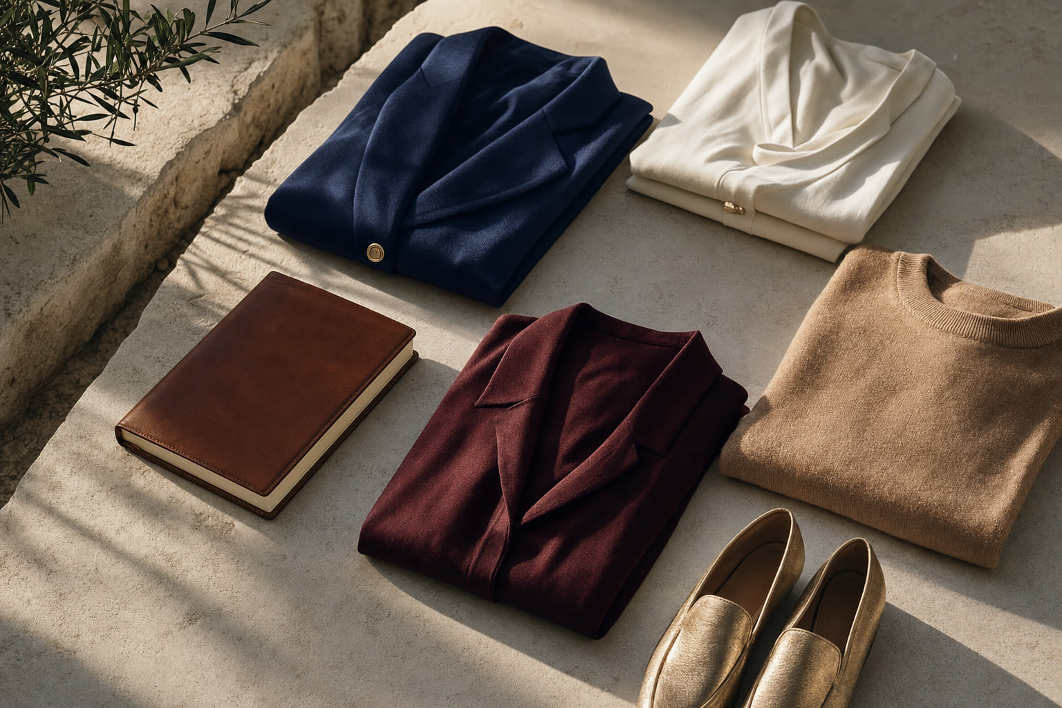
- Navy, ivory, and camel are the strongest base colors for creative industry interviews because they read as polished without being corporate.
- Deep burgundy and forest green work as controlled accent colors that signal individual taste without distraction.
- Avoid head-to-toe black in creative settings as it can read as safe to the point of disengagement.
- Fabric and fit matter as much as color: a well-cut wool dress in a neutral reads more sophisticated than a bright ill-fitting piece.
- One considered color choice, worn with restraint, communicates more confidence than a maximalist outfit assembled to impress.
In this guide
- Navy: The Single Most Versatile Interview Color
- Camel and Warm Ivory: Quiet Confidence in Neutral Territory
- Deep Burgundy and Forest Green: Controlled Accent Colors
- What to Wear With Your Chosen Color: Building the Full Look
- Colors to Approach With Caution in Creative Interviews
- Accessories: Where Color Can Do More Work
- Frequently asked questions
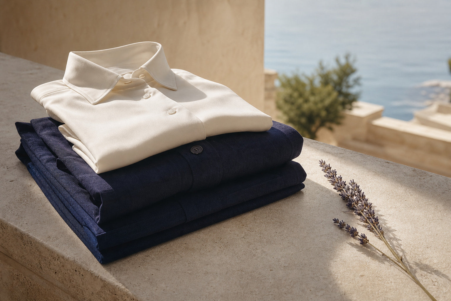
Navy: The Single Most Versatile Interview Color
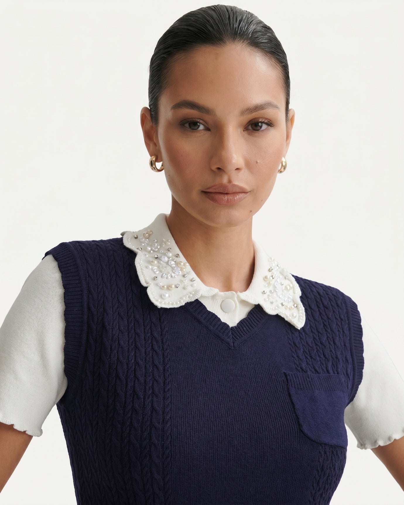
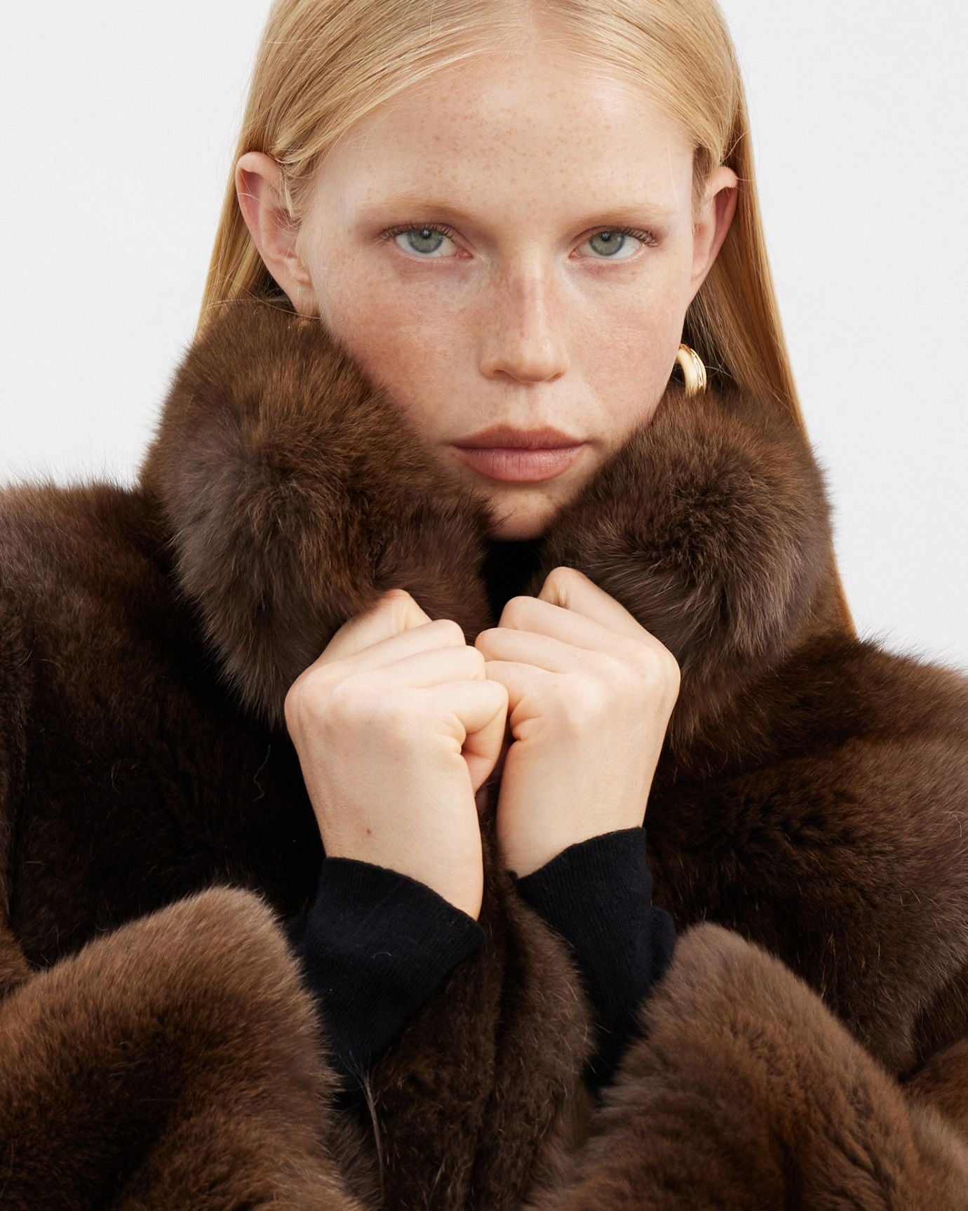
Navy is not a default. It is a deliberate choice, and that distinction matters in a creative context. Unlike corporate navy, which tends to appear in stiff suiting, navy worn in a refined, modern silhouette reads as someone who understands color theory without needing to announce it. It is the shade that sits between black and blue, carrying the authority of the former without the austerity.
For a creative interview, navy works best in a structured dress with clean lines rather than a matching suit. A sleeveless pleated silhouette, like the contrast collar pleated dress in navy and white, gives the color room to work properly. The white contrast collar adds definition without adding noise, which is exactly the kind of considered detail that registers well in design-forward environments.
Why navy works: It is associated with clarity and calm authority. Color psychology research consistently places navy among the colors perceived as most competent and trustworthy across cultures, a strong foundation in any interview setting.
Pair navy with ivory or warm white accessories rather than black. Black accessories against navy can look flat and unresolved. Ivory or bone tones add warmth and suggest a more refined eye.
Expert insightIf your interview is in a creative studio with industrial lighting, navy holds its depth better than black, which tends to flatten under fluorescent or LED overheads and loses all its texture.

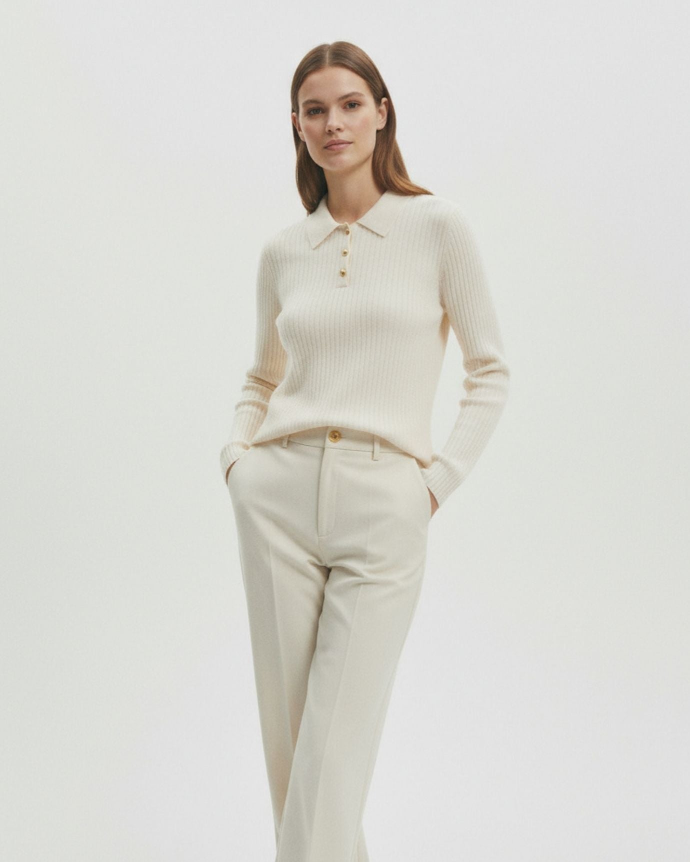
Camel and Warm Ivory: Quiet Confidence in Neutral Territory
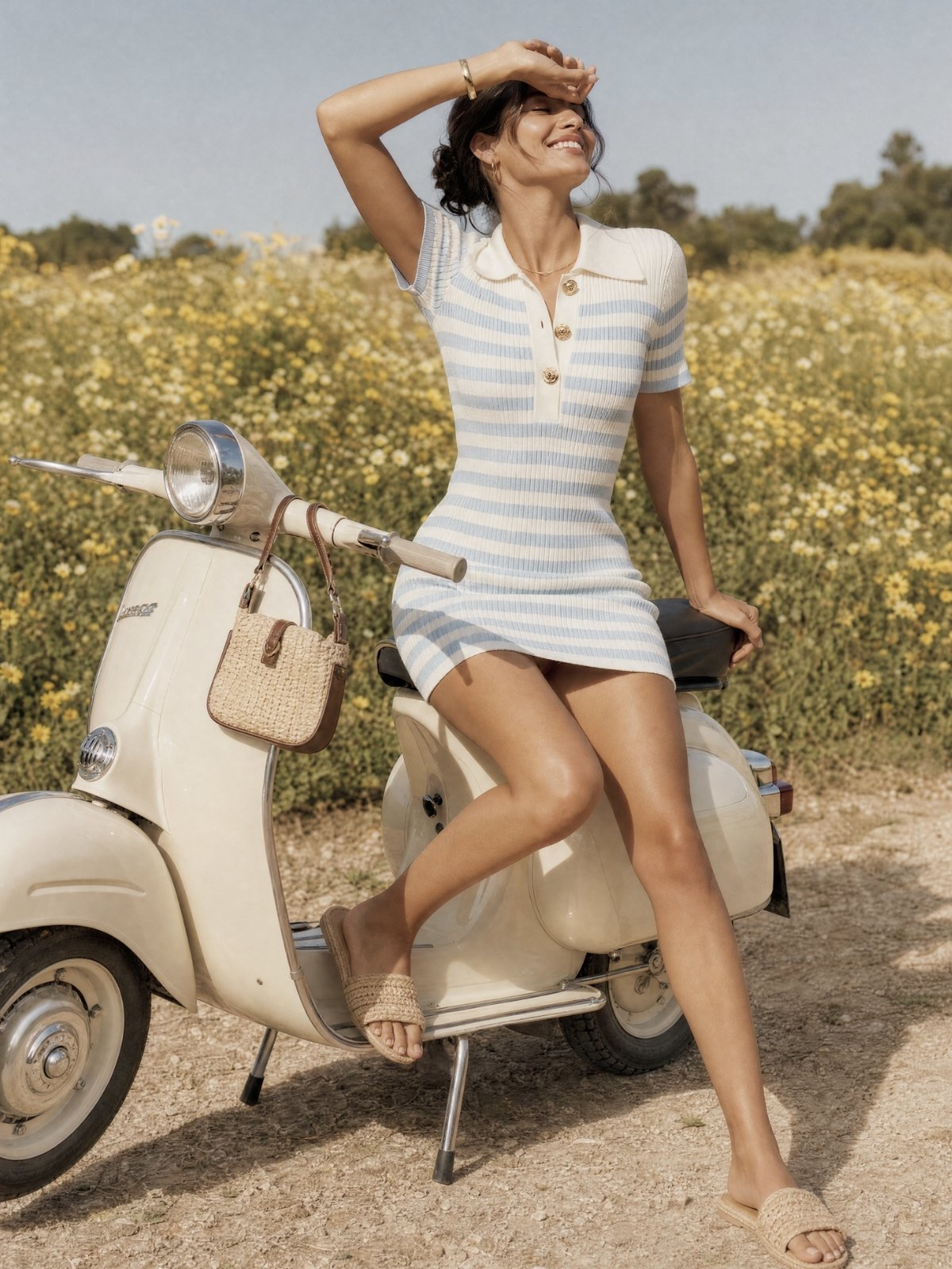
Camel is perhaps the most underused interview color for creative settings, and that is precisely what makes it so effective. It photographs beautifully, it reads as expensive without effort, and it signals an understanding of proportion and tone that goes beyond trend-following.
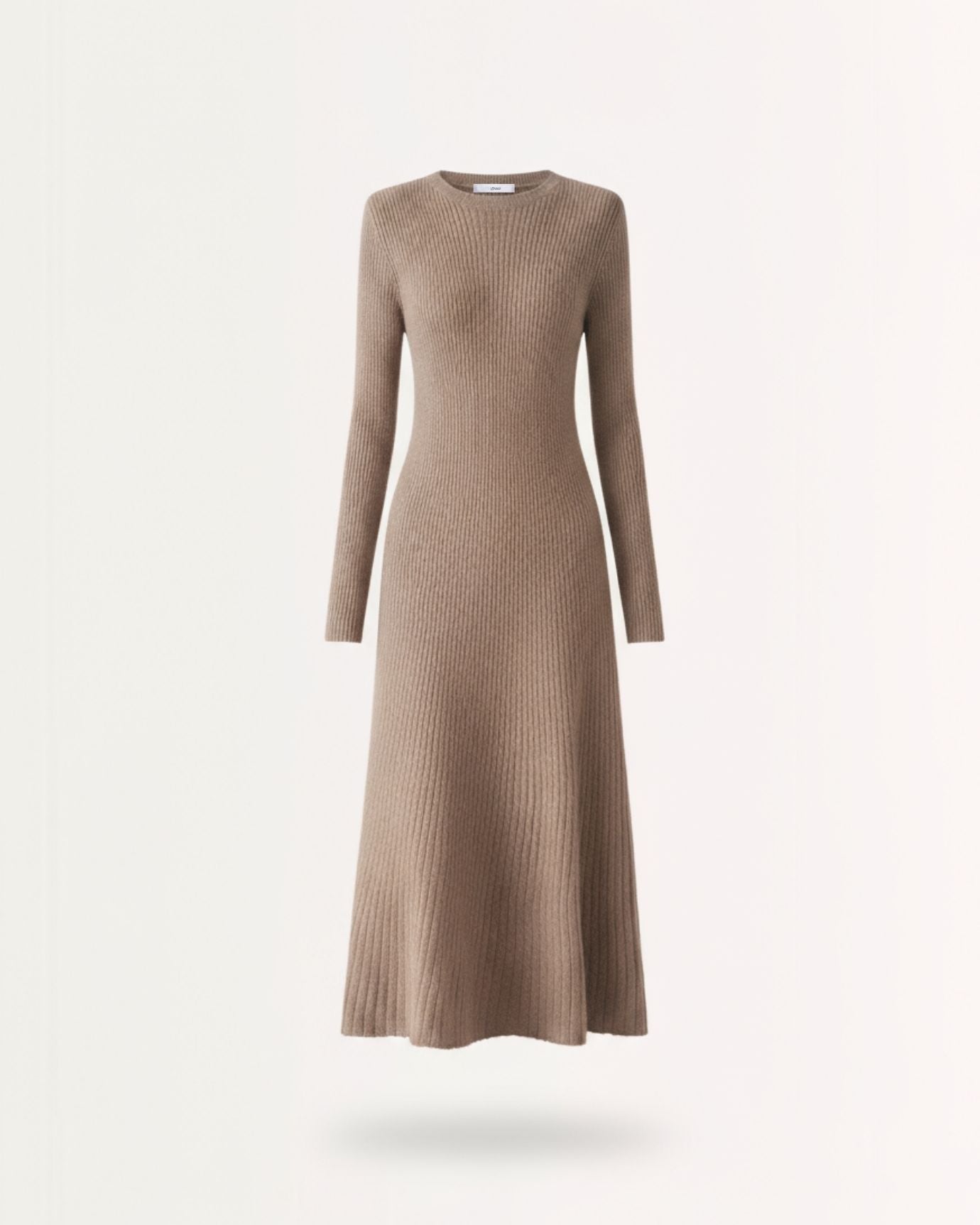
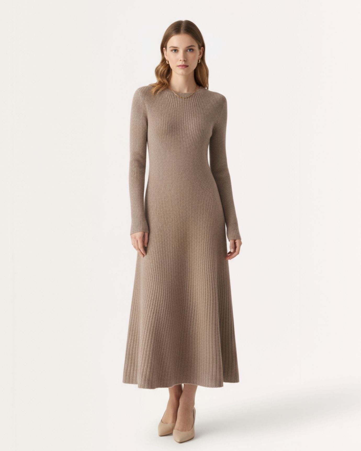
The key with camel in an interview context is fabric quality. Camel in a cheap synthetic reads as washed out. Camel in a well-finished wool or heavy linen reads as genuinely considered. A woman wool dress in old money style in a warm neutral tone is a strong choice: the weight of the fabric gives structure, the color communicates warmth and confidence, and the overall impression is of someone who has dressed for herself, not to perform.
Ivory operates differently from white. Pure white can read as clinical or, in creative spaces, almost too literal. Ivory has warmth and depth, and it works particularly well for women with warm or olive skin tones. If you want guidance on pairing colors to your specific complexion, the article on how to dress for your specific skin undertone covers this in practical detail.
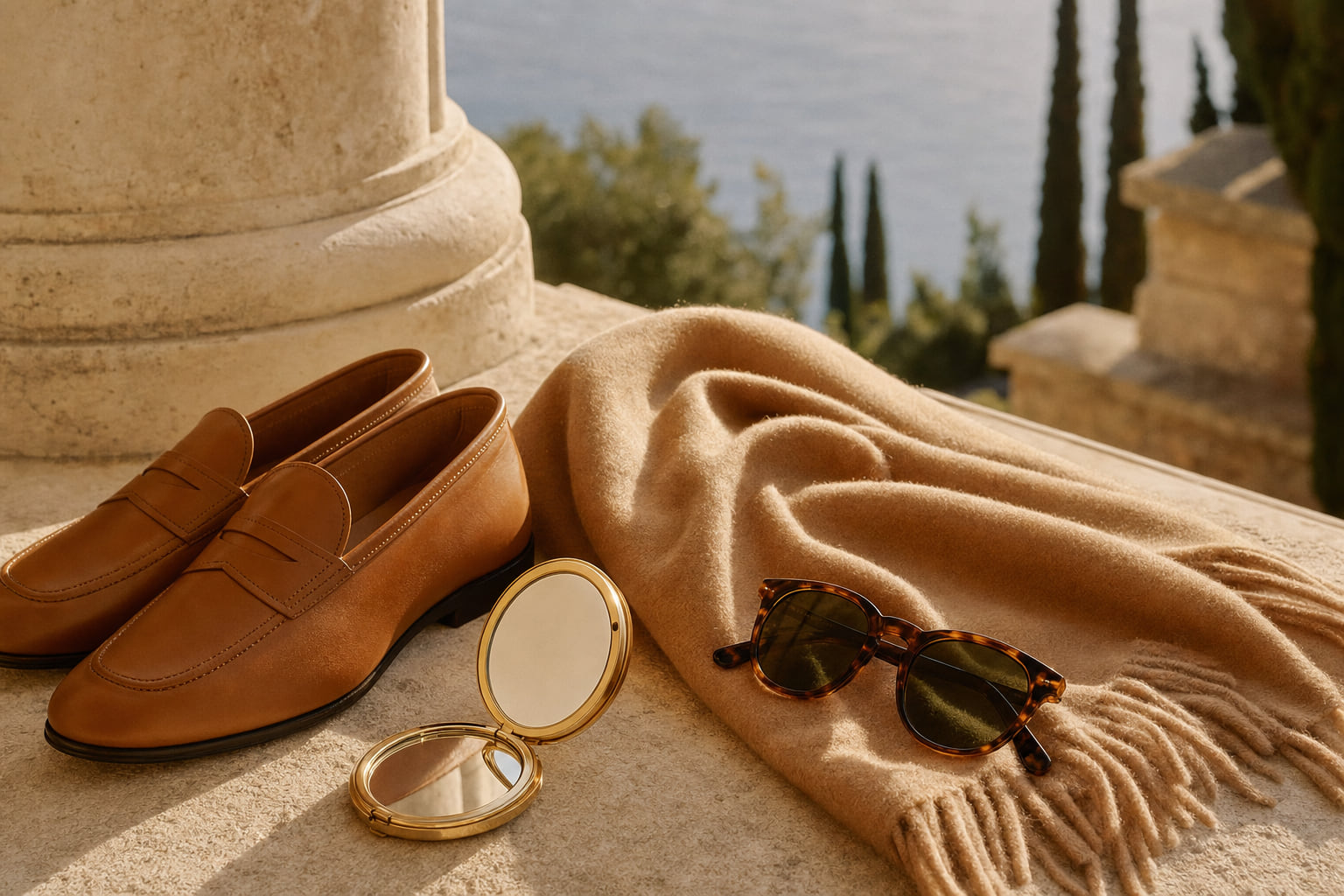
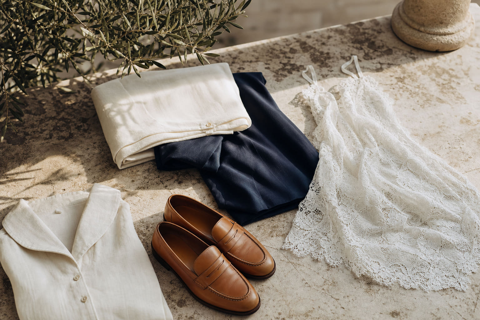
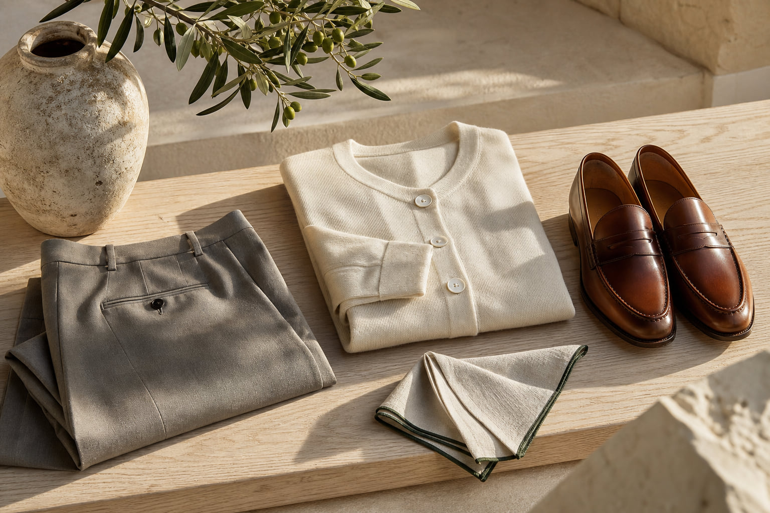
Styling note: With camel or ivory, keep your footwear in the same warm family. A pair of genuine leather loafers in an old money style in tan or cognac keeps the palette coherent and grounded.
Expert insightCamel and ivory are not safe choices. They are precise ones. The difference is intention: these colors require the rest of your outfit to be equally considered, which is exactly the kind of detail a creative director notices.

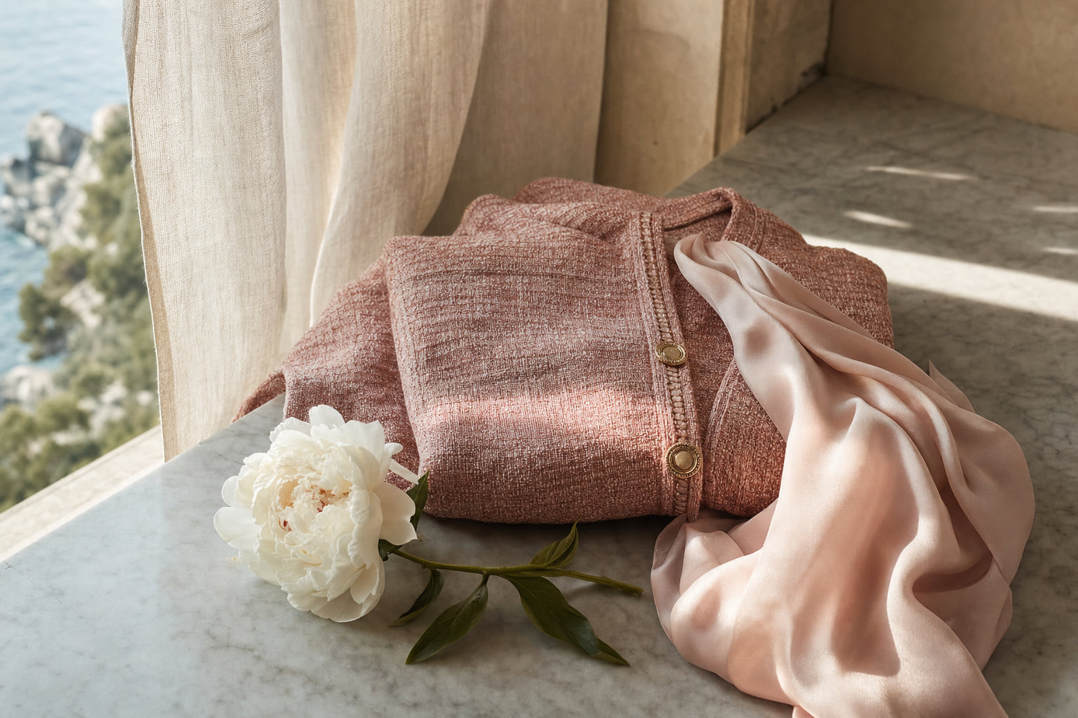
Deep Burgundy and Forest Green: Controlled Accent Colors
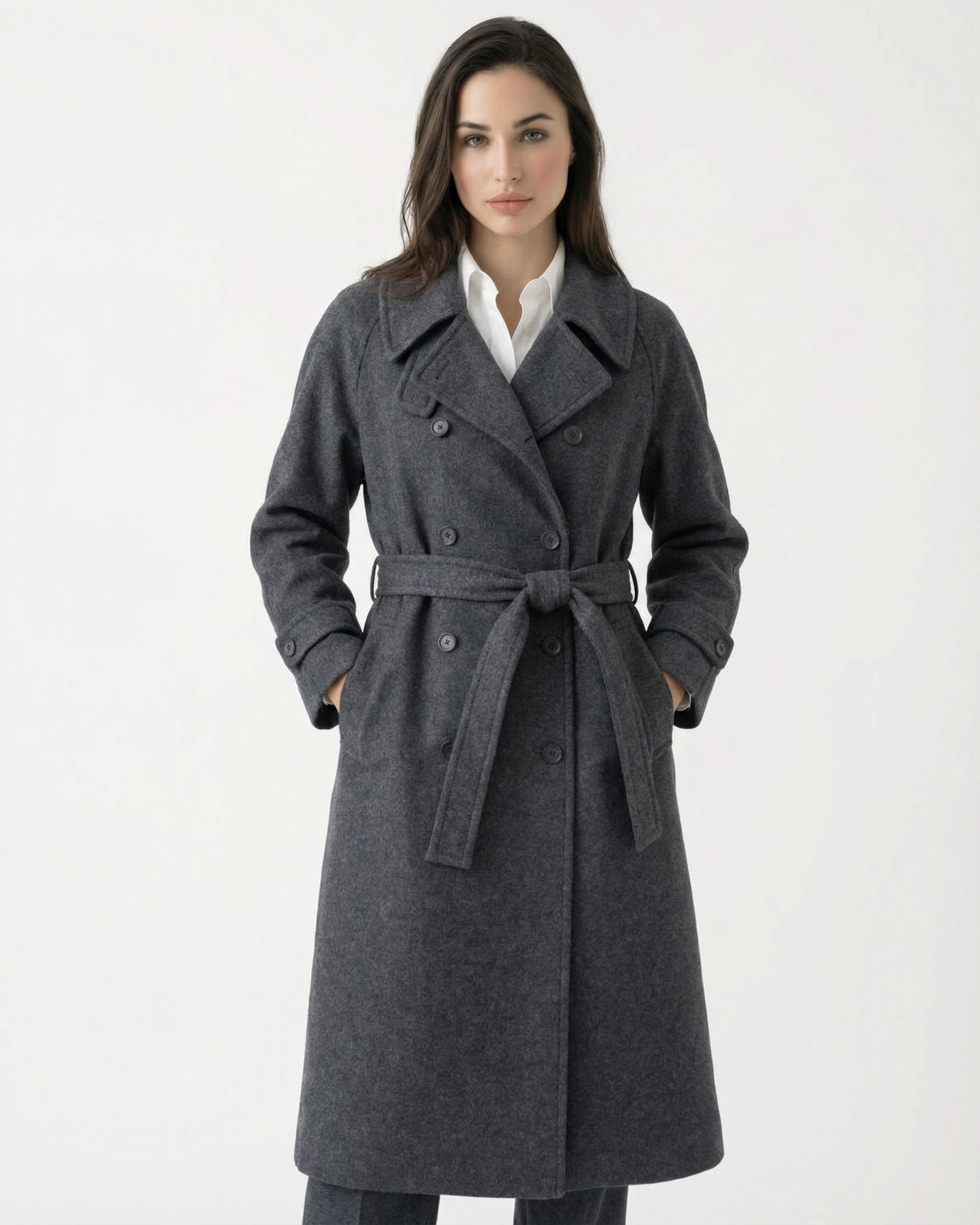
If you want to introduce personality through color, do it with depth rather than brightness. Deep burgundy and forest green are the two accent colors that consistently work in creative industry interviews because they have historical weight. These are the colors of old European libraries, of quality wool fabrics, of garments that have been worn and valued over time. They do not shout. They imply.
Burgundy is particularly effective because it carries warmth and confidence simultaneously. It is associated with precision and taste in European fashion history, and in a creative interview it signals that you have a perspective without being aggressive about it. A long-sleeved dress with a belt in a deep tone like burgundy or forest gives you structure and color in one piece, which simplifies the rest of your decisions considerably.
Forest green works best in matte fabrics. Avoid anything with sheen in green tones as it can tip quickly from sophisticated to costume. A matte wool or heavy jersey in forest green, worn with ivory or camel accessories, is a strong and memorable combination.
What to avoid: Bright emerald, kelly green, or true red. These read as fashion-forward in a social context but can come across as combative or attention-seeking in an interview, even in a creative firm. The goal is to be remembered for your ideas, not your outfit.
Expert insightBurgundy reads differently depending on undertone. Blue-based burgundy (closer to plum) works best for cool skin tones. Red-based burgundy (closer to wine) flatters warm and neutral complexions. Getting this right is the detail that separates a good choice from a great one.

What to Wear With Your Chosen Color: Building the Full Look
The color you choose is only as effective as the outfit it anchors. In a creative industry setting, proportion and finish matter enormously. A beautifully colored dress worn with scuffed shoes or a poorly fitted blazer will not land the way you intend.
For a complete interview look, consider a structured blazer over a dress or a tailored trouser pairing. The Lovau old money blazer works particularly well over a fitted dress in a contrasting but tonal color, navy blazer over ivory dress, or camel blazer over a forest green knit. The blazer signals structure and professional intent; the color underneath signals individuality.
If you prefer separates, high-waisted trousers in a refined fabric give you more flexibility. The Madrid Satis Trousers in a neutral tone pair cleanly with a tucked shirt or fine-knit top, and the high waist gives the silhouette the kind of clean vertical line that reads as polished without being stiff.
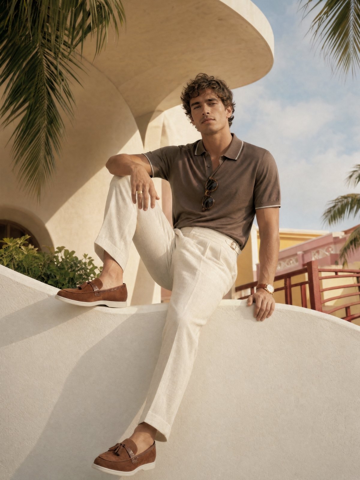
For footwear, loafers are the single best choice for creative industry interviews. They occupy the exact space between formal and creative that the setting demands. The Diana old money style loafers in a classic finish work with virtually every color combination in this guide.
For more guidance on building a wardrobe around color, the article on what colors make you look rich offers a broader framework that applies directly to interview dressing.

Colors to Approach With Caution in Creative Interviews
This is not a list of colors to avoid entirely. It is a list of colors that require more skill to execute correctly in an interview context, and where the risk of a misstep is higher.
Head-to-toe black: Black is not wrong, but it is the most common choice in creative industries, which means it carries no signal at all. If you wear black, the outfit must do something else: an interesting cut, a textured fabric, a precise fit. Otherwise it reads as someone who defaulted rather than decided. A velvet dress in a deep tone can make black or very dark colors work because the fabric itself carries visual interest.
Pastels: Pale pink, baby blue, and lavender can read as indecisive in a professional context unless they are worn with strong structure and fit. If you are drawn to softer colors, consider the deeper versions: dusty rose rather than baby pink, slate rather than sky blue.
Prints and pattern: Avoid busy prints for the interview itself. Small geometric patterns or subtle textures are fine, but large florals, bold stripes, or graphic prints shift attention away from the conversation. Save those for your second week.
For a broader look at how color choices shift across seasons and settings, the best colors to wear in 2026 according to style experts provides useful context on which tones are reading as current without being trend-dependent.

Accessories: Where Color Can Do More Work
Once your base outfit is settled in a strong, considered color, accessories are where you can introduce a second tone with more freedom. The rule is simple: one accent color, worn in one place.
A bag in a warm cognac against a navy dress. A silk scarf in forest green tied loosely at the wrist against an ivory outfit. A pair of tortoiseshell sunglasses carried rather than worn, which adds visual texture without competing with the outfit.
Sunglasses carried into an interview room are a detail that creative professionals notice. They are a small but legible signal of personal style. The brown taupe oval sunglasses work particularly well with warm neutrals, while the cat eye black smoke tint sunglasses complement navy and deep jewel tones.
Keep jewelry minimal and in one metal tone. Gold with warm colors, silver with cool ones. More than two pieces of jewelry in an interview context begins to feel like decoration rather than intention, and in a creative setting, intention is everything.
If you are building a more complete picture of your color palette across your wardrobe, the guide on the best trouser colors for an old money wardrobe is a useful complement to the dress and top choices covered here.

| Color | Best For | Fabric to Choose | Avoid Pairing With | Signal It Sends |
|---|---|---|---|---|
| Navy | Design studios, publishing, advertising agencies | Wool crepe, structured cotton | Black accessories | Authority, clarity, considered taste |
| Camel / Warm Ivory | Fashion houses, art direction, editorial roles | Wool, heavy linen, cashmere blend | Cool grey or silver tones | Confidence, warmth, European refinement |
| Deep Burgundy | Architecture firms, branding agencies, luxury brands | Matte jersey, wool, velvet | Bright gold or orange tones | Precision, depth, individual perspective |
| Forest Green | Creative consultancies, magazine editorial, interiors | Matte wool, heavy knit | Anything with sheen | Grounded, distinctive, unhurried confidence |
| Soft Charcoal | Tech-adjacent creative roles, UX and product design | Fine wool, ponte, structured knit | Heavy black accessories | Precision without coldness, modern restraint |
Frequently asked questions
Is it acceptable to wear color to a job interview in a creative industry?
Yes, and in many creative settings it is actively expected. The key is choosing colors with depth and intention rather than brightness. Deep burgundy, forest green, and navy all read as creative and professional simultaneously. What matters most is that the color you choose is supported by a well-fitted, high-quality garment. A long-sleeved dress with structure in a considered color will always outperform a bright, poorly fitted alternative.
Should I avoid black entirely for a creative industry interview?
Not entirely, but black requires more work to read as intentional rather than default. If you wear black, the cut and fabric must carry the visual interest. A velvet or textured fabric in black, worn with precise accessories, can work well. The issue is that head-to-toe matte black in a creative interview can suggest you played it safe rather than made a choice, which is not the impression you want to leave.
What colors work best if I have a job interview at a fashion house specifically?
Fashion houses respond well to a demonstration of restraint and proportion. Camel, ivory, and deep navy are strong choices because they are part of the vocabulary of classic European fashion. Avoid anything that looks trend-dependent, as it can date you immediately in the eyes of people who track trends professionally. For more on building a refined color foundation, the article on what colors make you look rich is directly relevant.
How do I choose between a dress and separates for a creative industry interview?
A dress simplifies your color decisions because the silhouette is already resolved. With separates, you have more variables to manage, which means more opportunity for something to feel slightly off. If you are less confident in color mixing, a single well-chosen dress in navy, camel, or deep burgundy is the more reliable choice. If you prefer separates, keep the color palette to two tones maximum and ensure the proportions are clean.
The best interview outfit for a creative industry role is not the most interesting outfit in your wardrobe. It is the most considered one. Navy, camel, ivory, burgundy, and forest green give you a full palette to work from, each one capable of signaling competence and genuine aesthetic sensibility without overreaching. Pair your chosen color with quality fabric, a clean silhouette, and accessories that reinforce rather than compete, and the outfit will do its job quietly, which is exactly how good style works. For a broader foundation in building this kind of wardrobe, explore the full old money woman collection and start from pieces that carry their color with real authority.